Scatterplots show many points plotted in the Cartesian plane. Each point represents the values of two variables. One variable is chosen in the horizontal axis and another in the vertical axis.
The simple scatterplot is created using the plot() function.
Syntax
The basic syntax for creating scatterplot in R is −
plot(x, y, main, xlab, ylab, xlim, ylim, axes)
Following is the description of the parameters used −
- x is the data set whose values are the horizontal coordinates.
- y is the data set whose values are the vertical coordinates.
- main is the tile of the graph.
- xlab is the label in the horizontal axis.
- ylab is the label in the vertical axis.
- xlim is the limits of the values of x used for plotting.
- ylim is the limits of the values of y used for plotting.
- axes indicates whether both axes should be drawn on the plot.
Example
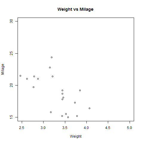
We use the data set “mtcars” available in the R environment to create a basic scatterplot. Let’s use the columns “wt” and “mpg” in mtcars.
input <- mtcars[,c('wt','mpg')]
print(head(input))
When we execute the above code, it produces the following result −
                    wt      mpg
Mazda RX4           2.620   21.0
Mazda RX4 Wag       2.875   21.0
Datsun 710          2.320   22.8
Hornet 4 Drive      3.215   21.4
Hornet Sportabout   3.440   18.7
Valiant             3.460   18.1
Creating the Scatterplot
The below script will create a scatterplot graph for the relation between wt(weight) and mpg(miles per gallon).
# Get the input values.
input <- mtcars[,c('wt','mpg')]

# Give the chart file a name.
png(file = "scatterplot.png")

# Plot the chart for cars with weight between 2.5 to 5 and mileage between 15 and 30.
plot(x = input$wt,y = input$mpg,
   xlab = "Weight",
   ylab = "Milage",
   xlim = c(2.5,5),
   ylim = c(15,30),
   main = "Weight vs Milage"
)

# Save the file.
dev.off()
When we execute the above code, it produces the following result −
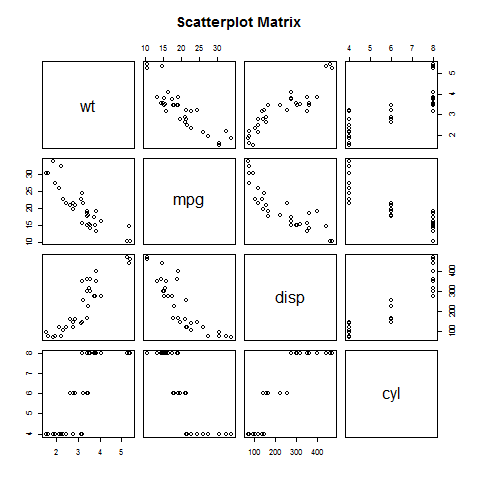
Scatterplot Matrices
When we have more than two variables and we want to find the correlation between one variable versus the remaining ones we use scatterplot matrix. We use pairs() function to create matrices of scatterplots.
Syntax
The basic syntax for creating scatterplot matrices in R is −
pairs(formula, data)
Following is the description of the parameters used −
- formula represents the series of variables used in pairs.
- data represents the data set from which the variables will be taken.
Example
Each variable is paired up with each of the remaining variable. A scatterplot is plotted for each pair.
# Give the chart file a name.
png(file = "scatterplot_matrices.png")

# Plot the matrices between 4 variables giving 12 plots.

# One variable with 3 others and total 4 variables.

pairs(~wt+mpg+disp+cyl,data = mtcars,
   main = "Scatterplot Matrix")

# Save the file.
dev.off()
When the above code is executed we get the following output.