In this chapter, we will show you how to persist your data using AsyncStorage.
Step 1: Presentation
In this step, we will create the App.js file.
import React from 'react'
import AsyncStorageExample from './async_storage_example.js'

const App = () => {
   return (
  <AsyncStorageExample />   )
}
export default App
Step 2: Logic
Name from the initial state is empty string. We will update it from persistent storage when the component is mounted.
setName will take the text from our input field, save it using AsyncStorage and update the state.
async_storage_example.js
import React, { Component } from 'react'
import { StatusBar } from 'react-native'
import { AsyncStorage, Text, View, TextInput, StyleSheet } from 'react-native'
class AsyncStorageExample extends Component {
state = {
'name': ''
}
componentDidMount = () => AsyncStorage.getItem('name').then((value) => this.setState({ 'name': value }))
setName = (value) => {
AsyncStorage.setItem('name', value);
this.setState({ 'name': value });
}
render() {
return (
<View style = {styles.container}>
<TextInput style = {styles.textInput} autoCapitalize = 'none'
onChangeText = {this.setName}/>
<Text>
{this.state.name}
</Text>
</View>
)
}
}
export default AsyncStorageExample
const styles = StyleSheet.create ({
container: {
flex: 1,
alignItems: 'center',
marginTop: 50
},
textInput: {
margin: 5,
height: 100,
borderWidth: 1,
backgroundColor: '#7685ed'
}
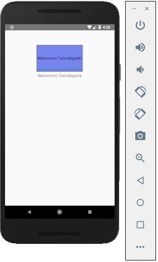
})When we run the app, we can update the text by typing into the input field.