Category: 06. Angular Binding

https://png.pngtree.com/png-clipart/20250425/original/pngtree-d-isolated-render-of-a-paperclip-icon-featuring-metallic-office-supply-png-image_20787914.png

  • Two-Way Data Binding

    Two-Way Data Binding in Angular

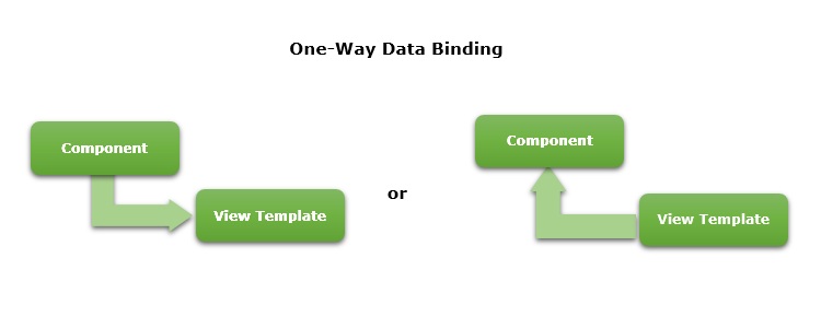
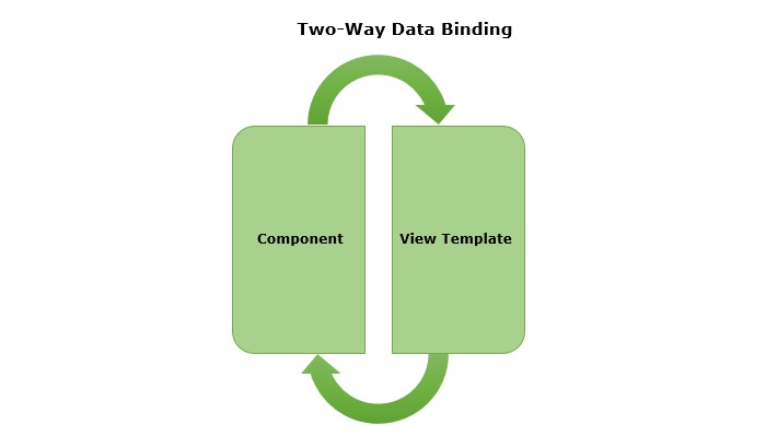
    Two-way data binding is a two-directional interaction in Angular. In this type of data binding, data flows in both ways, from the component to views and from the views back to the component. When you bind a value into an element then, two-way binding gives that element the ability to apply changes back to the source. It is the combination of property and event binding.

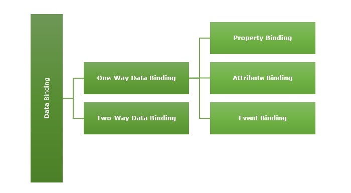
    The term Data binding refers to a mechanism that allows flow of data between component class to template and template to component class.

    two way data binding in angular

    Implementing Two-Way Binding

    We can use the following ways to implement two-way binding in Angular −

    Two-Way Binding using ngModel

    The ngModel is a directive in Angular that is used for two-way data binding between the component class and the HTML template. It helps to sync the data between the model in the component and the view in template. This directive is commonly used on form controls, such as <input>, <textarea>, and <select> to bind them to a component property.

    When the user interacts with the input field of a form, the value of the input is automatically updated in the component property. Similarly, if the component property is changed by any means, the input field is automatically updated to reflect the new value.

    Syntax

    For two-way binding using ngModel, we use ‘banana-in-a-box syntax’ which is shown below −

    <HTML[(ngModel)]="model.name"/>

    Where,

    • [(ngModel)]: The parentheses () represent the event binding and the square brackets [] represent property binding.
    • model.name: This is the component property that will be linked to the form control.

    Example

    In this example, we are demonstrating two-way data binding in Angular. We bind a form control to a component property using the ngModel directive. This will allow the input field to update the component’s user property and reflect any changes made to this property in the view immediately.

    Step 1: Create an Angular application named formApp using the command given below −

    ng newformApp

    Step 2: Import FormsModule first and then define a variable user inside src/app/app.component.tsFormModule will do the necessary setup to enable two-way data binding.

    import{ Component }from'@angular/core';import{ RouterOutlet }from'@angular/router';import{ FormsModule }from'@angular/forms';
    
    @Component({
      selector:'app-root',
      standalone:true,
      imports:[RouterOutlet, FormsModule],
      templateUrl:'./app.component.html',
      styleUrl:'./app.component.css'})exportclassAppComponent{
      title ='Two Way Binding';
      user: string ='';}

    Step 3: Update the view template, app.component.html as mentioned below −

    <h3>{{ title }}</h3><input type="text"[(ngModel)]="user"/><p>Welcome {{ user }}!</p><router-outlet />

    Here,

    The user property is bind to form control using ngModel directive. If you enter any text in the input box, it will update the user property.

    Finally, start your application using the below command −

    ng serve
    

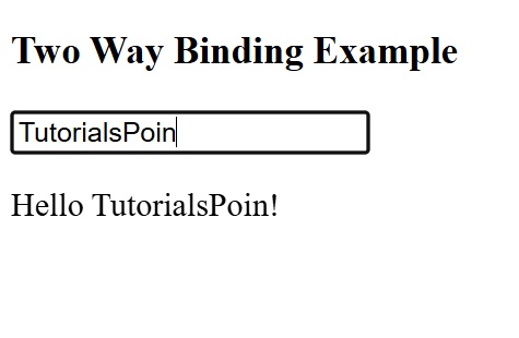
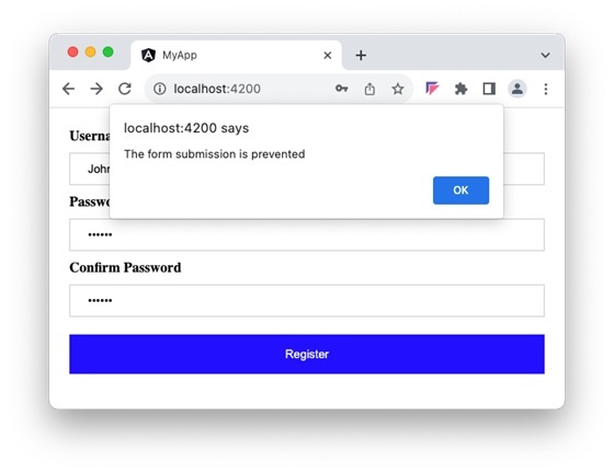
    After running your application, you could see a response as given below −

    Two Way Data binding using ngmodel

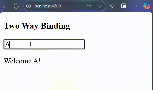
    Try to change the input value to any string of your choice. You will get the output as per the given input.

    NOTE: We will learn more about form controls in the upcoming chapters.

    Two-Way Binding using custom Event and Property Binding

    As mentioned earlier, if we combine event and property binding, we can achieve two-way binding. It is mainly used when we need to establish two-directional interaction between a parent and its child component. Compare to ngModel, using custom event and property binding requires more configuration.

    To enable two-way binding between components, the @Input() property and corresponding @Output property along with an event emitter method that updates the value of the @Input() needs to defined inside child component.

    Inside the parent component, wrap the @Input() property name in the ‘banana-in-a-box syntax’ and specify the corresponding property to which the updated value is assigned.

    Example

    In this example, we are illustrating two-way data binding by combining event and property binding together.

    Step 1: Create an Angular application named customApp using the command given below −

    ng newcustomApp

    Step 2: Next, generate a child component named child-component.

    ng generate component child-component
    CREATE src/app/child-component/child-component.component.html(31 bytes)CREATE src/app/child-component/child-component.component.spec.ts(672 bytes)CREATE src/app/child-component/child-component.component.ts(281 bytes)CREATE src/app/child-component/child-component.component.css(0 bytes)

    Step 3: Open child-component.component.ts file and add the following code −

    import{ Component, EventEmitter, Input, Output }from'@angular/core';import{ FormsModule }from'@angular/forms';
    
    @Component({
      selector:'app-child-component',
      standalone:true,
      imports:[FormsModule],
      template:'<input [value]="val" (input)="onValChange($event)" />',
      styleUrls:['./child-component.component.css']})exportclassChildComponentComponent{
      @Input() val: string ='';
      @Output() valChange: EventEmitter<string>=newEventEmitter<string>();onValChange(event: Event){// Cast the event target to HTMLInputElement and access the valueconst input = event.target as HTMLInputElement;if(input){this.valChange.emit(input.value);}}}

    Step 4: Add the following code inside app.component.ts file −

    import{ Component }from'@angular/core';import{ FormsModule }from'@angular/forms';import{ RouterOutlet }from'@angular/router';import{ ChildComponentComponent }from'./child-component/child-component.component';
    
    @Component({
      selector:'app-root',
      standalone:true,
      imports:[RouterOutlet, FormsModule, ChildComponentComponent],
      template:`<h3>{{ title }}</h3>
    
             &lt;app-child-component [(val)]="user"&gt;&lt;/app-child-component&gt; 
             &lt;p&gt;Hello {{ user }}!&lt;/p&gt;`,
    styleUrl:'./app.component.css'})exportclassAppComponent{ title ='Two Way Binding Example'; user: string ="";}

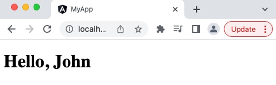
    Now, start your application using the below command −

    ng serve
    

    After running your application, you could see the following output −

    Two way binding using event and property binding
  • Style Binding

    What is Style Binding?

    A dynamic web application usually have dynamic styles and are set during the runtime of the application. Style binding is a special binding to bind a value to the style attribute of a HTML element dynamically.

    Let us see more details about style binding in this chapter.

    Ways to use Style Binding

    Angular provides four different ways to implement style binding. Each type of style binding supports a special feature. The four ways are as follows:

    Let us learn one by one in the upcoming sections.

    Single Style Binding

    In single style binding, the property name of a CSS style should be appended to style. string and should be surrounded by square bracket. For example, the width of a HTML element can be set using [style.width] as shown below −

    <div [style.width]="<template variable>"><!-- content --></div>

    Single Style Binding with Unit

    In single style binding with unit, the property name of a CSS style should be appended to style. string, the unit (.px) should be appended to the property name of a CSS style and should be surrounded by square bracket. For example, the width of a HTML element in px using can be set using [style.width.px] as shown below −

    <div [style.width.px]="<template variable>"><!-- content --></div>

    Multiple Style Binding

    In multiple style binding, style string should be surrounded by square bracket and the value should have proper CSS styles. For example, the width and height of a HTML element can be set using [style] as shown below −

    <div [style]="<template variable>"><!-- content --></div>

    Here, an example output of the template variable is width: 100px; height: 200px

    Multiple Style Binding with Object

    In multiple style binding with object, style string should be surrounded by square bracket and the value should be set with an object of type Record<string, string having keys and values with proper CSS property name (or converted to camelCase) and value respectively. For example, the width and height of a HTML element can be set using [style] as shown below −

    <div [style]="<objects as template variable>"><!-- content --></div>

    Here, an example object is as follows,

    {width:'100px',height:'100px'}

    Implementing Style Binding

    Let us create a simple registration form to understand attribute binding. Our registration form will have three input field as shown below and a button to submit the registration form.

    1. Username
    2. Password
    3. Confirm password
    

    Step 1: Create a new application, my-app using angular CLI as shown below −

    ng newmy-app
    

    Step 2: Create a new registration form component, RegisterForm using angular CLI as shown below −

    ng generate component RegisterForm
    

    Step 3: Next, open the registration form component’s template and add a form with username, password and confirm password.

    <div><form method="post"><div class="container"><label for="username"><b>Username</b></label><input type="text" name="username" required><label for="password"><b>Password</b></label><input type="password" name="password" required><label for="confirm_password"><b>Confirm Password</b></label><input type="password" name="confirm_password" required><button type="submit">Register</button></div></form></div>

    Step 4: Open the registration form component’s CSS style file and style the form using CSS as shown below −

    .container{padding: 15px;}input[type=text], input[type=password]{width: 100%;padding: 10px 20px;margin: 10px 0;display: inline-block;border: 1px solid #ccc;box-sizing: border-box;}button{background-color: blue;color: white;padding: 15px 20px;margin: 10px 0;border: none;cursor: pointer;width: 100%;}

    Step 5: Include our registration form component in the app template file, app.component.html:

    <app-register-form />

    Step 6: Run the application and test the registration form.

    style binding form

    Step 7: Next, let us try to apply the style for the button using style binding.

    Step 8: Add an object in the component with necessary values as shown below −

    btnStyle: Record<string, string> ={'backgroundColor':'purple','color':'white','padding':'15px 20px','margin':'10px 0','border':'none','cursor':'pointer','width':'100%'}

    Here, we have changed the background color of the button from blue to purple. Also, note that the name of the background color style property, background-color is in camelCase, backgroundColor.

    Step 9: Next, remove the button style in the components style file.

    Step 10: Next, assign the style object to the button through style binding.

    <button type="submit"[style]="btnStyle">Register</button>

    Step 11: The complete listing of the component is as follows:

    import{ Component }from'@angular/core';
    
    @Component({
       selector:'app-login-form',
       templateUrl:'./register-form.component.html',
       styleUrls:['./register-form.component.css']})exportclassRegisterFormComponent{
       btnStyle: Record<string, string>={'backgroundColor':'purple','color':'white','padding':'15px 20px','margin':'10px 0','border':'none','cursor':'pointer','width':'100%'}}

    Step 12: The complete listing of the component’s template is as follows:

    <div><form method="post"><div class="container"><label for="username"><b>Username</b></label><input type="text" name="username" required><label for="password"><b>Password</b></label><input type="password" name="password" required><label for="confirm_password"><b>Confirm Password</b></label><input type="password" name="confirm_password" required><button type="submit" [style]="btnStyle" >Register</button></div></form></div>

    Step 13: Run the application and check the output.

    confirm password
  • Class and Style Binding

    What is Class Binding?

    A dynamic web application usually have dynamic styles and are set during the runtime of the application. Class binding is a special binding to bind a dynamic value to the class attribute of a HTML element.

    Let us see more details about class binding in this chapter.

    Ways to use Class Binding

    Angular provides four different ways to implement class binding. Each of them supports a special feature. The four ways are as follows:

    Let us learn one by one in the upcoming sections.

    Single Class Binding

    In single class binding, class string should be surrounded by square bracket and a template variable should be set as it’s value.

    <div [class]="<template variable>"><!-- content --></div>

    Here, the template variable holds the class name for the specific HTML element.

    Single Class Binding with on/off Feature

    In single class binding with on/off feature, class style should be appended by the actual class name of the given HTML element and a template variable with boolean value should be set as it’s value. The boolean value determines the availability of the specific class to the HTML element.

    <div [class.<class name>]="template variable">
       <!-- content --></div>

    Here, the template variable outputs either true or false.

    Let us consider a class with name red, used to set the text of the HTML element to red color.

    .red{color: red;}

    Consider a member variable, isRedEnabled available in the component.

    isRedEnabled: boolean =true

    Then, the class binding can be set in a HTML element as shown below −

    <div [class.red]="isRedEnabled"><!-- content --></div>

    Multiple Class Binding

    In multiple class binding, class string should be surrounded by square bracket and the value should be set with one of more existing class name separated by space. For example, two class (myClass and myAnotherClass) for a HTML element can be set using [class] as shown below −

    <div [class]="<template variable>"><!-- content --></div>

    Here, the template variable will emit myClass myAnotherClass string.

    Multiple Class Binding through an Object with on/off Feature

    In multiple class binding through an object with on/off feature, class string should be surrounded by square bracket and the value should be set with an object of type Record<string, boolean> having keys and values with class name and boolean value respectively. The boolean value of a key determine whether the corresponding key will be set a class of the given HTML element.

    <div [class]="<objects as template variable>"><!-- content --></div>

    Let as consider an object with multiple keys representing class name and have boolean values as shown below −

    // in component
    myClass: Record<string, boolean>={ 
       c1:true,
       c2:false
       c3:true}

    Apply the class binding in the template as shown below −

    // in template
    <div [class]="myClass"><!-- content --></div>

    Then the output will have c1 and c3 class because both of these classes have true value in the object.

    // output
    <div class="c1 c3"><!-- content --></div>

    Implementing Class Binding

    Let us create a simple registration form to understand class binding. Our registration form will have three input field as shown below and a button to submit the registration form.

    1. Username
    2. Password
    3. Confirm password
    

    Step 1: Create a new application, my-app using angular CLI as shown below −

    ng newmy-app
    

    Step 2: Create a new registration form component, RegisterForm using angular CLI as shown below −

    ng generate component RegisterForm
    

    Step 3: Next, open the registration form component’s template and add a form with username, password and confirm password.

    <div><form method="post"><div class="container"><label for="username"><b>Username</b></label><input type="text" name="username" required><label for="password"><b>Password</b></label><input type="password" name="password" required><label for="confirm_password"><b>Confirm Password</b></label><input type="password" name="confirm_password" required><button type="submit">Register</button></div></form></div>

    Step 4: Open the registration form component’s CSS style and style the form using CSS as shown below −

    .container{padding: 15px;}input[type=text], input[type=password]{width: 100%;padding: 10px 20px;margin: 10px 0;display: inline-block;border: 1px solid #ccc;box-sizing: border-box;}button{background-color: blue;color: white;padding: 15px 20px;margin: 10px 0;border: none;cursor: pointer;width: 100%;}

    Step 5: Include our registration form component in the app template file, app.component.html

    <app-register-form />

    Step 6: Run the application and test the registration form.

    blue_button

    Step 7: Next, let us create few classes in the style file and apply our new class for the button using class binding.

    Step 8: Next, add two class, purple and smallcaps in the component’s style file.

    .purple{background-color: purple;}.smallcaps{font-variant: small-caps;}

    Step 9: Add a member variable, isPurple in the component as shown below −

    isPurple: boolean =true

    Step 10: Next, add an object in the component with purple and smallcaps class as keys as shown below −

    btnClass: Record<string, boolean>={'purple':true,'smallcaps':true}

    Step11: Next, assign the variable, isPurple to the button through class binding.

    <button type="submit"[class.purple]="isPurple">Register</button>

    Step12: Run the application and check the output. Output will show the button with purple color.

    purple button

    Step13: Next, reassign the object, btnClass to the buttons class through class binding.

    <button type="submit"[class]="btnClass">Register</button>

    Here, both purple and small caps will be applied.

    Step14: Run the application and check the output. Output will show the button with purple color and Register text is small caps format.

    button small caps

    Step15: The complete listing of the component is as follows,

    import{ Component }from'@angular/core';
    
    @Component({
       selector:'app-login-form',
       templateUrl:'./register-form.component.html',
       styleUrls:['./register-form.component.css']})exportclassRegisterFormComponent{
       isPurple: boolean =true
       
       btnClass: Record<string, boolean>={'purple':true,'smallcaps':true}}

    Step16: The complete listing of the component’s template is as follows,

    <div><form method="post"><div class="container"><label for="username"><b>Username</b></label><input type="text" name="username" required><label for="password"><b>Password</b></label><input type="password" name="password" required><label for="confirm_password"><b>Confirm Password</b></label><input type="password" name="confirm_password" required><!-- <button type="submit" [class.purple]="isPurple">Register</button> --><button type="submit" [class]="btnClass">Register</button></div></form></div>

    Style binding

    Style binding in Angular allows you to dynamically set inline CSS styles on an HTML element based on the component’s properties or template variables.

    Syntax of Style Binding

    Angular provides four different syntax in style binding. Each type of style binding supports a special feature. The four syntax as are follows:

    • Single style binding
    • Single style binding with unit
    • Multiple style binding
    • Multiple style binding through a custom style object
  • Attribute Binding

    What is Attribute Binding?

    Attribute binding helps to set the value for the attribute of the HTML element. Angular exposes attributes of the HTML element with a matching property with the attribute name converted into camelCase.

    For example, the colspan attribute’s corresponding angular property is colSpan. Even though, angular tries to provide all HTML elements attributes as property, it still misses some of the attributes of SVG elements, aria (web accessibility) elements, etc.,

    We can use attribute binding where the attributes of a HTML element is not available as property. Also, we can use attribute binding for attributes of all HTML element.

    How to use Attribute Binding?

    To use attribute binding in your Angular application, use the square brackets around the attribute name. It basically represents the attribute of a HTML element in the template.

    Syntax

    The syntax to use attribute binding is as follows −

    <HTMLTag [attr.<attribute_name>]="<template variable>"/>

    We can combine attr. string with the actual attribute name of the HTML element to create the angular attribute representation. The value of the attribute is a template variable. While generating the view from the template, angular will set the value of the attribute by processing the template variable.

    Implementing Attribute Binding

    Let us create a simple registration form to understand attribute binding. Our registration form will have three input field as shown below and a button to submit the registration form.

    • Username
    • Password
    • Confirm password

    Step 1: Create a new application, my-app using angular CLI as shown below −

    ng newmy-app
    

    Step 2: Create a new registration form component, RegisterForm using angular CLI as shown below −

    ng generate component RegisterForm
    

    Step 3: Open the registration form component’s template and add user registration form with username, password and confirm password.

    <div><form method="post"><div class="container"><label for="username"><b>Username</b></label><input type="text" name="username" required><label for="password"><b>Password</b></label><input type="password" name="password" required><label for="confirm_password"><b>Confirm Password</b></label><input type="password" name="confirm_password" required><button type="submit">Register</button></div></form></div>

    Step 4: Open the registration form component’s style and style the registration form using CSS as shown below −

    .container{padding: 15px;}input[type=text], input[type=password]{width: 100%;padding: 10px 20px;margin: 10px 0;display: inline-block;border: 1px solid #ccc;box-sizing: border-box;}button{background-color: blue;color: white;padding: 15px 20px;margin: 10px 0;border: none;cursor: pointer;width: 100%;}

    Step 5: Include our registration form component in the app template file, app.component.html:

    <app-register-form />

    Step 6: Run the application and test the registration form.

    registration form

    Step 7: Next, we will try to set the placeholder text for all input field using attributes binding. Add three member variable in the component to represent the placeholder text for username, password and confirm password input field.

    placeholder1: string ="Enter username"
    placeholder2: string ="Enter password"
    placeholder3: string ="Repeat password"

    Step 8: Assign the above declared component’s member variable to the placeholder attributes of username, password and confirm password input accordingly in the template using [attr.placeholder] attribute as shown below −

    <div><form method="post"><div class="container"><label for="username"><b>Username</b></label><input type="text" [attr.placeholder]="placeholder1" name="username" required><label for="password"><b>Password</b></label><input type="password" [attr.placeholder]="placeholder2" name="password" required><label for="confirm_password"><b>Confirm Password</b></label><input type="password" [attr.placeholder]="placeholder3"
    
         name="confirm_password" required&gt;&lt;button type="submit"&gt;Register&lt;/button&gt;&lt;/div&gt;&lt;/form&gt;&lt;/div&gt;</code></pre>

    Here,

    • attr.placeholder represents the placeholder attribute of input elements.

    Step 9: Let us add ARIA attribute, aria-label to the input field. aria-label is used for accessibility purposes.

    <div><form method="post"><div class="container"><label for="username"><b>Username</b></label><input type="text" [attr.aria-label]="placeholder1"
    
            &#91;attr.placeholder]="placeholder1" name="username" required&gt;&lt;label for="password"&gt;&lt;b&gt;Password&lt;/b&gt;&lt;/label&gt;&lt;input type="password" &#91;attr.aria-label]="placeholder2"
            &#91;attr.placeholder]="placeholder2" name="password" required&gt;&lt;label for="confirm_password"&gt;&lt;b&gt;Confirm Password&lt;/b&gt;&lt;/label&gt;&lt;input type="password" &#91;attr.aria-label]="placeholder3"
            &#91;attr.placeholder]="placeholder3" name="confirm_password" required&gt;&lt;button type="submit"&gt;Register&lt;/button&gt;&lt;/div&gt;&lt;/form&gt;&lt;/div&gt;</code></pre>

    Step 10: Next, run the application and check the output.

    application output

    Step 11: Since, we can set any attribute of the HTML element using attribute binding, let us apply the class, container using attribute binding.

    Step 12: Create a new member variable, myContainerClass in the component as shown below −

    myContainerClass: string ="container"

    Step 13: Apply the member variable in the template as shown below −

    <div [attr.class]="myContainerClass"><!-- form --></div>

    Step 14: The complete listing of the component is as follows:

    import{ Component }from'@angular/core';
    
    @Component({
       selector:'app-login-form',
       templateUrl:'./register-form.component.html',
       styleUrls:['./register-form.component.css']})exportclassRegisterFormComponent{
       myContainerClass: string ="container"
       placeholder1: string ="Enter username"
       placeholder2: string ="Enter password"
       placeholder3: string ="Repeat password"}

    Step 15: The complete listing of the component's template is as follows:

    <div><form method="post"><div class="container"><label for="username"><b>Username</b></label><input type="text" [attr.aria-label]="placeholder1"
    
            &#91;attr.placeholder]="placeholder1" name="username" required&gt;&lt;label for="password"&gt;&lt;b&gt;Password&lt;/b&gt;&lt;/label&gt;&lt;input type="password" &#91;attr.aria-label]="placeholder2"
            &#91;attr.placeholder]="placeholder2" name="password" required&gt;&lt;label for="confirm_password"&gt;&lt;b&gt;Confirm Password&lt;/b&gt;&lt;/label&gt;&lt;input type="password" &#91;attr.aria-label]="placeholder3"
            &#91;attr.placeholder]="placeholder3" name="confirm_password" required&gt;&lt;button type="submit"&gt;Register&lt;/button&gt;&lt;/div&gt;&lt;/form&gt;&lt;/div&gt;</code></pre>

    Step 16: Next, run the application and check the output.

    register

    Differences between Property Binding and Attribute Binding

    The table below shows how property binding is different from attribute binding −

    Property BindingAttribute Binding
    Property Binding binds to the properties of DOM elements or directives.Attribute binding binds to the attributes of an element
    It is used to bind properties that can change dynamically, like DOM properties.It is used when you need to bind to attributes that do not have corresponding properties on the element.
    It directly updates the DOM property.It updates the attribute value, but does not directly affect the DOM property.
  • Property Binding

    Property binding is a type of Data Binding in which we bind a property of a DOM. Its purpose is to show or hide a DOM element, or simply manipulate the DOM. It helps to set the value for the property of the HTML element or angular component.

    Data binding is a mechanism that allows flow of data between component class to template and template to component class.

    How to use Property Binding?

    To use property binding, we enclose the property of an HTML element or a component withing square brackets […] as shown below −

    <element-or-component [<property name>]="<template variable>"><!-- content --></element-orcomponent>

    The value of the property is basically a template variable. While generating the view from the template, angular will set the value of the property by processing the template variable.

    Example

    Let’s see how to set value for the property, src in img HTML element.

    Step 1: Declare a variable, image in the component and set a value.

    image: string ='images/my-image.jpg'

    Step 2: Set the image variable to the src property (enclose it using square bracket) of the img HTML element in the template as shown below −

    <img [src]="image"/>

    Attributes of HTML element

    Angular exposes attributes of the common HTML element with a matching property.

    <input type="text"[value]="val"/>

    Here, value is the property of the HtmlInputElement exposed by angular.

    For attributes with multiple words, the corresponding property name will be converted into camelCase format. for example, the colspan attribute’s corresponding angular property is colSpan.

    The Boolean Property

    Boolean property of a HTML element/component does have value. Few examples of boolean property available in the HTML element are disabledrequired and readonly. For boolean property, we can set a boolean variable for the property. The boolean value determines the presence / absence of property in the HTML element/component.

    Example

    Let us see how to set required property in input HTML element.

    Step 1: Declare a variable, isRequired in the component and set either TRUE or FALSE.

    isRequired: boolean =true

    Step 2: Set the isRequired variable to the required property (enclose it using square bracket) of the input HTML element in the template as shown below −

    <input type="text" name="Username"[required]="isRequired"/>

    Step 3: The output of the template will include required attribute because the value of the isRequired variable is true

    <input type="text" name="Username" required />

    Implementing Property Binding

    Let us create a simple registration form to understand property binding. Our registration form will have three input field as shown below and a button to submit the registraion form.

    • Username
    • Password
    • Confirm password

    Step 1: Create a new application, my-app using angular CLI as shown below −

    ng newmy-app
    

    Step 2: Create a new registration form component, RegisterForm using angular CLI as shown below −

    ng generate component RegisterForm
    

    Step 3: Open the registration form components template and a user with username, password and confirm password.

    <div><form method="post"><div class="container"><label for="username"><b>Username</b></label><input type="text" name="username" required><label for="password"><b>Password</b></label><input type="password" name="password" required><label for="confirm_password"><b>Confirm Password</b></label><input type="password" name="confirm_password" required><button type="submit">Register</button></div></form></div>

    Step 4: Open the registration form components style and style the form using CSS as shown below −

    .container{padding: 15px;}input[type=text], input[type=password]{width: 100%;padding: 10px 20px;margin: 10px 0;display: inline-block;border: 1px solid #ccc;box-sizing: border-box;}button{background-color: blue;color: white;padding: 15px 20px;margin: 10px 0;border: none;cursor: pointer;width: 100%;}

    Step 5: Include our registration form component in the app template file, app.component.html.

    <app-register-form />

    Step 6: Run the application and test the registration form.

    input registration form

    Step 7: Next, we will try to set the placeholder text for all input field using attributes binding. Add three member variable in the component to represent the placeholder text for username, password and confirm password input field.

    placeholder1: string ="Enter username"
    placeholder2: string ="Enter password"
    placeholder3: string ="Repeat password"

    Step 8: Assign the above declared components member variable to the placeholder attributes of username, password and confirm password input accordingly in the template using [placeholder] property as shown below −

    <input type="text" [placeholder]="placeholder1" name="username" required><input type="password" [placeholder]="placeholder2" name="password" required><input type="password" [placeholder]="placeholder3" name="confirm_password" required>

    Here,

    • attr.placeholder represents the placeholder attribute.

    Step 9: The complete listing of the component is as follows:

    import{ Component }from'@angular/core';
    
    @Component({
       selector:'app-login-form',
       templateUrl:'./register-form.component.html',
       styleUrls:['./register-form.component.css']})exportclassRegisterFormComponent{
       placeholder1: string ="Enter username"
       placeholder2: string ="Enter password"
       placeholder3: string ="Repeat password"}

    Step 10: The complete listing of the components template is as follows:

    <div><form method="post"><div class="container"><label for="username"><b>Username</b></label><input type="text" [placeholder]="placeholder1" name="username" required><label for="password"><b>Password</b></label><input type="password" [placeholder]="placeholder2" name="password" required><label for="confirm_password"><b>Confirm Password</b></label><input type="password" [placeholder]="placeholder3"
    
         name="confirm_password" required&gt;&lt;button type="submit"&gt;Register&lt;/button&gt;&lt;/div&gt;&lt;/form&gt;&lt;/div&gt;</code></pre>

    Step 11: Next, run the application and check the output.

    user details
  • Event Binding

    Angular provides option to listen and fire action for each user initiated event in a typical web application. Event binding is the process of targeting an event in a HTML element/component and set a responder for the target event. The responder will execute once the event is fired.

    In this tutorial, we will understand Event Binding.

    How to use Event Binding?

    An event can be set for an HTML element/component by including the event name inside the bracket (( )) and assigning a template statement. The template statement will execute once the event is fired by the user. The generic syntax to set an action for an event is as follows:

    (<event_name>)="template statement"

    The syntax to listen a click event of a button is as follows:

    <button(click)="template statement">Click here</button>

    Example

    Let us create a button and set an action to the button’s click event.

    Step 1: Create a submit button.

    <button type="submit>Submit</button>

    Step 2: Create an action method in the component.

    myAction(){alert('I am the action function for click event');}

    Step 3: Bind our myAction() method to click event of the button as shown below −

    <button type="submit"(click)="myAction()">Submit</button>

    Now, myAction() will execute whenever the submit button is clicked by the user.

    Event Object ($event)

    Event object has the data about target and the event send by the firing event to the responding action. Angular expose the event object of any event in the an object represented by $event in the context of template.

    To get the event object of the button click event, use $event object available in the template as shown below −

    <button type="submit"(click)="myAction($event)">Submit</button>

    Now, modify the action, myAction() in the component to use the $event object as shown below −

    myAction(e){
       e.preventDefault()}

    Here, preventDefault() is the method available in the HtmlButtonElement’s event object to suppress the button events built-in action like submitting the form.

    Types of Events

    Angular supports all events in a web application and the events are categorized by its source and usage. The type of events are as follows:

    • Mouse events
    • Keyboard based events
    • Touch based events
    • Document based events

    Let’s learn them one by one in brief.

    Mouse Based Events

    Mouse based events are events fired by mouse actions like click, scroll, movement, drag, etc.,. Some of the most important events in this category and its angular event binding target name are given below −

    • Single click – (click)
    • Double click – (dblclick)
    • Mouse down – (mousedown)
    • Mouse up – (mouseup)
    • Mouse entering an element – (mouseenter)
    • Mouse leaving an element – (mouseleave)
    • Scrolling a block – (scroll)
    • Holding and dragging an element – (drag)
    • Holding and dropping an element – (drop)
    • Dragging an event over the target drop event – (dragover)

    Keyboard Based Events

    Keyboard based events are events fired when the user works on the keyboard. Some of the most important events in this category are mentioned below −

    • Pressing a key – (keydown)
    • Releasing a key – (keyup)
    • Pressing a character key – (keypress)
    • Focusing an element – (focus)
    • Opposite of focusing an element – (blur)
    • Pressing a specific key or key combination like Shift + T (keydown.shift.t)

    Events targeting a specific key press can be done using below format:

    keydown.<modifier_key>.<key_code>
    keydown.<key_code>
    keydown.code.<event code separated by dot(.)>

    Here,

    • Modifier_key represents shift, alt and control
    • Key_code represent the target keyboard code like alphabets, digit, etc., as specified in HTML spec. Example, keydown.shift.t
    • Event code represent the event code as specified in HTML spec like keyT, Tab, etc.,

    For example, pressing shift key and t at the same time can be targeted as shown below −

    <div(keydown.shift.t)="alert('Shift + T')"><!-- content --></div>

    Touch Based Events

    Touch based events are events fired when the user interacts through a touch device. Some of the most important events in this category are as follows −

    • Pointing an element and start moving in a touch device – (touchstart)
    • Pointing an element and Moving in a touch device – (touchmove)
    • Pointing an element and stop moving in a touch device – (touchend)

    Web Document Based Events

    Web document based events are specific events fired in the web document to perform actions like cut, copy and paste a text, submitting a form, etc., Some of the most important events in this category are mentioned below −

    • Submitting a form by clicking the submit button – (submit)
    • Copying a text to clipboard – (copy)
    • Pasting a text from clipboard – (paste)
    • Deleting and copying a piece of text to clipboard – (cut)

    Implementing Event Binding

    Let us create a simple registration form to understand attribute binding. Our registration form will have three input field as shown below and a button to submit the registration form.

    • Username
    • Password
    • Confirm password

    Step 1: Create a new application, my-app using angular CLI as shown below −

    ng newmy-app
    

    Step 2: Create a new registration form component, RegisterForm using angular CLI as shown below −

    ng generate component RegisterForm
    

    Step 3: Next, open the registration form component’s template and add a form with username, password and confirm password.

    <div><form method="post"><div class="container"><label for="username"><b>Username</b></label><input type="text" name="username" required><label for="password"><b>Password</b></label><input type="password" name="password" required><label for="confirm_password"><b>Confirm Password</b></label><input type="password" name="confirm_password" required><button type="submit">Register</button></div></form></div>

    Step4: Open the registration form components css style and style the form using CSS as shown below −

    .container{padding: 15px;}input[type=text], input[type=password]{width: 100%;padding: 10px 20px;margin: 10px 0;display: inline-block;border: 1px solid #ccc;box-sizing: border-box;}button{background-color: blue;color: white;padding: 15px 20px;margin: 10px 0;border: none;cursor: pointer;width: 100%;

    Step 5: Include our registration form component in the app template file, app.component.html.

    <app-register-form />

    Step 6: Run the application and check the output.

    Step 7: Let us add a method in the component to capture the submit event and suppress the form submission.

    registerAccount(e: Event){
       e.preventDefault();alert('The form submission is prevented');}

    Step 8: Open the template and set the method for click event using event binding.

    <button type="submit"(click)="registerAccount($event)">Register</button>

    Step 9: The complete listing of the component is as follows:

    import{ Component }from'@angular/core';
    
    @Component({
       selector:'app-login-form',
       templateUrl:'./register-form.component.html',
       styleUrls:['./register-form.component.css']})exportclassRegisterFormComponent{registerAccount(e: Event){
    
      e.preventDefault();alert('The form submission is prevented');}}</code></pre>

    Step 10: The complete listing of the component's template is as follows:

    <div>
       <form method="post">
    
      &lt;div class="container"&gt;
         &lt;label for="username"&gt;&lt;b&gt;Username&lt;/b&gt;&lt;/label&gt;
         &lt;input type="text" name="username" required&gt;
      
         &lt;label for="password"&gt;&lt;b&gt;Password&lt;/b&gt;&lt;/label&gt;
         &lt;input type="password" name="password" required&gt;
      
         &lt;label for="confirm_password"&gt;&lt;b&gt;Confirm Password&lt;/b&gt;&lt;/label&gt;
         &lt;input type="password" name="confirm_password" required&gt;
      
         &lt;button type="submit" (click)="registerAccount($event)"&gt;Register&lt;/button&gt;
      &lt;/div&gt;
    </form> </div>

    Step 11: Run the application and check the output. Clicking the button does not submit the form as it is intercepted and prevented using event binding.

    Application Using Event Binding
  • Text interpolation

    Text interpolation is the process of using data of Angular component in its corresponding template using the template expression. It is used just to display a piece of information in HTML, such as displaying a title or name.

    The component is a building block of an Angular application. It consists of a TypeScript class, an HTML template, and CSS styles. The template expression is a piece of code written within double curly braces {{ }} in the Template.

    How to use Text Interpolation?

    As discussed earlier, we write the template expression inside double curly braces to use Text Interpolation. It is shown below for the reference −

    {{<template expression>}}

    Let us consider that a component has name as one of its property.

    exportclassHomeComponent{
       name: string ='John'}

    Now, name can be used in it’s template as shown below −

    Hello {{ name }}

    Understanding Template Expression

    Template expressions are same as that of JavaScript expression excluding two set of expression:

    • Expression with no usage in the template (assignement, object creation, etc.,)
    • Expressions with side effects

    For example, the increment operator (++) basically increment the given variable and then returns the incremented value. This is called side effect. Since the increment operator produces the side effect, it is not allowed in the template expression.

    Some of the JavaScript expressions not allowed in the template expression. They are given below:

    • Assignment operators: Template does not have the concept of creating a new variable and setting value for it in the context of template.
    • new keyword: Template does not allow the creation of new object. Any object should be created in the component class. Object created in the component will be available in the template.
    • typeof and instanceOf keyword: Template does not allow interpretation of the object in the template. Logic should be done in the component through public method and should exposed to the template.
    • Chaining expressions: Template expression allows only a single expression and so, all chaining operators are excluded.
    • increment and decrement operators: Template does not allow side effects. Since the increment and decrement operator does side effects, they are excluded.
    • Bitwise operator: Pipe symbol (|) is used to represent the angular pipe concept. Angular pipes are used for text transformation.

    As template will render many times during the lifetime of the application, angular team recommends the expression to be short, quick and have no side effects.

    Template Expression Context

    Template expression has three context −

    1. Component’s property: Components property are the property set in the components instance. For example, a user object (user) in the component can be used in the template as follows,

    {{ user.name }}

    Here, user context is component’s instance.

    2. Template input variable: Template input variable are input to the template assigned through directives. For example, ngFor directive send the index and current item of the loop to the template as shown below,

    <ul><li *ngFor="let user of users">{{user.name}}</li></ul>

    Here, user context is template input variable.

    3. Template reference variable: Template reference variable is basically representation of HTML elements, components and directive in the give template as shown below −

    <input #user /><span>{{ user.value }}</span>

    Here, user context is template reference variable.

    The precedence of context in case of name collision is as follow,

    • Template variable
    • Variable in the directive’s context
    • Component’s member variable

    Working Example

    Now, let’s see a practical example of Text Interpolation in Angular.

    Step 1: Create a new application using angular CLI as shown below −

    $ ng newmy-app
    

    Step 2: Create a component, Hello using angular CLI as shown below −

    $ ng generate component Hello
    CREATE src/app/hello/hello.component.css(0 bytes)CREATE src/app/hello/hello.component.html(20 bytes)CREATE src/app/hello/hello.component.spec.ts(552 bytes)CREATE src/app/hello/hello.component.ts(198 bytes)

    Step 3: Next, open the component file, hello.component.ts and add a variable named user with value John.

    import{ Component }from'@angular/core';
    
    @Component({
       selector:'app-hello',
       templateUrl:'./hello.component.html',
       styleUrls:['./hello.component.css']})exportclassHelloComponent{
       user: string ="John"}

    Step 4: Next, open the component template file, hello.component.html and add an input element:

    <h1> Hello,{{ user }}</h1>

    Here, user is the template input variable exposed by component.

    Step 5: Next, open the app component’s template file, src/app/app.component.html and add our component as shown below −

    <app-hello />

    Step 6: Finally, run the application and check whether the output is correct.

    hello john
  • Data Binding

    Data Binding is the process of connecting a target (such as a DOM element, property, or event) in a template to a model (data or behavior) in the component. This process lets the template to dynamically reflect changes in the component’s state or execute actions based on user interactions, using template expressions or template statements.

    In Angular, data binding is used to establish communication between component class to view template and view template to the component class.

    Types of Data Binding

    There are two types of Data Binding in Angular −

    • One-Way Data Binding
    • Two-Way Data Binding

    The diagram below shows the categorization of data binding −

    types of data binding in angular

    One-Way Data Binding

    One-way data binding is a one-directional interaction between a component and its template. The data flows either from component to its corresponding template or template to the component. If you perform any changes in your component, then it will reflect in the HTML elements.

    one way data binding in angular

    One-way data binding can be achieved through the following ways −

    • Text Interpolation
    • Event Binding
    • Property Binding
    • Attribute Binding

    Text Interpolation

    In general,Text Interpolationis the process of formatting or manipulating strings. In Angular,itis used to display data from a component to a view. In this way of data binding, we use the curly braces {{ }}.

    Let us consider a variable, name available in the component.

    name: string ="John"

    Then, the name can be used in the template using interpolation as shown below −

    Name:{{ name }}

    The final output of the template is shown below −

    Name: John
    

    Event Binding

    Event binding is the process of setting an action to the event of an HTML element or another component. It is used to achieve one-way data binding where data flows from the view template to the component class. Here, we use the parentheses ( ).

    Events are actions like a mouse click, double click, hover or any other keyboard and mouse actions. If a user interacts with an application and performs some actions, then an event will be raised.

    Suppose there is a method called myAction() inside the component.

    myAction(){// do some process}

    For this, event binding can be written as shown below −

    <button type="submit"(submit)="myAction">Click here</button>

    Once the submit event is fired, myAction() method will be called and executed.

    Property Binding

    Property binding lets us bind a property of a DOM. It is used to show or hide a DOM element, or simply manipulate the DOM. Here, we use square brackets [ ]

    Let us consider a property, name available in the component.

    name: string ="John"

    Property binding can be written as shown below −

    <input type="text" name="username"[value]="name"/>

    The output of the template is shown below −

    <input type="text" name="username" value="John"/>

    Attribute binding

    Attribute binding is used to bind the data from component to HTML attributes. The syntax is as follows −

    <HTMLTag [attr.ATTR]="Component data">

    For example, let’s consider a property, name available in the component.

    name: string ="John"

    Attribute binding can be written as shown below −

    <input type="text" name="username"[attr.value]="name"/>

    The output of the template is shown below −

    <input type="text" name="username" value="John"/>

    Two-way Data Binding

    Two-way data binding is a two-way interaction where data flows in both ways, from component to views and views to component at the same time. If you do any changes in your property (or model) then, it reflects in your view and vice-versa. It is the combination of property and event binding.

    two way data binding in angular

    The NgModel, a standalone Angular directive, is used for two-way data binding. This directive binds the form control to property and the property to form control.

    The syntax of ngModel is as follows −

    <HTML [(ngModel)]="model.name" />
    

    A sample two-way data binding format is as follows,

    // parent-comp template<child-comp [(data)]="dataChange()"/>

    Here, data will be passed initially from parent to child component and then, whenever the data gets updated in the child component, the child component will fire an event with updated data and the parent will capture the data through event callback method, dataChange().

    We will learn two-way data binding concept in more detail in the upcoming chapter.