Angular elements are reusable components that have been transformed into custom elements (also called Web Components). Angular provides a simple and effective method to create Web components.
Web components are custom HTML elements available in native HTML specifications to extend the features/tags of the HTML document. It can be created through JavaScript and can be made available in the HTML document. JavaScript has special methods to create custom HTML elements.
Creating custom HTML elements using JavaScript is a lengthy process and developers need to understand the internal workings of custom HTML elements and the Shadow DOM concept. Angular simplifies the process by enabling the conversion of Angular components to web components with minimal change in the component class.
Creating Angular Elements
Creating Angular elements means transforming a component into a custom element. For this purpose, the @angular/elements package is used. This package exports a createCustomElement() function that converts a component into a class that can be registered with the browser as a custom element.
Example
Let us learn how to create a custom HTML element in Angular.
In this example, we will create a component to display employee information (say EmpCard) and convert it into custom HTML element.
Step 1: Create an angular application, emp-card-web-component using Angular CLI.
ng newemp-card-web-component
Step 2: Create the emp-card component using Angular CLI.
Step 3: Add encapsulation option in the @Component decorator with ViewEncapsulation.ShadowDom option. ShadowDom option enables the HTML native ShadowDom concept to preserve the styles of the component without leaking into the other part of the HTML document.
Step 8: Next, install @angular/elements module provided by angular team. @angular/elements module has options to create custom HTML element from angular component.
ng add @angular/elements
✔ Determining Package Manager
   Using package manager: npm
✔ Searching for compatible package version
   Found compatible package version: @angular/[email protected].
✔ Loading package information from registry
✔ Confirming installation
✔ Installing package
Package "@angular/elements" was found but does not support schematics.
Step 9: Next, open the main.ts file and remove all boilerplate code.
Step 10: Next, import createApplication from @angular/platform-browser. createApplication will bootstrap the angular application.
Step 11: Next, import createCustomElement from @angular/element module. createCustomElement will be used to create custom HTML element from the angular component.
Step 13: Next, create application using createAppliation() method by inputting providers and a callback method. The callback method will be used to create the custom HTML element from angular component.
Step 14: Implement the callback method and create custom element using createCustomElement() method. createCustomElement accepts the component to be converted and the apps injector.
We can get injector from application reference returned from createApplication() method.
Step 18: Once, the build is done, the output files are available in dist/emp-card-web-component folder. It has below files (similar files) along with a index.html file.
main-5LWF45YA.js
polyfills-FFHMD2TL.js
styles-5INURTSO.css
Step 19: Update the index.html file of the src folder with the newly created component and check the output for correctness.
Angular allows the component to be dynamically created and loaded at run time at a specific location in the host (another) component. Loading a component at run time opens a lot of opportunities to do advanced functionality. For example, a banner rotation component can accept heavily customized banner item instead of accepting banners confirming to a specific template, which is always pre-defined and static in nature.
Let us learn how to create an Angular component at run time and attach it to the host component in this chapter.
How to Render Angular Components Dynamically?
There are two ways to create dynamic components in Angular:
Using NgComponentOutlet
Using ViewContainerRef
Using NgComponentOutlet
The NgComponentOutlet is a directive that helps in dynamic component creation. It instantiates a Component and embeds its view (host view) inside the current view. Please note it only accepts Components and to use it, you need to import CommonModule.
Example
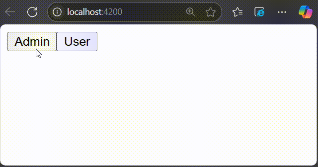
In this example, we see the practical implementation of NgComponentOutlet directive. Here, we create an Angular application that will have two main child components and they will be associated with buttons named Admin and User. On clicking the Admin button, AdminBioComponent will be displayed and when you click the User button, StandardBioComponent will be displayed.
Step 1: Create AdminBioComponent using the given command −
ng g c admin-bio
Step 2: Create a second component, StandardBioComponent using the command given below −
ng g c standard-bio
Step 3: We need another component that will contain the logic of dynamic component creation.
ng g c check-bio
Step 4: Now, open admin-bio.component.html file and copy the below code −
<h3>Admin Bio</h3><p>Content of the Admin Bio Component.</p>
Step 5: Then, open standard-bio.component.html file and copy the below code −
<h3>Standard Bio</h3><p>Content of the Standard Bio Component.</p>
Step 6: Next, open check-bio.component.html file and copy the below code −
Step 7: In the check-bio.component.ts file, create a method named getBioComponent(). This method will check which button is clicked among the two and display the view accordingly. The complete code is given below −
Step 8: Next, open app.component.html file and copy the below code −
<!-- buttons to trigger admin() and userLog() methods --><button(click)="admin()">Admin</button><button(click)="userLog()">User</button><!-- conditional rendering --><div *ngIf="isValid"><!--input binding --><app-check-bio [user]="user"></app-check-bio><router-outlet /></div>
Here, the given buttons will trigger the admin() and userLog() methods. The *ngIf directive conditionally includes the <div> element in the DOM if the isValid property is true. If it is false, the <div> and its contents are not rendered.
Step 10: Finally, inside the app.component.ts file, copy the below code −
The second way of creating and rendering components dynamically is by using ViewContainerRef. Other components or directives use it to get a reference to a view container corresponding to their location in the DOM. In this way, ViewContainerRef helps to dynamically create and insert components at that specific location.
Example
Let us create a real time application to display a collection of employees in two different formats, table and gallery. We will create two components, one to show employees in the table and another in gallery format. Then we will create a host component, which will dynamically load either table based component or gallery based component.
Step 1: Create an interface to hold common data across multiple dynamic component
$ ng generate interfaceDynDataCREATE src/app/dyn-data.ts(29 bytes)
Step 2: Create a directive, DynSample. The purpose of the directive is to target and select the view container (where dynamic component will be placed) in the host component template.
$ ng generate directive DynSample
CREATE src/app/dyn-sample.directive.spec.ts(237 bytes)CREATE src/app/dyn-sample.directive.ts(147 bytes)
Step 3: Create a dynamic component, DynList. The purpose of the component is to list the employee as gallery.
Step 5: Create a host component, DynHost. The purpose of the component is to host any one of the component, DynList and DynTable based on configuration.
Attribute directive purpose is to target the element (ng-template) in the host components template where the dynamic component will be injected.
appDynSample is the selector to target and select the element (ng-template). The dynamic component will be created, initialized and injected into the appHello element (ng-template) later.
Step 7: Next, initialize the view component reference object (ViewComponentRef) in the directive as shown below −
Imported the ViewContainerRef from @angular/core module
Initialized the viewContainerRef object through contructor dependency injection. viewContainerRef is the view container of the targeted element (ng-template) in the host components template. ViewContainerRef has method to dynamically create a component and append that component to it. We will use it later in the host component to dynamically create the DynListComponent and DynTableComponent.
Step 8: Next, open the interface, DynData and add an array property, data
exportinterfaceDynData{
data : any[]}
Step 9: Next, open the DynListComponent component and implement DynData interface.
Step 24: Next, open the app components template and include the host component.
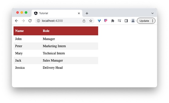
<app-dyn-host format="table"/>
Here, we have directed the host component to render the employees data in the tabular format. The host component will dynamically create the DynTableComponent and inject into the host component template.
Step 25: Next, run the application and you can see that the employee data is shown in a tabular format as shown below −
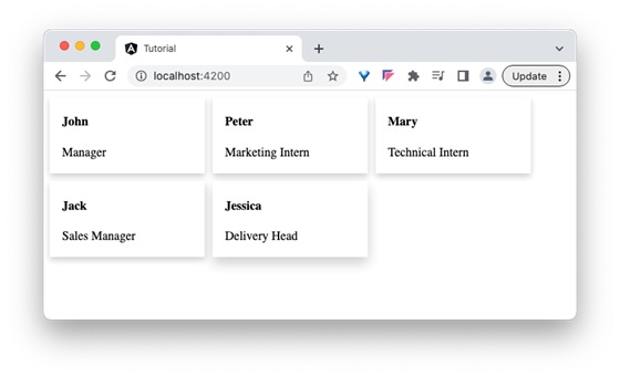
Step 26: Next, open the app components template and change the format to gallery.
<app-dyn-host format="gallery"/>
Here, we have directed the host component to render the employees data in gallery format. The host component will dynamically create the DynListComponent and inject into the host component template.
Step 27: Next, run the application and you can see that the employee data is shown in gallery format as shown below −
Content projection is a technique available in the Angular component to include external content (from consumer of the component) along with layout and styles in the specific area of the component template.
Different Implementation of Content Projection
The different ways in which we can implement content projection are:
Single-slot content projection
Multi-slot content projection
Conditional content projection
Single-Slot Content Projection
A component involving only one content projection is called single-slot content projection.
Example
Let us understand the content projection by creating the above explained component.
Step 1: Create a projectionSample application using the below command −
ng newprojectionSample
Step 2: Navigate to project folder and create a new component with the name content-projection-sample:
cd projectSample

ng generate component content-projection-sample
CREATE src/app/content-projection-sample/content-projection-sample.component.html(41 bytes)CREATE src/app/content-projection-sample/content-projection-sample.component.spec.ts(736 bytes)CREATE src/app/content-projection-sample/content-projection-sample.component.ts(320 bytes)CREATE src/app/content-projection-sample/content-projection-sample.component.css(0 bytes)
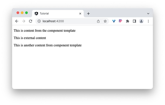
Step 3: Add <ng-content> tag in the template, i.e. content-projection-sample.component.html file as shown below −
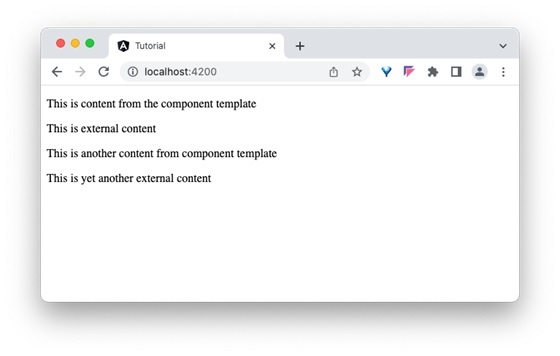
<p>This is content from the component template</p><ng-content></ng-content><p>This is another content from component template</p>
Step 4: Use the content-projection-sample component in the app.component.html file as shown below −
<app-content-projection-sample><p>This is external content</p></app-content-projection-sample><router-outlet></router-outlet>
Step 5: Now import the ContentProjectionSampleComponent inside the AppComponent.
Angular allows multiple content to be projected in the component as well and it is called multi-slot content projection.
Example
Let us see how to use multiple content projections by modifying the above example.
Step 1: Add another <ng-content> along with selector attribute in the component template, content-projection-sample.component.html as shown below −
<p>This is content from the component template</p><ng-content></ng-content><p>This is another content from component template</p><ng-content select="[second]"></ng-content>
Step 2: Update the app component template, app.component.html as shown below −
<app-content-projection-sample><p>This is external content</p><p second>This is yet another external content</p></app-content-projection-sample><router-outlet></router-outlet>
Here, the value of selector attribute (second) set in the component template is used in the content to be projected.
Step 3: Now, run the application and check the output.
Conditional content projection
Conditional content projection is projecting a content when certain condition is met. We can use ng-content to conditionally project the content. But it is not recommended since <ng-content> will be initialized even if the content is not going to be rendered. Instead, we can use <ng-template> to project the content safely since it will initialize the content only when it is going to be rendered.
Example
Let us create a working demo by updating our projectionSample application and learning the conditional projection in more detail.
Step 1: Create a directive, greet-content using angular CLI as shown below −
ng g directive directives/greet-content
CREATE src/app/directives/greet-content.directive.spec.ts(257 bytes)CREATE src/app/directives/greet-content.directive.ts(184 bytes)
Step 2: Update the directive and get the template reference as shown below −
show is the variable, which holds the deciding condition
@ContentChild is the decorator, which will be used to get the directive instance
Step 4: In the component’s template, use ngIf for checking the condition, ng-container and ngTemplateOutlet to display the template (greet.template) in the components template as shown below −
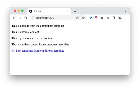
<p>This is content from the component template</p><ng-content></ng-content><p>This is another content from component template</p><ng-content select="[second]"></ng-content><div *ngIf="show"><ng-container [ngTemplateOutlet]="greet.template"></ng-container></div>
Step 5: Finally, use the component and its conditional projection in the app component as shown below −
<app-content-projection-sample><p>This is external content</p><ng-container ngProjectAs="second"><p>This is yet another external content</p></ng-container><ng-template appGreetContent>
Step 7: Run the application and check the output to find whether content is rendered through conditional projection concept or not:
Step 8: Update the condition, show in the component to false and check the output to find that the ng-template content is not rendered.
exportclassContentProjectionSampleComponent{
   show =false;
   @ContentChild(GreetContentDirective) greet!: GreetContentDirective;}
Special Case: ngProjectAs Attribute
ngProjectAs is a special attribute used to project content in complex scenarios. One example is using ng-container to layout the template. As we know, ng-container does not render itself and out-render its child content, we need to use ngProjectAs attribute to project its content.
Let us change the above example to use ng-container and ngProjectAs attribute. Update the app component template, app.component.html as shown below −
<app-content-projection-sample><p>This is external content</p><ng-container ngProjectAs="second"><p>This is yet another external content</p></ng-container></app-content-projection-sample><router-outlet></router-outlet>
Here, the value of selector attribute (second) set in the component template is used in the ng-container.
When you work with a large Angular application, placing all features in a single Component is not a good idea. As the application grows, maintaining it can become quite challenging. Therefore, we need to split it into multiple components. It may require creating components inside others to form a hierarchical structure.
In Angular, it is possible to nest components inside each other. The outside container is known as the parent container, and the inner one is known as the child container.
How to Create Nested Components in Angular?
Nested components are normal Angular Components with parent-child relations. The parent can access and share data with the child, either partially or fully. Creating nested components follows the same process as creating regular components.
Example
Let’s look at an example of how to create nested components in an Angular application. Following are the steps −
Step 1: Create an application named nestedApplication.
ng newnestedApplication
Step 2: Use the cd command to navigate inside the project folder. Then, create a component called parent using the following command −
ng g c parent
Step 3: To create child component, use the command given below −
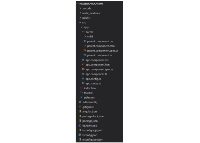
ng g c parent/child
Here, child will be created inside the parent component. And, your project structure will look like this −
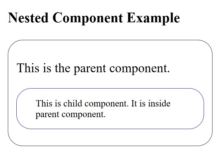
Step 4: Next, make changes in the child.component.html file:
<p>This is child component. It is inside parent component.</p>
Step 5: Add the below code snippet to the parent.component.html file:
<p>This is child component. It is inside parent component.</p>
Step 6: Now, call the ParentComponent inside the app.component.html file:
Styling is the process of designing and formatting the visual presentation of web pages. Since Angular applications are composed of multiple components, styles are applied to them individually. Angular components can be styled using CSS as well as popular pre-processors such as Sass and Less.
Let’s see different techniques of applying styles to the Angular components and different ways to allow safe and efficient customization of styles by the component users in this chapter.
How to Add Styles to Angular Components?
You can use the following ways for styling Angular components −
Using “styles”
Using “styleUrls”
Styling through template
Using global styles
Using CSS preprocessor
Customized styles
Using custom selectors
Using “styles”
The simplest and fastest way to style a component is by usingstyles. It is a property of the@Componentdecorator. It accepts an array of CSS styles and applies it to the component view. The pseudo-code of using styles in a component is as follows:
@Component({// selector and template code

   styles:['p { font-style: italic; }', 'em { font-style: italic;
   font-weight: bold }']// other properties / meta data})exportclassMyComponent{// ...}
The style applied using styles will affect the component view generated through component template only and is not inherited by the view of the nested components in the component template as well as any content projected in the component view.
Using “styleUrls”
The styleUrls is also a property of the @Component decorator and is similar to styles property. It accepts an array of CSS style file paths instead of the style itself and applies it to the component view. The pseudo-code of using styleUrls in a component is as follows:
@Component({// selector and template code

   styleUrls:['my-component.component.css','my-component-another.component.css']// other properties / meta data})exportclassMyComponent{// ...}
The style applied using styleUrls will affect the component view generated through the component template only and is not inherited by the view of the nested components in the component template as well as any content projected in the component view.
Styling Through Template
Styling through template is old school method of using CSS styles in the HTML itself through template property of @Component decorator. We can style a component using template in two ways, which are:
Applying styles using HTML style tag
Linking CSS files through link tag
Styling through template does not restrict the styles to the component view only and applies to the entire HTML generated from the component including nested components and projections.
Applying Style Using “style” Tag
In HTML, style tag is used to define internal CSS styles for a web page. This tag allows you to embed CSS rules directly within the HTML document. The use of this tag in the Angular template is similar to how we use it in HTML. The pseudo-code to apply styles using style tag is as follows:
`,// other properties / meta data})exportclassMyComponent{// ...}
Applying Style Using “link” Tag
The most common use of link tags in HTML documents is to attach external stylesheets. The pseudo code to apply styles to an Angular component using link tag is as follows:
`,// other properties / meta data})exportclassMyComponent{// ...}
The CSS file path should be relative to the component file. Otherwise, the CSS path in the generated HTML may be pointing to an incorrect or non-existing file.
@import can be used in CSS files to load more CSS files and the import file should be relative to the host CSS file.
@import'./another-css.css'
Using Global Styles
Global styles will be configured during the application creation itself. Angular CLI will set src/styles.css file as a global stylesheet. We can use it to set styles targeting anything in the application. We can use the global setting to set one or more style sheets as required. The below snippet shows the initial angular configuration created during application creation through angular CLI.
Angular allow not only the plain CSS to style the component. It allows the popular CSS preprocessors such as Sass and Less. Using Sass and Less is as simple as including the Sass and Less files instead of CSS files.
Component styleUrls can be used to include Sass and Less as specified below.
@Component({// selector and template code

   styleUrls:['my-component.component.scss']// other properties / meta data})exportclassMyComponent{// ...}
CSS preprocessor can be configured at project level or component level through angular settings. Angular CLI command “ng new” will ask the preprocessor to set during initial project creation.
$ ng newmyapp? Would you like to add Angular routing? No
? Which stylesheet format would you like to use?(Use arrow keys)CSSSCSS[ https://sass-lang.com/documentation/syntax#scss                ]
  Sass   [ https://sass-lang.com/documentation/syntax#the-indented-syntax ]
  Less   [ http://lesscss.org
Angular CLI will configure the project with proper CSS preprocessor.
Customize Styles of Angular Component
Generally, every angular component will have a default style associated with it. As components can be used in various scenarios, there is a necessity to customize the style of the component to match a given scenario. A good component should have a clear approach to changing the style to suit the environment where the component is used. Angular provides four ways to customize the style of a component.
CSS custom properties
Global CSS along with @mixins
Using pseudo selectors of shadow DOM
Using component properties / API
CSS Custom Properties
CSS provides CSS variables to hold styles. Once the CSS variables are defined, they can be used in any CSS properties and allow certain styles to be changed across the application by changing the value of the CSS variable.
Let us see how to define and use CSS variables. CSS variables can be created using :root pseudo selector as shown below −
:root{--myColor: red;}
Here, myColor variable is defined and its initial value is red. myColor variable can be used in other CSS properties as shown below −
p{color:var(--myColor, grey);}
Here, color will be set with the value of myColor (red in this case). If myColor does not have any value or undefined, then grey will be set as color.
The same concept can be applied in a component by using component property and CSS Variable as shown below.
Declare a property for the CSS variable, myColorVar in the component as shown below −
Use CSS variable, myColor and Component property, myColorVar in the style (template) as shown below −
<p [style.--myColor]="myColorVar">Hello</p>
Now, the component can be customized by changing the CSS variable in the :root pseudo selector as shown below −
:root{--myColor: green;}
Global CSS with @mixins
CSS preprocessor provides a great option to mix different style as and when needed in the CSS using mixin concept. Mixin is simply grouping of one or more CSS styles with a name and using it afterwards wherever necessary using the defined name. Let us define two mixin, one for color and another for font style:
Finally, the user can customize the color and font style in the global style without interfering with the component.
Pseudo Selector of Shadow DOM
Components using shadow DOM can be set with part attributes to allow the users to customize the style using ::part pseudo selector in the CSS styles as shown below −
Here, component will use the properties to get the color information from the user and set it in the template.
Using Custom Selectors
Angular provides two custom selectors similar to the shadow DOM concept.
:host
:host-context
:host selector is used to style the host element of the component. It comes in two forms. First one is a simple form as shown below −
Here, :host selector applies to the host element and all its descendant elements.
The second one is the function form, which will target the host element only if the host element has the included selector (as arguments) as shown below −
:host(.active){font-weight: bold;}
Here, :host(.active) targets the host element only if it has an active class.
Finally, :host-context selector is similar to host function form :host() except it checks whether any of the ancestor of the host element has the specified selector (in the argument).
:host(.active){font-weight: bold;}
Here, the style applies to the host only when any of the ancestors of the host element has .active class assigned to it.
Angular provides options to share data from parent component to child component as well as, child to parent component. Also, it is possible to share data between any other component within the Angular application. Component is a TypeScript class decorated with the @Component decorator. It is used to create the user interface.
Data sharing is the practice of making important information accessible to different parts of an application. It is done by transferring data from one component to another, allowing access to data during operations, or synchronizing data between different parts of an application.
Interaction between components is one of the important and necessary features in the context of component based architecture. Angular provides multiple options to pass and receive data between components. Let us see how to share data between components in this tutorial.
How Components Interact in Angular?
In Angular, parent and child components shares data or interacts to each other through the following ways −
The parent component can pass the data to the child component through the @Input()decorator. The child component receives data during its entire life cycle from initialization to destruction. Angular is designed in such a way that the child component automatically intercepts the data changes from the parent component and does the necessary update. Angular also provides hooks to intercept the data changes and write custom processing.
Overall, we have three ways for the child component to intercept data from parent component −
Auto interception
Setter interception
ngOnChanges hook
Auto Interception
Auto interception simplifies receiving the data from parent component. Angular provides a decorator @Input to receive data from parent component. It receives the data whenever the parent component updates the data Configuring Input decorator is very simple. Just append the input decorator to a property in the child component and then pass the data from parent component through child component attributes in the template.
Example
Let us create a child component and then try to pass the data from parent to child and render it in the child component.
Step 1: Create a new child component, InOutChildSample using angular CLI as shown below −
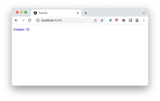
Step 6: Finally, run the application and check that the counter shows whether the value passed from the parent component or not −
Setter Interception
The setter based interception is just an extension of the previous technique. It basically uses a getter and setter for the property used in @Input decorator.
Example
Let us change our counter example, in-out-child-sample.component.ts to intercept the counter using setter and reset the counter to 1, if the counter value exceeds 25.
import{ Component, Input }from'@angular/core';

@Component({
  selector:'app-in-out-child-sample',
  standalone:true,
  imports:[InOutChildSampleComponent],
  templateUrl:'./in-out-child-sample.component.html',
  styleUrl:'./in-out-child-sample.component.css'})exportclassInOutChildSampleComponent{
  @Input()getcounter(): number {returnthis._counter;}setcounter(val: number){this._counter = val ||0;if(val >25)this._counter = val %25;}private _counter: number =1;}
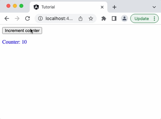
Add a function to increment the counter value in the parent component as shown below −
inc(){this.counter++}
Add a button in the parent components template and bind the function as shown below −
Run the application, and you can see that the counter will reset to 1 once it reaches 25.
The ngOnChanges Hook Interception
As we learned in the life cycle of a component and its hook methods, ngOnChanges is a hook method, which will run whenever angular detects changes in its input.
ngOnChanges hook accepts an object of type SimpleChanges. SimpleChanges is a dictionary having all properties with changes. We can go through all the properties and find the latest value of the property. The pseudo-code to go through all changed properties is as follows −
const currentVal = prop.currentValue
cont isFirstChange = pop.isFirstChange()if(prop.isFirstChange()){
console.log("The current value is ${prop.currentValue}")}else{
console.log(`${key} changed from ${prop.previousValue} to
${prop.currentValue}`);}}}</pre>
Using @Output Decorator
Child component can send the data to parent component through the @Output decorator. Use of this decorator is quite simple and similar to @Input decorator except that the output is actually an event emitter passing the data (output) along with event. The parent component can be subscribed for the event in the child component and get the emitted value from the child component whenever the data is changed in the child component.
Example
Let us write an @output decorator in our child component, InOutChildSample component and try to get the output from the parent component.
Step 1: Create an output event emitter in the child component, in-out-child-sample.component.ts along with a method to pass the value of the counter by emitting the event along with counter data in the child component, in-out-child-sample.component.ts.
Step 2: Open the child component template, in-out-child-sample.component.html and add a button to invoke the counter event when the user clicks the button.
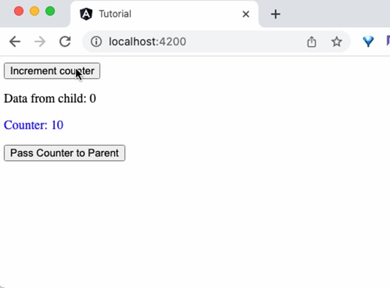
<div><p>Counter:{{counter}}</p><button(click)="passCounterToParent()">Pass Counter to Parent</button></div>
Here,
click is the button click event and it is configured to run passCounterToParent() function when it is clicked.
Step 3: Add a variable in the parent component to hold the output data passed through event from child component. Also, add a function in the parent component to get the output data passed through event from child component.
Step 4: Open the parent component template, app.component.html and add the code as shown below −
<button(click)="inc()">Increment counter</button><p>Data from child:{{childCounter}}</p><app-in-out-child-sample [counter]="counter"(counterEvent)="get($event)"/>
Here,
counterEvent is the event from the child component
get($event) is the callback function. $event will hold the current counter value.
childContent is the data from the child component.
Step 5: Finally, run the application and you can see that the child component will send the updated counter value to the parent component when the button in the child component is clicked.
Using Local Variable
Parent components can get complete access to the child component throughlocal variable. However, parent component gets access to the child component in its template only.
Example
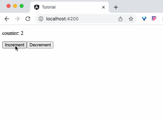
Let us create two component, ParentCounterComponent and ChildCounterComponent to understand the concept. The purpose of the ParentCounterComponent is to provide counter functionality through two button, increment and decrement button. The increment button will increment the counter and the decrement button will decrement the counter. Parent component will get the increment and decrement functionality from child component instead of implementing itself.
Step 1: Create child component, ChildCounterComponent using angular CLI as shown below −
Step 2: Declare a variable counter and two methods inc() and dec() to increment and decrement the counter respectively inside the child component −
import{ Component }from'@angular/core';

@Component({
  selector:'app-child-counter',
  standalone:true,
  imports:[],
  templateUrl:'./child-counter.component.html',
  styleUrl:'./child-counter.component.css'})exportclassChildCounterComponent{
  counter: number =0// increment and decrement counter  inc(){this.counter++}dec(){this.counter--}}
Step 3: Next, open parent component's template file, app.component.html and add child component along with an id, #child to access the child component.
<app-child-counter #child></app-child-counter>
Step 4: Next, add two buttons and bind click events with child component's inc() and dec() methods accessed through child identifier. Also, show the current value of counter using child identifier.
Step 6: Finally, run the application and check whether the counter is working fine.
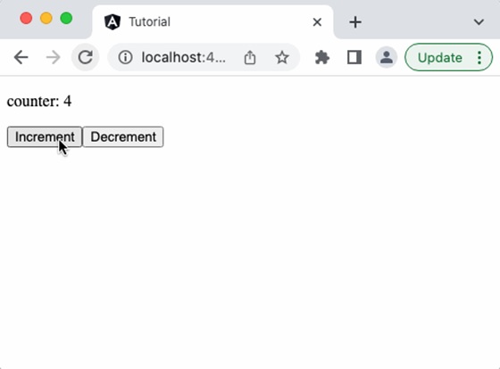
Using @Viewchild Decorator
Like the local variable, the @ViewChild decorator is also used to get complete access to the child component. However, along with template, the parent component will get access to the child component in its class environment as well. This makes a huge difference as the parent component can use the child component functionality in its methods as well.
Example
To understand the @Viewchild decorator, let's change the parent component, i.e. AppComponent. Now, we will use @ViewChild concept instead of local variable. We don't need to make any changes in the child component.
Step 1: Import necessary classes from @angular/core module:
Here, we have created a counter method in ngAterViewInit life cycle hook. The child component will be available only after this life cycle. So, we have created a dummy counter method (which needs to access child component's counter value ) during component initialization and the update the counter method in the hook method.
Step 6: The complete code of the AppComponent is as follows −
Here, we have not included the identifier and used only the parent components functionality instead of child component (which we have done in previous example, local variable concept). The parent component will get the required functionality from child variable, which it got through @ViewChild decorator.
Step 8: Finally, run the application and check that the counter shows that the value passed from parent component as shown below −
Using a Common Service
Service is an integral part of the angular framework. We can create a service to implement specific functionality and then use it in any component. The best use cases of services are as follows:
API calls
Utility functions
Sharing data between components
Example
Let us learn how to use services to share data between components in this section. We will learn the step by step process to share data through a service in this example.
Step 1: Create a service, MyCounterService using angular CLI as shown below −
ng g service services/MyCounter
CREATE src/app/services/my-counter.service.spec.ts(389 bytes)CREATE src/app/services/my-counter.service.ts(147 bytes)
It is better to put all the services inside a single folder. Therefore, we are creating MyCounter inside service folder using the above command.
Step 2: Create a component, MyCounterServiceComponent using angular CLI as shown below −
Step 10: Next, open the component's template, my-counter-service.component.html and write template markup to show the current counter value and then add two more buttons to increment and decrement the counter value. Bind inc() and dec() methods to increment and decrement button's click event respectively.
Step14: Run the application and see that incrementing one component will reflect in the other component as well. It happens as it is based on the same service.
View encapsulation is a technique to encapsulate the style of the given view from other sections of the application. By default, the CSS style applied in an HTML document will affect the entire document. The same applies to the Angular framework as well. This default behaviour is going to be an advantage in some scenarios like global styles but at the same time, it may affect specific parts of the application unintentionally (like a special button/link with specific styles).
To make sure that the style of the specific part of the application does not get affected, the view encapsulation concept provided by Angular can be used.
View Encapsulation Modes in Angular
Angular provides a property named view encapsulation in the Component decoration to direct the scope of component style. There are three modes of encapsulation, which are as follows −
None (ViewEncapsulation.None)
Emulated (ViewEncapsulation.Emulated)
ShadowDom (ViewEncapsulation.ShadowDom)
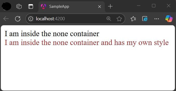
ViewEncapsulation.None
The mode None will not do anything to safeguard the style of an element inside the component. Component view will be exposed to all the global styles and get affected by it.
Example
Let us create a simple component to check how ViewEncapsulation.None mode works.
Step 1: Create a new Angular application with the name sample-app using the below command −
ng newsample-app
Step 2: Navigate to the project folder using cd command. Create a new component and name it view-encapsulation-sample.
Step 4: Change the template, view-encapsulation-sample.component.html and add two containers as shown below −
<div>I am inside the none container</div><div class="mystyle">I am inside the none container and has my own style</div>
Here, the first container does not have any styles or class and it is more prone to get affected by the global styles. The second container has class attributes and yet has a chance to get affected by global styles.
Step 5: Apply the style in the component css file, view-encapsulation-sample.component.css as shown below −
div.mystyle { color: brown }
Step 6: Add the component in the app component, app.component.html as shown below −
Step 7: On running the application, you can clearly see that the generated style and element are plain and no safeguard is applied and the application will look as shown below −
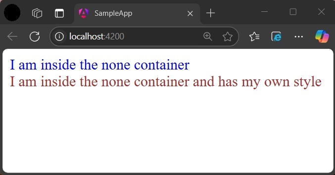
Step 8: Add a style in the global css assets, styles.css targeting div tag and re-run the application.
div { color: blue }
Now, the color of the first container changed to blue as shown below −
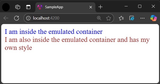
ViewEncapsulation.Emulated
Emulated mode will change the styles in such a way that it only applies to the element inside the component only. However, global styles may still affect elements inside a component.
Example
Let us change our application and apply the Emulated option as shown below −
Now, re-run the application and check the result −
ViewEncapsulation.ShadowDom
ShadowDom mode will apply the HTML native shadow dom concept to scope the style of the component. The element of the component will not be affected by the global styles in any situation as it completely hide using shadowDOM concept.
Example
Change our application and apply the ShadowDOM mode as shown below −
Now, both containers are safeguarded by native shadowDOM concept and are not affected by the global styles.
Applying different encapsulation in an application
View encapsulation of a component can be different from other components used in the application as view encapsulation is applied per component basis. Even the nested component can have different view encapsulation options as per component requirements. Angular will apply the encapsulation as directed even in very complex nested component trees as well.
Angular component goes through a series of stages/events during its existence. Before moving further in the journey of learning Angular, it is necessary to understand how a component interacts with the framework and the DOM throughout its existence.
When an angular component is constructed, it first goes through the change detection phase, where it checks whether there are any changes in the input and then acts accordingly. Then, the initialization phase kicks on and continues to other phases and finally gets destroyed in the destruction phase.
Component Lifecycle Phases in Angular
The different stages of the Angular Components Lifecycle are as follows −
Creation: It is the first phase where a component is instantiated.
Change Detection: Then, Angular try to detect changes in the View and Content of the application.
Rendering: After change detection, the new template is updated.
Destruction: The Component is destroyed at the end.
Component Lifecycle Hook in Angular
Each phase of the angular component is associated with a lifecycle hook interface which can be implemented to perform arbitrary action in that particular phase. Generally, the lifecycle hooks refer to the methods of lifecycle hook interfaces. Let’s see the phases, their sequence and the corresponding hooks.
Phases
Lifecycle Hooks
Description
Creation
Constructor
Constructor runs when Angular instantiates the component for the first time.
Change Detection
ngOnChanges()
Change detection is the first phase, where the angular component will check the inputs for changes and act accordingly. It has a corresponding lifecycle hook, ngOnChanges(). This hook runs before the ngOnInit() during the first initialization process.
ngOnInit()
The ngOnInit() lifecycle hook runs exactly once after ngOnChanges(). It is raised to do the necessary initialization process based on the initial input.
ngDoCheck()
Next, Angular tries to detect the changes in the component and act accordingly. The lifecycle hook used for checking is ngDoCheck(). This hook is invoked even if there is not change in the input bound properties. Avoid defining this hook as it might affect the page’s performance.
ngAfterContentInit()
This lifecycle hook is called only once after the initialization of all children nested inside the content of component.
ngAfterContentchecked()
It is invoked during every change detection phase after the children nested inside the component’s content have been checked for changes.
ngAfterViewInit()
Next is the view initialization phase, where angular sets the various child views of the component template. The lifecycle hook used for view initialization phase is ngAfterViewInit().
ngAfterViewchecked()
Now, Angular tries to detect the changes in the view of the component/directive. The lifecycle hook for view checking phase is ngAfterViewchecked().
Rendering
afterNextRender()
It runs only once when all components have been rendered to the DOM.
afterRender()
Runs every time after all components have been rendered to the DOM.
Destruction
ngOnDestroy()
In the final phase, ngOnDestroy() hook is called to destroy the component/directive.
Execution Order of Component Lifecyle Hooks
Let us see the lifecycle sequence of an arbitrary component/directive through its hooks.
ngOnChanges
ngOnInit
ngDoCheck
ngAfterContentInit
ngAfterContentChecked
ngAfterViewInit
ngAfterViewChecked
ngOnChanges
ngDocheck
ngAfterContentChecked
ngAfterViewchecked
Repeation of Step 8 – 11 until destruction
ngOnDestroy
Example
Let us create a new component, MyLifecycleComponent, wire up all hooks and check the sequence of the lifecylce using console output.
Step 1: Create a new component using angular CLI as shown below −
ng generate component my-lifecycle-sample
This will create a new component and its related template and styles as shown below.
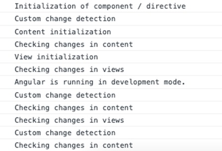
Run the application using ng serve and test the console through developer tool in the browser. It will show all the lifecycle events executing in the above discussed order.
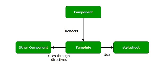
Components are the building blocks of an Angular application. The primary use of Angular Component is to generate a section of web page called View. By combining different views, a single application is created. Every component will have an associated template and it will be called in order to generate views.
Let us learn the basic concept of components in this tutorial.
Structure of Angular Component
Each component of an Angular application has a few important parts which are as follows −
@component Decorator: All the application related configurations are written inside this decorator.
HTML Template: View of the Angular application.
Styles: It controls the styles of a view.
TypeScript Class: Code related to behavior of the Angular application goes into this class.
By default, all these parts are created by Angular CLI, you can update, add or even delete them if any of them is not required.
How to Create Components in Angular?
In Angular, a new Component is created using the ng generate component command as specified below −
ng generate component name-of-component
Example
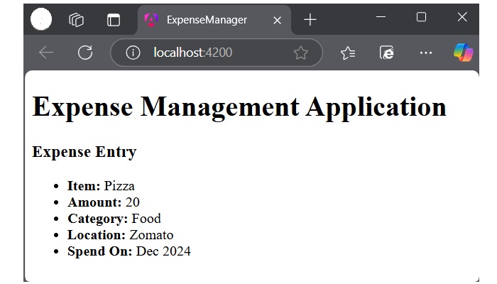
Let’s see an example where we create a new component in our ExpenseManager application. This component will contain our first expense entry. First, open the command prompt and navigate to ExpenseManager application.
cd expense-manager
Now, use the command given below to create a expense-entry component −
ng generate component expense-manager
Following files and folders will be created by Angular CLI on the above command −
Angular component goes through a series of stages/events during its existence. The different stages of the Angular Components Lifecycle are creation, change detection, rendering and destruction.
Each phase of the angular component is associated with a lifecycle hook interface which can be implemented to perform arbitrary action in that particular phase. The lifecycle hooks refer to the methods of lifecycle hook interfaces.
Component Interaction
Component interaction is one of the important and necessary features in the context of component based architecture. Angular provides multiple options to pass and receive data between components.
You can share data from parent component to child component as well as, child to parent component. Also, it is possible to share data between any other component within the Angular application.
In Angular, parent and child components interacts through the following ways −
@Input decorator
@Output decorator
local variable
@Viewchild decorator
Services
Component Styling
Component styling is the process of designing and formatting the visual presentation of views or components. You can use the following ways for styling:
Using “styles”
Using “styleUrls”
Styling through template
Using global styles
Using CSS preprocessor
Customized styles
Using custom selectors
Nested Components
Nested components are normal Angular Components with parent-child relations. The parent can access and share data with the child, either partially or fully. The component nested inside another component is called child component. The component containing the child component is called the parent component.
Dynamic Components
Angular allows the component to be dynamically created and loaded at run time at a specific location in the host (another) component.