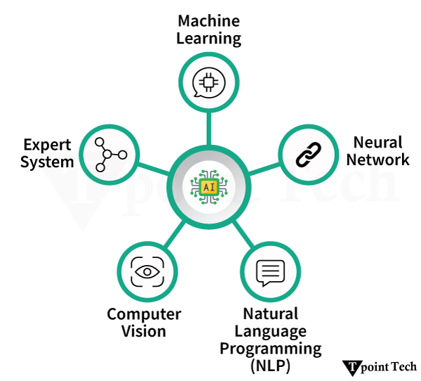
The term “Artificial Intelligence” refers to the simulation of human intelligence processes by machines, especially computer systems. It also includes Expert systems, voice recognition, machine vision, and natural language processing (NLP).
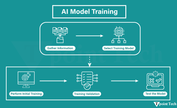
AI programming focuses on three cognitive aspects such as learning, reasoning, and self-correction.
- Learning Processes
- Reasoning Processes
- Self-correction Processes
Learning Processes
This part of AI programming is concerned with gathering data and creating rules for transforming it into useful information. The rules, which are also called algorithms, offer computing devices with step-by-step instructions for accomplishing a particular job.
Reasoning Processes
This part of AI programming is concerned with selecting the best algorithm to achieve the desired result.
Self-Correction Processes
This part of AI programming aims to fine-tune algorithms regularly in order to ensure that they offer the most reliable results possible.
Artificial Intelligence is an extensive field of computer science that focuses on developing intelligent machines capable of doing activities that would normally require human intelligence. While AI is a multidisciplinary science with numerous methodologies, advances in deep learning and machine learning create a paradigm shift in almost every aspect of technology.
Examples of AI
The following are examples of AI-Artificial Intelligence:
- Google Maps and Ride-Hailing Applications
- Face Detection and Recognition
- Text Editors and Autocorrect
- Chatbots
- E-Payments
- Search and Recommendation Algorithms
- Digital Assistant
- Social Media
- Healthcare
- Gaming
- Online Ads-Network
- Banking and Finance
- Smart Home devices
- Security and Surveillance
- Smart Keyboard App
- Smart Speaker
- E-Commerce
- Smart Email Apps
- Music and Media Streaming Service
- Space Exploration
Let’s discuss the above examples in detail.
1. Google Maps and Ride-Hailing Applications
Traveling to a new destination does not require much thought any longer. Rather than relying on confusing address directions, we can now easily open our phone’s map app and type in our destination.
So how does the app know about the appropriate directions, the best way, and even the presence of roadblocks and traffic jams? A few years ago, only GPS (satellite-based navigation) was used as a navigation guide. However, artificial intelligence (AI) now provides users with a much better experience in their unique surroundings.
The app algorithm uses machine learning to recall the building’s edges that are supplied into the system after the person has manually acknowledged them. This enables the map to provide simple visuals of buildings. Another feature is identifying and understanding handwritten house numbers, which assists travelers in finding the exact house they need. Their outline or handwritten label can also recognize locations that lack formal street signs.
The application has been trained to recognize and understand traffic. As a result, it suggests the best way to avoid traffic congestion and bottlenecks. The AI-based algorithm also informs users about the precise distance and time it will take them to arrive at their destination. It has been trained to calculate this based on traffic situations. Several ride-hailing applications have emerged as a result of the use of similar AI technology. So, whenever you need to book a cab via an app by putting your location on a map, this is how it works.
2. Face Detection and Recognition
Utilizing face ID to unlock our phones and using virtual filters on our faces while taking pictures are two uses of AI that are presently essential for our day-by-day lives.
Face recognition is used in the former, which means that every human face can be recognized. Face recognition is used in the above, which recognizes a particular face.
Intelligent machines often match-and some cases, even exceed human performance. Human babies begin to identify facial features such as eyes, lips, nose, and face shapes. A face, though, is more than just that. A number of characteristics distinguish human faces.
Smart machines are trained in order to recognize facial coordinates (x, y, w, and h, which form a square around the face as an area of interest), landmarks (nose, eyes, etc.), and alignment (geometric structures). This improves the human ability to identify faces by several factors. Face recognition is also used by government facilities or at the airport for monitoring and security.
3. Text Editors or Autocorrect
When typing a document, there are inbuilt or downloadable auto-correcting tools for editors of spelling errors, readability, mistakes, and plagiarism based on their difficulty level.
It should have taken a long time for us to master our language and become fluent in it. Artificially intelligent algorithms often use deep learning, machine learning, and natural language in order to detect inappropriate language use and recommend improvements. Linguists and computer scientists collaborate in teaching machines grammar in the same way that we learned it in school.
Machines are fed large volumes of high-quality data that have been structured in a way that machines can understand. Thus, when we misspell a single comma, the editor will highlight it in red and offer suggestions.
4. Chatbots
Answering a customer’s inquiries can take a long time. The use of algorithms to train machines to meet customer needs through chatbots is an artificially intelligent solution to this problem. This allows machines to answer as well as take and track orders.
We used Natural Language Processing (NLP) to train chatbots to impersonate customer service agents’ conversational approaches. Advanced chatbots do not require complex input formats (such as yes/o questions). They are capable of responding to complex questions that necessitate comprehensive answers.
They will appear to be a customer representative, in fact, another example of artificial intelligence (AI). If you give a negative rating to a response, the bot will figure out what went wrong and fix it the next time, ensuring that you get the best possible service.
5. Online-Payments
It can be a time-consuming errand to rush to the bank for any transaction. Good news! Artificial Intelligence is now being used by banks to support customers by simplifying the process of payment.
Artificial intelligence has enabled you to deposit checks from the convenience of your own home. Since AI is capable of deciphering handwriting and making online cheque processing practicable, artificial intelligence can potentially be utilized to detect fraud by observing consumers’ credit card spending patterns.
For example, the algorithms are aware of what items User X purchases, when and where they are purchased, and in what price range they are purchased. If there is some suspicious behavior that does not match the user’s profile, then the system immediately signals user X.
6. Search and Recommendation Algorithms
When we wish to listen to our favorite songs, watch our favorite movie, or shop online, have we ever found that the things recommended to us perfectly match our interests? This is the beauty of artificial intelligence.
These intelligent recommendation systems analyze our online activity and preferences to provide us with similar content. Continuous training allows us to have a customized experience. The data is obtained from the front end, saved as big data, and analyzed using machine learning and deep learning.
Then, it can predict your preferences and make suggestions to keep you amused without having to look for something else. Artificial intelligence can also be utilized to improve the user experience of a search engine. Generally, the answer we are searching for is found in the top search results. What causes this?
Data is fed into a quality control algorithm to identify high-quality content from SEO-spammed, low-quality content. This aids in creating an ascending order of search results on the basis of the quality for the greatest user experience. Since search engines are made up of codes, natural language processing technology aids in understanding humans through these applications; in reality, they can predict what a person wants to ask by compiling top-ranked searches and guessing their questions when they begin to type.
Machines are constantly being updated with new features such as image search and voice search. If we need to find out a song that is playing at a mall, all we have to do is hold the phone up to it, and a music-identifying app will tell us what it is within a few seconds. The machine will also offer you song details after searching through an extensive collection of tunes.
7. Digital Assistants
When our hands are full, we often enlist the help of digital assistants to complete tasks on our behalf. We might ask the assistant to call our father while we are driving with a cup of tea in one hand. For instance, Siri would look at our contacts, recognize the word “father,” and dial the number.
Siri is an example of a lower-tier model that can only respond to voice commands and cannot deliver complex responses. The new digital assistant is fluent in human language and uses advanced NLP (Natural Language Processing) and ML (Machine Learning) techniques. They are capable of understanding complex command inputs and providing acceptable results.
They have adaptive abilities that can examine preferences, habits, and schedules. It enables them to use prompts, schedules, and reminders to help us systemize, coordinate, and plan things.
8. Social Media
The advent of social media gave the world a new narrative with immense freedom of speech. Although, it brought certain social ills like cyberbullying, cybercrime, and abuse of language. Several social media apps are using AI to help solve these issues while also providing users with other enjoyable features.
AI algorithms are much quicker than humans at detecting and removing hate speech-containing messages. It is made possible by their ability to recognize hostile terms, keywords, and symbols in a variety of languages. These have been entered into the system, which can also contribute neologisms to its dictionary. Deep learning’s neural network architecture is a vital part of the process.
Emojis have become the most common way to express a wide range of emotions. This digital language is also understood by AI technology because it can understand the meaning of a certain piece of text and guess the exact emoji.
Social networking, a perfect example of artificial intelligence, may even figure out what kind of content a user likes and recommends similar content. Facial recognition is also used in social media profiles, assisting users in tagging their friends via automatic suggestions. Smart filters can recognize spam and undesirable messages and automatically filter them out. Users may also take advantage of smart answers.
The social media sector could use artificial intelligence to detect mental health issues such as suicidal thoughts by analyzing the information published and consumed. This information can be shared with mental health professionals.
9. Healthcare
Infervision is using artificial intelligence and deep learning to save lives. In China, where there are insufficient radiologists to keep up with the demand for checking 1.4 billion CT scans each year for early symptoms of lung cancer. Radiologists are essential to review many scans every day, which isn’t just dreary, yet human weariness can prompt errors. Infervision trained and instructed algorithms to expand the work of radiologists in order to permit them to diagnose cancer more proficiently and correctly.
The inspiration and foundation for Google’s DeepMind is Neuroscience, which aims to create a machine that can replicate the thinking processes in our own brains. While DeepMind has effectively beaten people at games, what is truly captivating are the opportunities for medical care applications. For example, lessening the time it takes to plan treatments and utilizing machines to help diagnose ailments.
10. Gaming
Artificial Intelligence has been an important part of the gaming industry in recent years. In reality, one of AI’s most significant achievements is in the gaming industry.
One of the most important achievements in the field of AI is DeepMind’s AI-based AlphaGo software, which is famous for defeating Lee Sedol, the world champion in the game of GO. Shortly after the win, DeepMind released AlphaGo, which trounced its predecessor in an AI-AI face-off. The advanced machine, AlphaGo Zero, taught itself to master the game, unlike the original AlphaGo, which DeepMind learned over time using a vast amount of data and supervision.
Unlike the first AlphaGo, which DeepMind prepared over the long run by utilizing a lot of information and oversight, the high-level framework AlphaGo Zero instructed itself to dominate the game. Another example of Artificial Intelligence in gaming comprises the First Encounter Assault Recon, also known as F.E.A.R, which is the first-person shooter video game.
11. Online Ads Network
The online advertising industry is the most significant user of artificial intelligence that uses AI (Artificial Intelligence) to not only monitor user statistics but also to advertise on the basis of statistics. The online advertising industry will struggle if AI is not implemented, as users will be shown random advertisements that have no relation to their interests.
Since AI has been so good at determining our preferences and serving us ads, the worldwide digital ad industry has crossed 250 billion US dollars, with the business projected to cross the 300 billion mark in 2019. So, the next time, remember that AI is changing your life while you browse the internet and encounter adverts or product recommendations.
12. Banking and Finance
The banking and finance industry has a major impact on our daily lives, which means the world runs on liquidity, and banks are the gatekeepers who control the flow. Did you know that artificial intelligence is heavily used in the banking and finance industry for things such as customer service, investment, fraud protection, and so on? The automatic emails we get from banks if we make an ordinary transaction are a simple example.
That’s AI keeping an eye on our account and trying to alert us regarding any potential fraud. AI is now being trained to examine vast samples of fraud data in order to identify patterns so that we can be alerted before it happens to us. If we run into a snag and contact our bank’s customer service, we are probably speaking with an AI bot. Even the largest financial industry uses AI to analyze data in order to find the best ways to invest capital in order to maximize returns while minimizing risk.
Not only that, but AI is set to play an even larger role in the industry, with major banks around the world investing billions of dollars in AI technology, and we will be able to see the results sooner rather than later.
13. Smart Home Devices
Another popular example of AI (Artificial Intelligence) is smart home devices. Artificial intelligence is even being welcomed into our homes. Most of the smart home gadgets we purchase use artificial intelligence to learn our habits and automatically change settings to make our experience as seamless as possible.
We have effectively examined how we utilize savvy voice assistants to control these smart home gadgets. We probably are aware that it is a great example of AI’s impact on our lives. That is to say, there are smart thermostats that change the temperature depending on our preferences, smart lights that change the color and intensity of lights depending on time, and much more. This will not happen when our primary interaction with all our smart home devices is only through AI.
14. Security and Surveillance
Although we all can debate about the ethics of using a large surveillance system, there’s no denying that it’s being used, and AI is playing a significant role in it. It isn’t workable for people to keep monitoring many monitors simultaneously, and thus, utilizing AI makes sense. With technologies such as facial recognition and object recognition improving every day, it won’t be long before all the security cameras dealt with are checked by an AI and not a human. Right now, before AI can be completely implemented, this is going to be our future.
15. Smart Keyboard Apps
Smart keyboard apps are another example of AI (Artificial Intelligence). In all actuality, not every person loves managing on-screen keyboards. Although, they have become far more intuitive, permitting clients to type comfortably and quickly. What has likely ended up being a catalyst for them is the integration of AI. The smart keyboard applications keep a tab on the composing style of a client and predict words and emojis based on that. Consequently, typing on the touchscreen has gotten quicker and more advantageous. Not to mention that artificial intelligence is crucial in detecting misspellings and typos.
16. Smart Speakers
Not in vain; many think that smart speakers are good to go for a major blast into technology. Besides controlling smart home gadgets, they are likewise capable of various things like sending fast messages, setting updates, checking the climate, and getting the most recent news.
Also, it’s this flexibility that ends up being a conclusive factor for them. Driven by the hugely popular Amazon Echo series, the worldwide brilliant speaker market arrived at an exceptional high in 2019 with sales of 149.9 million units, which is a huge increment of 70% in 2018. Additionally, the sales in Q4 2019 also saw another record with an incredible 55.7 million units. Smart speakers are likely the most unmistakable instances of the utilization of AI in our reality.
17. E-Commerce
Artificial intelligence algorithms have given the necessary vital impulse to web-based businesses to give a more customized insight. According to many sources, its use has significantly improved sales and has also aided in developing long-term consumer relationships. Thus, organizations take advantage of AI to deploy chatbots to gather urgent information and predict purchases to make a client-centric experience.
On the way across this shift of technique? Simply invest some time on websites such as Amazon and eBay, and we will soon see how quickly the scene around you is improving rapidly!
18. Smart Email Apps
In the event that you actually find your inbox cluttered with an excessive number of undesirable messages, the possibility is quite high that we can yet stay with an old-fashioned email application.
Present-day email applications such as Spark make several AI to filter out spam messages and furthermore arrange messages so you can rapidly get to the significant ones. Likewise, it additionally provides smart answers dependent on the messages we get to help us answer any email rapidly. The “Smart Reply” highlight of Gmail is an extraordinary illustration of this. It utilizes AI to filter the content of the email and gives you context-oriented answers.
19. Music and Media Streaming Service
Another amazing illustration of how AI affects our lives is the music and media streaming features that we utilize reliably. Whether or not you are utilizing Spotify, Netflix, or YouTube, AI is making the decisions for you.
All things considered, everything, once in a while, is great, and some of the time is awful. For instance, I enjoy Spotify’s Discover Weekly playlist since it has acquainted me with a few new artists who I would not have known about if it weren’t for Spotify’s AI divine beings.
Then again, I additionally remember going down the YouTube rabbit hole, wasting uncountable hours simply watching the suggested videos. That suggested videos section has become so great at knowing my taste that it’s alarming. Thus, keep in mind that AI is at work whenever you are watching a suggested video on YouTube, viewing a suggested show on Netflix, listening to a pre-made playlist on Spotify, or using any other media and music streaming service.
20. Space Exploration
Space expeditions and discoveries consistently require investigating immense measures of information. Artificial Intelligence and Machine learning are the best approaches for dealing with and measuring information on this scale. After thorough astronomers and research utilized Artificial Intelligence to filter through long periods of information obtained by the Kepler telescope to distinguish an inaccessible eight-planet solar system.’
21. Cybersecurity
AI plays a very key role in transforming roles in modern cybersecurity. It helps in detecting the threat more consistently while being fast and more accurate. It also works as a response system that takes care of the attacks that happened and retaliates them.
AI does all these through machine learning and deep learning techniques that only learn from all the previous data and try to find the patterns that might help in identifying the malicious activity. For context, it can detect unauthorized data access and underlying anomalies in the network that might help track a cyber attack.
AI-powered solutions that imitate the human immune system are used by businesses such as Darktrace to automatically identify and eliminate threats in real time. In a similar vein, Microsoft’s Azure Sentinel and IBM’s QRadar use AI to evaluate enormous volumes of log data and identify security events with high precision, lowering the number of false positives.
22. Agriculture
Smart agriculture takes the help of AI to change conventional farming methods, and that makes it more cost-efficient and sustainable. Drones, Heat-sensor and CVs are used as a form or medium to collect data on the farming aspects. This data enables farmers to make informed decisions that can greatly increase crop yields and resource management. AI systems, for instance, are able to identify early indicators of illness or nutritional deficiencies in crops, enabling prompt treatments to stop losses.
The See & Spray platform from John Deere, which uses cutting-edge computer vision to differentiate between crops and weeds, is a useful example of this technology in action. It makes it possible to apply herbicides precisely where they are needed, which minimizes the impact on the environment, lowers expenses, and uses fewer chemicals. AI is assisting in the transformation of agriculture into a data-driven, sustainable sector that can satisfy the rising need for food on a worldwide scale with such advancements.
23. Weather Forecast
Based on current data and worldwide trends, artificial intelligence algorithms can assist numerous weather forecasting applications in making quick predictions about the weather. Compared to conventional techniques, these models save money and energy and can offer continuous updates and information changes.
In a number of tests, they have outperformed humans in accuracy, and their use is growing. GraphCast, a machine learning and artificial intelligence model financed by Alphabet and Google DeepMind, is a recent example of this. This model surpasses current industry standards on 90% of evaluated variables and can forecast hundreds of weather variables globally.
24. Autonomous Vehicle
Autonomous Vehicles, or self-driving cars, are a revolutionary use of AI in the field of transportation. Using a combination of AI algorithms, sensors, cameras, radar, and LIDAR, these cars analyze their environment, make driving decisions, and operate without human input. Just as a human driver would analyze data from their eyes and ears, AI uses data from the sensors in real-time to detect hazards in the environment, identify traffic signals, follow lanes, and adapt to changing road conditions, including other traffic and weather.
For example, autonomous vehicles can anticipate the behavior of pedestrians and other vehicles in order to make appropriate decisions for safe and efficient driving. A familiar real-world application is Tesla’s Autopilot system. Tesla has developed an AI-powered system that uses standard cruise control but also offers features like automatic lane-keeping, adaptive cruise control, and self-parking.
25. Evaluating Learning and Student Feedback
The education sector is being positively transformed, specifically regarding assessment, with greater efficiency and insight made possible through artificial intelligence (AI). The application of an AI algorithm can autonomously evaluate assessments, which minimizes grading time for teachers while keeping evaluation consistent.
In addition to scoring students’ assessments, AI can identify patterns in student responses to determine common areas of struggle. For example, if a [concerning] number of students get a question wrong, AI will notify the instructor to suggest that the related content may need to be retaught or clarified. The benefits of assessments, when combined with feedback based on data, strengthen a teacher’s ability to improve learning and address gaps.