We have studied the strategies which can reason either in forward or backward, but a mixture of the two directions is appropriate for solving a complex and large problem. Such a mixed strategy, make it possible that first to solve the major part of a problem and then go back and solve the small problems arise during combining the big parts of the problem. Such a technique is called Means-Ends Analysis.
Means-Ends Analysis is a problem-solving technique used in Artificial Intelligence for limiting search in AI programs. It is a mixture of Backward and forward search techniques. The MEA technique was first introduced in 1961 by Allen Newell and Herbert A. Simon was in their problem-solving computer program, which was named as General Problem Solver (GPS). The MEA analysis process centered on the evaluation of the difference between the current state and the goal state.
How means-ends analysis Works?
The means-ends analysis process can be applied recursively for a problem. It is a strategy to control search in problem-solving. Following are the main Steps which describes the working of MEA technique for solving a problem.
- First, evaluate the difference between the Initial State and the final State.
- Select the various operators that can be applied to each difference.
- Apply the operator at each difference, which reduces the difference between the current state and the goal state.
Operator Subgoaling
In the MEA process, we detect the differences between the current state and the goal state. Once these differences occur, we can apply an operator to reduce the differences. But sometimes it is possible that an operator cannot be applied to the current state. So we create the subproblem of the current state, in which operators can be applied, such type of backward chaining in which operators are selected, and then sub-goals are set up to establish the preconditions of the operator is called Operator Subgoaling.
Algorithm for Means-Ends Analysis:
Let’s we take Current state as CURRENT and Goal State as GOAL, then following are the steps for the MEA algorithm.
- Step 1: Compare CURRENT to GOAL, if there are no differences between both then return Success and Exit.
- Step 2: Else, select the most significant difference and reduce it by doing the following steps until the success or failure occurs.
- Select a new operator O which is applicable for the current difference, and if there is no such operator, then signal failure.
- Attempt to apply operator O to CURRENT. Make a description of two states.
i) O-Start, a state in which O?s preconditions are satisfied.
ii) O-Result, the state that would result if O were applied In O-start. - If
(First-Part <—— MEA (CURRENT, O-START)
And
(LAST-Part <—– MEA (O-Result, GOAL), are successful, then signal Success and return the result of combining FIRST-PART, O, and LAST-PART.
The above-discussed algorithm is more suitable for a simple problem and not adequate for solving complex problems.
Example of Mean-Ends Analysis:
Let’s take an example where we know the initial state and goal state as given below. In this problem, we need to get the goal state by finding differences between the initial state and goal state and applying operators.

Solution:
To solve the above problem, we will first find the differences between the initial states and goal states, and for each difference, we will generate a new state and apply the operators. The operators we have for this problem are:
- Move
- Delete
- Expand
1. Evaluating the initial state: In the first step, we will evaluate the initial state and will compare the initial and Goal state to find the differences between both states.

2. Applying Delete operator: As we can check the first difference is that in goal state there is no dot symbol which is present in the initial state, so, first we will apply the Delete operator to remove this dot.

3. Applying Move Operator: After applying the Delete operator, the new state occurs which we will again compare with goal state. After comparing these states, there is another difference that is the square is outside the circle, so, we will apply the Move Operator.
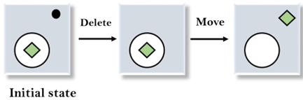
4. Applying Expand Operator: Now a new state is generated in the third step, and we will compare this state with the goal state. After comparing the states there is still one difference which is the size of the square, so, we will apply Expand operator, and finally, it will generate the goal state.

Uses of Means-Ends Analysis
Artificial intelligence (AI) systems commonly employ means-end analysis. Since the computational procedures involved in the analysis mimic some features of human cognition and problem-solving abilities, it is a crucial goal-based problem-solving technique in the development of AI systems that behave like humans. Using a combination of backward and forward search strategies, AI systems also employ means-ends analysis to limit searches within programs by assessing the difference between the problem’s current state and the desired state.
Implementation
We will now do the simulation of moving from a start number to a goal number by applying operations like add, subtract, or multiply, that will helps in understanding teh MEA.
Code:
- # Importing libraries
- import networkx as nx
- import matplotlib.pyplot as plt
- import time
- # basic graph function
- def createMyGraph():
- g = nx.Graph()
- # These are the places (nodes)
- placeNames = [‘Start’, ‘point_A’, ‘point_B’, ‘point_C’, ‘point_D’, ‘point_E’, ‘Goal’]
- for p in placeNames:
- g.add_node(p)
- # now putting the roads (edges) with distances
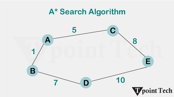
- g.add_weighted_edges_from([
- (‘Start’, ‘point_A’, 2),
- (‘Start’, ‘point_B’, 4),
- (‘point_A’, ‘point_C’, 2),
- (‘point_B’, ‘point_D’, 1),
- (‘point_C’, ‘point_E’, 3),
- (‘point_D’, ‘point_E’, 1),
- (‘point_E’, ‘Goal’, 2)
- ])
- return g
- # used to find how far a node is from the goal
- def distanceGuess(graphx, frm, to):
- try:
- dist = nx.shortest_path_length(graphx, frm, to, weight=’weight’)
- except:
- dist = float(‘inf’)
- return dist
- # The actual means-end logic goes here
- def meaSolver(grph, st, gl):
- cur = st
- trail = [cur]
- counter = 0
- print(“=== STARTING MEA ===\n”)
- while cur != gl:
- neigh = list(grph.neighbors(cur))
- best = None
- bestH = float(‘inf’)
- for x in neigh:
- guess = distanceGuess(grph, x, gl)
- if guess < bestH:
- best = x
- bestH = guess
- if best is None:
- print(“No more moves :(“)
- return trail
- print(f”Move {counter+1}: {cur} –> {best} (h={bestH})”)
- cur = best
- trail.append(cur)
- showGraph(grph, trail, cur, gl, counter)
- time.sleep(1)
- counter += 1
- print(“\nReached the goal “)
- return trail
- # This draws the graph at each step
- def showGraph(g, visited, now, goal, stepN):
- pos = nx.spring_layout(g, seed=1)
- plt.figure(figsize=(8,6))
- nx.draw(g, pos, with_labels=True, node_size=700, node_color=’lightblue’, edge_color=’grey’)
- nx.draw_networkx_nodes(g, pos, nodelist=[now], node_color=’orange’, node_size=800)
- nx.draw_networkx_nodes(g, pos, nodelist=[goal], node_color=’green’, node_size=800)
- # show path so far
- path_edges = list(zip(visited[:-1], visited[1:]))
- nx.draw_networkx_edges(g, pos, edgelist=path_edges, edge_color=’blue’, width=2)
- labels = nx.get_edge_attributes(g, ‘weight’)
- nx.draw_networkx_edge_labels(g, pos, edge_labels=labels)
- plt.title(f”Step {stepN+1}: at {now}”)
- plt.axis(‘off’)
- plt.pause(1)
- plt.close()
- # running it
- myG = createMyGraph()
- res = meaSolver(myG, ‘Start’, ‘Goal’)
- print(“\nFinal Path:”)
- for i, pt in enumerate(res):
- print(f”{i+1}: {pt}”)
- <textarea>
Output:
Move 1: Start -> point_B (h=4)

Move 2: point_B -> point_D (h=3)

Move 3: point_D -> point_E (h=2)

Move 4: point_E -> Goal (h=0)

Reached the goal
Final Path:
1: Start
2: point_B
3: point_D
4: point_E
5: Goal
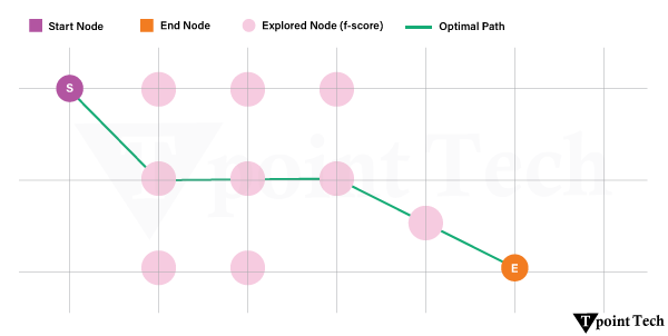
Starting with the node marked “Start,” the algorithm analyzes every nearby node at each step and picks the one that seems nearest to the target depending on the estimated shortest path (heuristic). In the given instance, the path taken was Start-> point_A->point_C-> point_E-> Goal. This indicates that the agent consistently picked the direction with the least expected remaining cost, hence methodically closing the gap to the target. The graph allows easy observation of the decision-making process as the process is visibly traced with each movement emphasized.