As in the previous topic, we have learned about the wumpus world and how a knowledge-based agent evolves the world. Now, in this topic, we will create a knowledge base for the Wumpus world and will derive some proof for the Wumpus world using propositional logic.
The agent starts visiting from the first square [1, 1], and we already know that this room is safe for the agent. To build a knowledge base for the Wumpus world, we will use some rules and atomic propositions. We need a symbol [i, j] for each location in the wumpus world, where i is for the location of rows, and j is for the column location.
Atomic proposition variable for the Wumpus world:
Let Pi,j be true if there is a Pit in the room [i, j].
Let Bi,j be true if the agent perceives a breeze in [i, j] (dead or alive).
Let Wi,j be true if there is a wumpus in the square[i, j].
Let Si,j be true if the agent perceives a stench in the square [i, j].
Let Vi,j be true if that square[i, j] is visited.
Let Gi,j be true if there is gold (and glitter) in the square [i, j].
Let OKi,j be true if the room is safe.
Note: For a 4 * 4 square board, there will be 7*4*4= = 122 propositional variables.
Some Propositional Rules for the Wumpus World
Note: lack of variables gives us similar rules for each cell.
Representation of Knowledgebase for Wumpus World
Following is the Simple KB for the wumpus world when an agent moves from room [1, 1] to room [2,1]:
Here in the first row, we have mentioned propositional variables for room[1,1], which shows that the room does not have wumpus(¬ W11), no stench (¬S11), no Pit(¬P11), no breeze(¬B11), no gold (¬G11), visited (V11), and the room is Safe(OK11).
In the second row, we have mentioned propositional variables for room [1,2], which shows that there is no wumpus, stench, and breeze are unknown as an agent has not visited room [1,2], no Pit, not visited yet, and the room is safe.
In the third row, we have mentioned the propositional variable for room[2,1], which shows that there is no wumpus(¬ W21), no stench (¬S21), no Pit (¬P21), Perceives breeze(B21), no glitter(¬G21), visited (V21), and room is safe (OK21).
Prove that Wumpus is in the room (1, 3)
We can prove that the wumpus is in the room (1, 3) using propositional rules that we have derived for the wumpus world and using the inference rule.
Apply Modus Ponens with ¬S11 and R1:
We will firstly apply MP rule with R1 which is ¬S11 → ¬ W11 ^ ¬ W12 ^ ¬ W21, and ¬S11 which will give the output ¬ W11 ^ W12 ^ W12.
Apply And-Elimination Rule:
After applying And-elimination rule to ¬ W11 ∧ ¬ W12 ∧ ¬ W21, we will get three statements:
¬ W11, ¬ W12, and ¬W21
Apply Modus Ponens to ¬S21, and R2:
Now we will apply Modus Ponens to ¬S21 and R2 which is ¬S21 → ¬ W21 ∧¬ W22 ∧ ¬ W31, which will give the Output as ¬ W21 ∧ ¬ W22 ∧¬ W31
Apply -Elimination Rule:
Now again apply And-elimination rule to ¬ W21 ∧ ¬ W22 ∧¬ W31, We will get three statements:
¬ W21, ¬ W22, and ¬ W31
Apply MP to S12 and R4:
Apply Modus Ponens to S12 and R4, which is S12 → W13 ∨. W12 ∨. W22 ∨.W11, we will get the output as W13∨ W12 ∨ W22 ∨.W11.
Apply Unit resolution on W13 ∨ W12 ∨ W22 ∨W11 and ¬ W11 :
After applying the Unit resolution formula on W13 ∨ W12 ∨ W22 ∨W11 and ¬ W11 we will get W13 ∨ W12 ∨ W22.
Apply Unit resolution on W13 ∨ W12 ∨ W22 and ¬ W22:
After applying Unit resolution on W13 ∨ W12 ∨ W22, and ¬W22, we will get W13 ∨ W12 as output.
Apply Unit Resolution on W13 ∨ W12 and ¬ W12 :
After Applying Unit resolution on W13 ∨ W12 and ¬ W12, we will get W13 as an output, hence it is proved that the Wumpus is in the room [1, 3].
Building the Knowledge Base for the Wumpus World
Initial Knowledge Setup
Encoding the Starting State of the Wumpus World
In the Wumpus World, we start with a predefined grid environment and a certain scheme of putting the agent, the Wumpus, the pits, and the gold. Logical representations of this setup should be included in the initial state of the knowledge base.
Agent’s Position:
The agent initially begins his journey from the bottom left corner, say Room [1,1].
Logical Representation: At(Agent, [1,1]).
Wumpus and Pits:
At the start, they are unknown where the Wumpus and pits are, but the existence of the Wumpus and pits is inferred from percepts like “stench” and “breeze.”
Example: ¬Pit([1,1]) (No pit in the starting room).
Gold:
At first, nothing is known about the location of the gold.
Example: ¬Gold([1,1]).
Representing Safe and Unsafe Zones
The agent is allowed to move in safe zones without stepping on a Wumpus or falling into a pit. Inferred unsafe zones based on percepts received from adjacent rooms.
The temple’s knowledge base of the environment pertains to the dynamic agent’s perceived environment. Every time a percept happens (e.g., breeze, stench, glitter) updates fire:
Example of Percept Processing:
However, if a stench is detected in [2,2], the knowledge base will include:
It is a structured approach to the evolution of the knowledge base so as to have the agent traverse the Wumpus World efficiently while modelling uncertainties.
Applications of the Wumpus World Knowledge Base
Logical Representation:
The Wumpus World is an exciting domain with the environment being a grid with specific rules and hazards that allow for using logical statements encoding facts and regulations. For instance, we can use propositional logic to denote conditions like if there is a stench in a room, then there is a possibility of the Wumpus nearby.
Inference Mechanisms:
In particular, the knowledge base shows how, through employing forward chaining, backward chaining, and resolution, AI systems can deduce new facts from existing facts.
Uncertainty and Incompleteness:
The Wumpus World also models situations without complete information. AI applications such as medical diagnosis and risk analysis need to know how to deal with uncertainty using probabilities or assumptions, and this knowledge is taught in the knowledge base.
Developing Problem-Solving Strategies
Goal-Oriented Search:
Using its knowledge base, the agent in the Wumpus World selects its safe paths, spots the gold, and exits the grid, avoiding the hazards. This respects the idea of goal-oriented search strategies such as breadth-first search, depth-first search, and A* algorithms.
Heuristic Development:
The agent will be able to optimize its actions by incorporating heuristics in its decision-making process, such that there is as much exploration as safety. For instance, a heuristic might suggest that rooms with minimum perceived risk, according to the currently available knowledge, need to be explored first.
Iterative Decision-Making:
The agent deals with dynamic updates to the knowledge base so that the agent can modify its strategy based on new available information. Real-world problem solving with game AI or robotics navigation uses this iterative approach to problem solving.
Enhancing Autonomous Agent Design
Environment Awareness:
Then, the agent constructs a mental model of the environment by utilising percepts (smells, breezes, glitter, etc. ). A key aspect of situational awareness in dynamic real-world robotics and self-driving cars is watching their surroundings.
Decision Autonomy:
The decision of an agent, having or not having a sufficient knowledge base, determines whether it is autonomous. Logical rules and inference mechanisms demonstrated in the inference mechanisms of the Wumpus World serve as a backbone of such systems as automated drones and industrial robots.
Risk Assessment:
In the Wumpus World, agents are taught to consider the risks versus rewards. For example, upon entering a high-reward room, we may need to enter an adjacent room that is potentially dangerous. This also applies to financial AI systems that decide on investing risks or healthcare bots that decide on treatment options.
The Wumpus world in AI is a 4×4 grid-based problem, which is used to demonstrate the worth of a knowledge-based agent for knowledge representation. It was inspired by the video game Hunt the Wumpus by Gregory Yob in 1973.
Understanding the Wumpus World
The Wumpus world is a cave that has 4×4 rooms connected with passageways. So there are a total of 16 rooms, which are connected to each other. We have a knowledge-based agent who will go forward in this world. The cave has a room with a beast, which is called Wumpus, that eats anyone who enters the room. The Wumpus can be shot by the agent, but the agent has a single arrow.
In the Wumpus world, there are some Pit rooms which are bottomless, and if the agent falls into a Pit, then he will be stuck there forever. The exciting thing with this cave is that in one room, there is a possibility of finding a heap of gold. So the agent’s goal is to find the gold and climb out of the cave without falling into the Pits or being eaten by Wumpus. The agent will get a reward if he comes out with gold, and he will get a penalty if he is eaten by Wumpus or falls in the pit.
Note: Here, Wumpus is static and cannot move.
Following is a sample diagram for representing the Wumpus world. It is showing some rooms with Pits, one room with Wumpus, and one agent at (1, 1) square location of the world.
Sensory Information in Wumpus World
The agent receives percepts from the environment that help it navigate:
Stench: Rooms adjacent (not diagonal) to the Wumpus contain a stench.
Breeze: Rooms adjacent to pits are breezy.
Glitter: A room containing gold glitter.
Scream: If the Wumpus is killed, it emits a scream heard throughout the cave.
Bump: The agent perceives a bump when it walks into a wall.
The Wumpus can be killed by the agent if the agent is facing it, and the Wumpus will emit a horrible scream, which can be heard anywhere in the cave.
PEAS Description of the Wumpus world
PEAS means Performance, Environment, Actuators, and Sensors. It explains the Wumpus world. We have given a PEAS description as follows:
Performance Measure
+1000 reward points if the agent comes out of the cave with the gold.
-1000 points penalty for being eaten by the Wumpus or falling into the pit.
-1 for each action, and -10 for using an arrow.
The game ends if either agent dies or comes out of the cave.
Environment
A 4×4 grid of rooms.
The agent initially is in room square [1, 1], facing toward the right.
The location of Wumpus and gold is chosen randomly except for the first square [1,1].
Each square of the cave can be a pit with probability 0.2, except the first square.
Actuators:
Left turn
Right turn
Move forward
Grab
Release
Shoot
Sensors
The agent will perceive the stench if he is in the room adjacent to the Wumpus. (Not diagonally).
The agent will perceive the breeze if he is in the room directly adjacent to the Pit.
The agent will perceive the glitter in the room where the gold is present.
The agent will perceive the bump if he walks into a wall.
When the Wumpus is shot, it emits a horrible scream which can be perceived anywhere in the cave.
These percepts can be represented as a five-element list, in which we will have different indicators for each sensor.
For example, if the agent perceives stench, breeze, but no glitter, no bump, and no scream, then it can be represented as [Stench, Breeze, None, None, None].
Properties of the Wumpus World
Let’s take a look at the properties of the Wumpus World:
Partially Observable:The Wumpus world is partially observable because the agent can only perceive the close environment, such as an adjacent room.
Deterministic:It is deterministic, as the result and outcome of the world are already known.
Sequential:The order is important, so it is sequential.
Static:It is static as the Wumpus and Pits are not moving.
Discrete:The environment is discrete.
Single Agent:The environment is a single agent, as we have one agent only, and Wumpus is not considered an agent.
Exploring the Wumpus world
Now we will explore the Wumpus world and determine how the agent will find its goal by applying logical reasoning.
Step 1: Starting Position
Initially, the agent is in the first room or on the square [1,1], and we already know that this room is safe for the agent, so to represent in the diagram below (a) that room is safe, we will add the symbol OK. Symbol A is used to represent the agent, symbol B for the breeze, G for Glitter or gold, V for the visited room, P for pits, and W for Wumpus.
At Room [1,1], the agent does not feel any breeze or any Stench, which means the adjacent squares are also OK.
Step 2: Moving to [2,1]
Now the agent needs to move forward, so it will either move to [1, 2] or [2,1]. Let’s suppose the agent moves to the room [2, 1]. In this room, the agent perceives some breeze, which means Pit is around this room. The pit can be in [3, 1], or [2,2], so we will add the symbol P? to say that, is this Pit room?
Now the agent will stop and think and will not make any harmful move. The agent will go back to the [1, 1] room. The rooms [1,1] and [2,1] are visited by the agent, so we will use the symbol V to represent the visited squares.
Step 3: Moving to [1,2]
At the third step, the agent will move to the room [1,2], which is OK. In the room [1,2], the agent perceives a stench, which means there must be a Wumpus nearby. But Wumpus cannot be in the room [1,1] as by the rules of the game, and also not in [2,2] (Agent had not detected any stench when he was at [2,1]). Therefore, the agent infers that Wumpus is in the room [1,3], and in the current state, there is no breeze, which means in [2,2] there is no Pit and no Wumpus. So it is safe, and we will mark it OK, and the agent moves further in [2,2].
Step 4: Moving to [2,3]
At room [2,2], there is no stench and no breezes present, so let’s suppose the agent decides to move to [2,3]. At room [2,3], the agent perceives glitter, so it should grab the gold and climb out of the cave.
Conclusion
We have learnt a lot about the Wumpus world. It was inspired by the video game Hunt the Wumpus by Gregory Yob in 1973. It is a simple world example to illustrate the worth of a knowledge-based agent and to represent knowledge representation. We studied the PEAS rule in the Wumpus World, which means Performance measure, Environment, Actuators, and Sensors. We also studied the four steps of the agent in the exploration of the Wumpus World.
Wumpus World in Artificial Intelligence FAQs
1. What is the Wumpus World in AI?
The Wumpus world is a simple world example to illustrate the worth of a knowledge-based agent and to represent knowledge representation. The agent tries to avoid dangers like the Wumpus and pits while finding gold.
2. Why is the Wumpus World important in Artificial Intelligence?
In artificial intelligence, we need intelligent computers which can create new logic from old logic or by evidence, so generating the conclusions from evidence and facts is termed as Inference.
Inference rules:
Inference rules are the templates for generating valid arguments. Inference rules are applied to derive proofs in artificial intelligence, and the proof is a sequence of the conclusion that leads to the desired goal.
In inference rules, the implication among all the connectives plays an important role. Following are some terminologies related to inference rules:
Implication: It is one of the logical connectives which can be represented as P → Q. It is a Boolean expression.
Converse: The converse of implication, which means the right-hand side proposition goes to the left-hand side and vice-versa. It can be written as Q → P.
Contrapositive: The negation of converse is termed as contrapositive, and it can be represented as ¬ Q → ¬ P.
Inverse: The negation of implication is called inverse. It can be represented as ¬ P → ¬ Q.
From the above term some of the compound statements are equivalent to each other, which we can prove using truth table:
Hence from the above truth table, we can prove that P → Q is equivalent to ¬ Q → ¬ P, and Q→ P is equivalent to ¬ P → ¬ Q.
Types of Inference rules:
1. Modus Ponens:
The Modus Ponens rule is one of the most important rules of inference, and it states that if P and P → Q is true, then we can infer that Q will be true. It can be represented as:
Example:
Statement-1: “If I am sleepy then I go to bed” ==> P→ Q Statement-2: “I am sleepy” ==> P Conclusion: “I go to bed.” ==> Q. Hence, we can say that, if P→ Q is true and P is true then Q will be true.
Proof by Truth table:
2. Modus Tollens:
The Modus Tollens rule state that if P→ Q is true and ¬ Q is true, then ¬ P will also true. It can be represented as:
Statement-1: “If I am sleepy then I go to bed” ==> P→ Q Statement-2: “I do not go to the bed.”==> ~Q Statement-3: Which infers that “I am not sleepy” => ~P
Proof by Truth table:
3. Hypothetical Syllogism:
The Hypothetical Syllogism rule state that if P→R is true whenever P→Q is true, and Q→R is true. It can be represented as the following notation:
Example:
Statement-1: If you have my home key then you can unlock my home. P→Q Statement-2: If you can unlock my home then you can take my money. Q→R Conclusion: If you have my home key then you can take my money. P→R
Proof by truth table:
4. Disjunctive Syllogism:
The Disjunctive syllogism rule state that if P∨Q is true, and ¬P is true, then Q will be true. It can be represented as:
Example:
Statement-1: Today is Sunday or Monday. ==>P∨Q Statement-2: Today is not Sunday. ==> ¬P Conclusion: Today is Monday. ==> Q
Proof by truth-table:
5. Addition:
The Addition rule is one the common inference rule, and it states that If P is true, then P∨Q will be true.
Example:
Statement: I have a vanilla ice-cream. ==> P Statement-2: I have Chocolate ice-cream. Conclusion: I have vanilla or chocolate ice-cream. ==> (P∨Q)
Proof by Truth-Table:
6. Simplification:
The simplification rule state that if P∧ Q is true, then Q or P will also be true. It can be represented as:
Proof by Truth-Table:
7. Resolution:
The Resolution rule state that if P∨Q and ¬ P∧R is true, then Q∨R will also be true. It can be represented as
Propositional logic is used by artificial intelligence to allow a computer to express propositions concerning a particular subject in formally logical ways. It combines propositions (these are statements that must be either true or false) with logical connectives such as ∧, ∨ and ¬. Many automated logic, knowledge representation and decision-making systems are based on this logic that can be provided.
Given the formal definition of the situations, the so-called facts, which are represented by the so-called propositions, propositional logic provides for an organized approach to the reasoning about situations and, besides, makes the AI system able to conclude new facts based on the available ones.
While less fully formed than predicate logic, due to the limited number of available expressions, first-order logic has a central place in making intelligent agents. It defines a technique of knowledge representation in logical and mathematical form.
Syntax of propositional Logic:
The syntax of propositional logic defines the allowable sentences for the knowledge representation. There are two types of Propositions:
Atomic Propositions
Compound propositions
Atomic Proposition: Atomic propositions are simple propositions. It consists of a single proposition symbol. These are the sentences which must be either true or false.
Example 1:
2+2 is 4; it is an atomic proposition as it is a fact.
“The Sun is cold” is also a proposition as it is a false fact.
Compound proposition: Compound propositions are constructed by combining simpler or atomic propositions, using parenthesis and logical connectives.
Example 2:
“It is raining today, and the street is wet.”
“Ankit is a doctor, and his clinic is in Mumbai.”
Logical Connectives
Logical connectives are used to connect two simpler propositions or represent a sentence logically. We can create compound propositions with the help of logical connectives. There are mainly five connectives, which are given as follows:
Negation: A sentence such as ¬ P is called negation of P. A literal can be either Positive literal or negative literal.
Conjunction: A sentence that has ∧ a connective, such as P ∧ Q, is called a conjunction.
Example: Rohan is intelligent and hardworking. It can be written as,
P= Rohan is intelligent,
Q= Rohan is hardworking. → P∧ Q.
Disjunction: A sentence that has ∨ a connective, such as P ∨, is called disjunction, where P and Q are the propositions.
Example: “Ritika is a doctor or Engineer”
Here P= Ritika is Doctor. Q= Ritika is Doctor, so we can write it as P ∨ Q.
Implication: A sentence such as P → Q is called an implication. Implications are also known as if-then rules. It can be represented as
If it is raining, then the street is wet.
Let P= It is raining, and Q= Street is wet, so it is represented as P → Q
Biconditional: A sentence such as P⇔ Q is a Biconditional sentence example: If I am breathing, then I am alive
P= I am breathing, Q= I am alive, it can be represented as P ⇔ Q.
Following is the summarized table for Propositional Logic Connectives:
Truth Table
In propositional logic, we need to know the truth values of propositions in all possible scenarios. We can combine all the possible combinations with logical connectives, and the representation of these combinations in a tabular format is called a Truth table. Following is the truth table for all logical connectives:
Truth Table with Three Propositions
We can build a proposition composing three propositions: P, Q, and R. This truth table is made up of 8n Tuples as we have taken three proposition symbols.
Precedence of connectives:
Just like arithmetic operators, there is a precedence order for propositional connectors or logical operators. This order should be followed while evaluating a propositional problem. Following is the list of the precedence order for operators:
Precedence
Operators
First Precedence
Parenthesis
Second Precedence
Negation
Third Precedence
Conjunction(AND)
Fourth Precedence
Disjunction(OR)
Fifth Precedence
Implication
Six Precedence
Biconditional
Logical Equivalence
Propositional logic is one of the features that have logical equivalence. The definition of logical equivalence is given by saying two propositions are logically equivalent if and only if the columns of a truth table are the same.
Assuming two propositions, A and B, we’ll mark it by A⇔B, and this is the logical equivalence. From the below truth table, we see that the columns of ¬A∨ B and B→A are identical, so A is Equivalent to B.
Properties of Operators
Commutativity:
P∧ Q= Q ∧ P, or
P ∨ Q = Q ∨ P.
Associativity:
(P ∧ Q) ∧ R= P ∧ (Q ∧ R),
(P ∨ Q) ∨ R= P ∨ (Q ∨ R)
Identity element:
P ∧ True = P,
P ∨ True= True.
Distributive:
P∧ (Q ∨ R) = (P ∧ Q) ∨ (P ∧ R).
P ∨ (Q ∧ R) = (P ∨ Q) ∧ (P ∨ R).
DE Morgan’s Law:
¬ (P ∧ Q) = (¬P) ∨ (¬Q)
¬ (P ∨ Q) = (¬ P) ∧ (¬Q).
Double-negation elimination:
¬ (¬P) = P.
Applications of Propositional Logic in AI
Knowledge Representation: Expressed in the propositional logic, knowledge is presented formally in a certain structure. It enables them to store and process information or facts about the world. For instance, in knowledge-based systems, the knowledge base comprises propositions and logical rules.
Problem Solving and Planning: This serves the purpose of allowing AI planners to solve problems and create action sequences given particular goals. For instance, the STRIPS planning system assists propositional logic in the following aspects: it is used in representing preconditions and effects of actions.
Decision Making: If applied properly, it assists in considering top choices and selecting the best approach to be used. Ername logical rules for decision criteria or even truth tables can be implemented in order to evaluate the performance of various choices.
Natural Language Processing (NLP): However, this is also used in NLP applications such as semantic parsing, which involves turning natural language sentences into logical forms. This assists in the meaning post-processing of a sentence and enables one to give reasons for the meaning of a given sentence.
Some Basic Facts about Propositional Logic
Propositional logic is also called Boolean logic, as it works on 0 and 1.
In propositional logic, we use symbolic variables to represent the logic, and we can use any symbol to represent a proposition, such as A, B, C, P, Q, R, etc.
Propositions can be either true or false, but they cannot be both.
Propositional logic consists of an object, relations or functions, and logical connectives.
These connectives are also called logical operators.
Propositions and connectives are the basic elements of propositional logic.
Connectives can be said as a logical operator which connects two sentences.
A proposition formula that is always true is called tautology, and it is also called a valid sentence.
A proposition formula that is always false is called a Contradiction.
A proposition formula which has both true and false values is called.
Statements that are questions, commands, or opinions, such as “Where is Rohini?”, “How are you?” and “What is your name?” are not propositions.
Limitations of Propositional Logic
Although it has numerous advantages, it also has some drawbacks, and they are as follows:
Lack of Expressiveness: It cannot differentiate scenarios such as ‘All humans are mortal’.
Scalability: The Excel table goes up with the number of propositions as the number of rows as rows in the Excel table will increase.
Limited Inference: It only considers and works with true and false propositions and cannot handle the probabilities.
No Quantifiers: Unlike predicate logic, it does not cover the use of quantifiers for all symbols ∝ and their existing symbols ∃.
Inability to Handle Uncertainty: It cannot accommodate probabilities or partial truths to assist, which makes it deficient in uncertain conditions.
Lack of Context Awareness: It removes the meaning or context of statements, which in turn reduces the ability to decipher complex situations.
We cannot represent relations like ALL, some, or none with propositional logic.
Conclusion
Therefore, propositional logic can be seen as providing essential premises for further improvements in the logical thinking of artificial intelligence. It allows logical relationships to be encoded and represented in such a way that provides a common interface for AI systems to manipulate data and think about it. Even though it is not as explanatory as FOL, PL remains actively employed in rule-based programs, problem-solving paradigms, and planning strategies.
This is particularly important to move on to higher forms of logic, including predicate and probabilistic calculus. In conclusion, it will be pointed out that propositional logic still plays a significant role in the development and work of modern intelligent systems.
Artificial intelligence refers to the process of experiencing intelligence through machines to execute specific functions such as perceiving, understanding, deciding, and deciding. However, this becomes a challenge when it comes to accomplishing this goal because machines need human knowledge to accomplish such tasks. Knowledge representation, which can be defined as the ways and methods that enable the storage and understanding of human knowledge by machines, falls under AI.
There is clearly a significant task with regard to knowledge representation in the context of making it understandable by machines for subsequent use in reasoning and problem-solving. To meet this challenge, several techniques of representing knowledge in artificial intelligence have been formulated, including the rule-based system, semantic network, frame knowledge representation, ontology, and logic-based knowledge representation.
They help organize the information in a manner that such knowledge can be processed and used for the application of varying levels of inference or reasoning.
What is Knowledge Representation?
Knowledge representation was put into practice in an attempt to capture and represent the extent of the relationship between certain concepts, ideas or objects in a way that can elicit inferences or conclusions. In order to do this, four different representation techniques can be employed: logical representation, semantic network representation, frame representation, and production rules.
This makes AI useful in practice in the sense that many intelligent systems are designed using the techniques of knowledge representation in order to reason, understand language, find patterns, learn, and make decisions. For instance, the KRS can be of help in constructing an application that would enable the user to ask questions related to a specific area of interest or create a recommender system to be used to recommend items of interest to the user.
Different Kinds of Knowledge That Need to Be Represented in AI
The knowledge that needs to be represented in AI can be classified as Objects, Events, Performance, Facts, Meta-knowledge or knowledge-base.
Objects
It is a nominal variable defined as things in the external environment that can be viewed in terms of their characteristics or can be GET IT tangible and inert. Some of the objects will be cars, buildings, and people. Various techniques, such as object-oriented programming techniques, represent knowledge in AI.
Events
In wider terms, they refer to activities that occur in the world or actions that happen in the world. Some of the things that are associated with events include driving a car, preparing a meal or going to a concert. Event-based systems are used to represent knowledge in AI, and the use of events does this.
Performance
Performance can also be defined as the manner in which agents or systems act in terms of executing tasks. It consists of the purpose and aims of the task as well as the measures that will be employed to assess productivity. These systems rely on performance as the basis of knowledge in AI.
Facts
Facts mean statements that can either be true or false statements. It is common knowledge that a preposition is a part of speech that involves an adverbial modification of a verb, and it can be confirmed using a fact or as an argument from the conclusion. Some examples of facts include “the sky is blue”, “the earth orbits around the sun”, and “water boils at 100 degrees Celsius”. Invariably, facts are used to model knowledge in AI knowledge-based systems.
Meta-Knowledge
Meta-knowledge refers to knowledge about knowledge. The first subtopic is the structure and organization of knowledge, which is more detailed about the structuring of information and how knowledge institutions are arranged. The meta-knowledge is crucial to AI since it facilitates the evaluation of the quality of knowledge for adequate reasoning to be applied.
Knowledge-Base
A knowledge base is also referred to as ‘artificial knowledge’ and can be described as a pool of information in a format that can be accessed and utilized by machines. It is the information that is embedded within an entity and is pertinent to a specific subject area of activity. One of the most used knowledge representations in AI is the use of a knowledge base to represent knowledge in KBS.
Knowledge Representation Techniques
There are four main ways of knowledge representation, which are given as follows:
Logical Representation
Semantic Network Representation
Frame Representation
Production Rules
Logical Representation
Logical representation is a language with some concrete rules which deal with propositions and have no ambiguity in representation. Logical representation means drawing a conclusion based on various conditions. This representation lays down some important communication rules. It consists of precisely defined syntax and semantics, which support sound inference. Each sentence can be translated into logic using syntax and semantics.
Syntax:
Syntaxes are the rules that decide how we can construct legal sentences in logic.
It determines which symbol we can use in knowledge representation.
How to write those symbols.
Semantics:
Semantics are the rules by which we can interpret the sentence in the logic.
Semantics also involves assigning a meaning to each sentence.
Logical representation can be categorized into mainly two logics:
Propositional Logics
Predicate logics
Advantages of logical representation:
Logical representation enables us to do logical reasoning.
Logical representation is the basis for the programming languages.
Disadvantages of logical Representation:
Logical representations have some restrictions and are challenging to work with.
Logical representation techniques may not be very natural, and inference may not be so efficient.
Semantic Network Representation
Semantic networks are an alternative to predicate logic for knowledge representation. In Semantic networks, we can represent our knowledge in the form of graphical networks. This network consists of nodes representing objects and arcs which describe the relationship between those objects. Semantic networks can categorize objects in different forms and can also link those objects. Semantic networks are easy to understand and can be easily extended.
This representation consists of mainly two types of relations:
IS-A relation (Inheritance)
Kind-of-relation
Example:
The following are some statements that we need to represent in the form of nodes and arcs.
Statements:
Jerry is a cat.
Jerry is a mammal
Jerry is owned by Priya.
Jerry is brown-coloured.
All Mammals are animals.
In the above diagram, we have represented the different types of knowledge in the form of nodes and arcs. Each object is connected with another object by some relation.
Drawbacks in Semantic representation:
Semantic networks take more computational time at runtime as we need to traverse the complete network tree to answer some questions. It might be possible in the worst-case scenario that after crossing the entire tree, we find that the solution does not exist in this network.
Semantic networks try to model human-like memory (Which has 1015 neurons and links) to store the information, but in practice, it is not possible to build such a vast semantic network.
These types of representations are inadequate as they do not have any equivalent quantifier, e.g., for all, for some, none, etc.
Semantic networks do not have any standard definition for the link names.
These networks are not intelligent and depend on the creator of the system.
Advantages of Semantic Network:
Semantic networks are a natural representation of knowledge.
Semantic networks convey meaning transparently.
These networks are simple and easily understandable.
Frame Representation
A frame is a record-like structure that consists of a collection of attributes and its values to describe an entity in the world. Frames are the AI data structure that divides knowledge into substructures by representing stereotypical situations. It consists of a collection of slots and slot values. These slots may be of any type and size. Slots have names and values called facets.
Facets: The various aspects of a slot are known as Facets. Facets are features of frames that enable us to put constraints on the frames. Example: IF-NEEDED facts are called when data of any particular slot is needed. A frame may consist of any number of slots, and a slot may include any number of facets, and facets may have any number of values. A frame is also known as slot-filter knowledge representation in artificial intelligence.
Frames are derived from semantic networks and later evolved into our modern-day classes and objects. A single frame is not very useful. The frames system consists of a collection of frames that are connected. In the frame, knowledge about an object or event can be stored together in the knowledge base. The frame is a type of technology that is widely used in various applications, including Natural language processing and machine visions.
Example: 1
Let’s take an example of a frame for a book
Slots
Filters
Title
Artificial Intelligence
Genre
Computer Science
Author
Peter Norvig
Edition
Third Edition
Year
1996
Page
1152
Example 2:
Let’s suppose we are taking an entity, Peter. Peter is an engineer as a profession, and his age is 25, he lives in the city of London, and the country is England. So, the following is the frame representation for this:
Slots
Filter
Name
Peter
Profession
Doctor
Age
25
Marital status
Single
Weight
78
Advantages of Frame Representation:
The frame knowledge representation makes the programming easier by grouping the related data.
The frame representation is comparably flexible and used by many applications in AI.
It is very easy to add slots for new attributes and relations.
It is easy to include default data and to search for missing values.
Frame representation is easy to understand and visualize.
Disadvantages of Frame Representation:
In the frame system, the inference mechanism is not easily processed.
The inference mechanism cannot proceed smoothly with a frame representation.
Frame representation has a much more generalized approach.
Production Rules
Production rules system consists of (condition, action) pairs, which means, “If condition then action”. It has mainly three parts:
The set of production rules
Working Memory
The recognize-act-cycle
In production rules, the agent checks for the condition, and if the condition exists, then the production rule fires and a corresponding action is carried out. The condition part of the rule determines which rule may be applied to a problem. The action part carries out the associated problem-solving steps. This complete process is called a recognize-act cycle.
The working memory contains the description of the current state of problem-solving and rules that can write knowledge to the working memory. This knowledge matches and may fire other regulations.
If a new situation (state) is generated, then multiple production rules will be fired together; this is called a conflict set. In this situation, the agent needs to select a rule from these sets, and it is called a conflict resolution.
Example:
IF (at bus stop AND bus arrives) THEN action (get into the bus)
IF (on the bus AND paid AND empty seat) THEN action (sit down).
IF (on bus AND unpaid) THEN action (pay charges).
IF (bus arrives at destination) THEN action (get down from the bus).
Advantages of Production rule:
The production rules are expressed in natural language.
The production rules are highly modular, so we can easily remove, add or modify an individual rule.
Disadvantages of Production rule:
The production rule system does not exhibit any learning capabilities, as it does not store the result of the problem for future use.
During the execution of the program, many rules may be active; hence, rule-based production systems are inefficient.
Humans are best at understanding, reasoning, and interpreting knowledge. Human knows things, which is knowledge, and based on their knowledge, they perform various actions in the real world. But how machines do all these things comes under knowledge representation and reasoning. Hence, we can describe Knowledge representation as follows:
Knowledge representation and reasoning (KR, KRR) is the part of Artificial Intelligence which concerned with AI agents‘ thinking and how thinking contributes to the intelligent behaviour of agents.
It is responsible for representing information about the real world so that a computer can understand and utilise this knowledge to solve complex real-world problems, such as diagnosis a medical condition or communicating with humans in natural language.
It is also a way to describe how we can represent knowledge in artificial intelligence. Knowledge representation is not just storing data in a database, but it also enables an intelligent machine to learn from that knowledge and experience so that it can behave intelligently like a human.
What to Represent?
The following are the kind of knowledge that needs to be represented in AI systems:
Object: All the facts about objects in our world domain. E.g., Guitars contain strings, and trumpets are brass instruments.
Events: Events are the actions that occur in our world.
Performance: It describes behaviour that involves knowledge about how to do things.
Meta-knowledge: It is knowledge about what we know.
Facts: Facts are the truths about the real world and what we represent.
Knowledge Base: The central component of the knowledge-based agents is the knowledge base. It is represented as KB. The Knowledgebase is a group of Sentences (Here, sentences are used as a technical term and not identical with the English language).
Knowledge: Knowledge is awareness or familiarity gained by experiences of facts, data, and situations. The following are the types of knowledge in artificial intelligence:
Types of Knowledge
The following are the various types of knowledge:
1. Declarative Knowledge
Declarative knowledge is knowing about something.
It includes concepts, facts, and objects.
It is also called descriptive knowledge and expressed in declarative sentences.
It is simpler than procedural language.
2. Procedural Knowledge
It is also known as imperative knowledge.
Procedural knowledge is a type of knowledge that is responsible for knowing how to do something.
It can be directly applied to any task.
It includes rules, strategies, procedures, agendas, etc.
Procedural knowledge depends on the task to which it can be applied.
3. Meta-Knowledge
Knowledge about the other types of knowledge is called Meta-knowledge.
4. Heuristic Knowledge
Heuristic knowledge represents the knowledge of some experts in a field or subject.
Heuristic knowledge is rules of thumb based on previous experiences and awareness of approaches, and it is good to work with but not guaranteed.
5. Structural Knowledge
Structural knowledge is basic knowledge for problem-solving.
It describes relationships between various concepts such as kind of, part of, and grouping of something.
It describes the relationship that exists between concepts or objects.
The Relation between Knowledge and Intelligence
Knowledge of the real world plays a vital role in intelligence, and the same applies to creating artificial intelligence. Knowledge plays an important role in demonstrating intelligent behaviour in AI agents. An agent is only able to accurately act on some input when he has some knowledge or experience about that input.
Let’s suppose that you met a person who is speaking in a language that you don’t know; then how would you be able to act on that? The same thing applies to the intelligent behaviour of the agents.
As we can see in the diagram below, there is one decision-maker who acts by sensing the environment and using knowledge. But if the knowledge part is not present, then it cannot display intelligent behaviour.
AI Knowledge Cycle
An Artificial intelligence system has the following components for displaying intelligent behaviour:
Perception
Learning
Knowledge Representation and Reasoning
Planning
Execution
The above diagram shows how an AI system can interact with the real world and what components help it to show intelligence. An AI system has a Perception component by which it retrieves information from its environment. It can be visual, audio, or another form of sensory input. The learning component is responsible for learning from data captured by the Perception component.
In the complete cycle, the main components are knowledge representation and Reasoning. These two components are involved in showing the intelligence of machine-like humans. These two components are independent of each other but also coupled together. The planning and execution depend on the analysis of Knowledge representation and reasoning.
Approaches to Knowledge Representation
There are mainly four approaches to knowledge representation, which are given below:
1. Simple Relational Knowledge:
It is the simplest way of storing facts, which uses the relational method, and each fact about a set of objects is set out systematically in columns.
This approach of knowledge representation is famous in database systems, where the relationship between different entities is represented.
This approach has little opportunity for inference.
Example:
The following is a simple relational knowledge representation.
Player
Weight
Age
Player1
65
23
Player2
58
18
Player3
75
24
2. Inheritable Knowledge
In the inheritable knowledge approach, all data must be stored in a hierarchy of classes.
All classes should be arranged in a generalised form or a hierarchal manner.
In this approach, we apply the inheritance property.
Elements inherit values from other members of a class.
This approach contains inheritable knowledge, which shows a relation between instance and class, and it is called the instance relation.
Every individual frame can represent the collection of attributes and their value.
In this approach, objects and values are represented in Boxed nodes.
We use Arrows that point from objects to their values.
Example:
3. Inferential Knowledge
The inferential knowledge approach represents knowledge in the form of formal logic.
This approach can be used to derive more facts.
It guaranteed correctness.
Example:
Let’s suppose there are two statements:
Marcus is a man
All men are mortal
Then it can be represented as;
man(Marcus)
∀x = man (x) ———-> mortal (x)s
4. Procedural Knowledge
The procedural knowledge approach uses small programs and codes that describe how to do specific things and how to proceed.
In this approach, one important rule is used, which is the If-Then rule.
With this knowledge, we can use various coding languages such as LISP and Prologue.
We can easily represent heuristic or domain-specific knowledge using this approach.
However, it is not necessary that we can represent all cases in this approach.
Requirements for a knowledge Representation system:
A good knowledge representation system must possess the following properties.
1. Representational Accuracy: The KR system should have the ability to represent all kinds of required knowledge.
2. Inferential Adequacy: The KR system should have the ability to manipulate the representational structures to produce new knowledge corresponding to the existing structure.
3. Inferential Efficiency: The ability to direct the inferential knowledge mechanism in the most productive directions by storing appropriate guides.
4. Acquisitional efficiency: The ability to acquire new knowledge easily using automatic methods.
Challenges in Knowledge Representation
Handling Ambiguity and Uncertainty
Ambiguity: In other words, language, symbols, concepts, and other sorts of signifiers can be given more than one meaning, depending on the context. In this case, the word can be any of a financial institution or the side of a river as a bank.
Uncertainty: But, unsurprisingly, incomplete, imprecise, or contradictory information is the fact of the matter. For example, the prediction of stock market trends is uncertainty of economic data, geopolitical factors, as well as human behavior.
They are commonly used to represent and infer under uncertainty with systems that are based on making reasoned guesses using what is known as Bayesian networks and probabilistic graphical models.
Scalability of Representation
Volume of Knowledge: For example, there are plenty of high-dimensional domains involving lots of data to be managed by AI systems, which need to be made available in a timely fashion for use in answering questions (e.g., healthcare or autonomous vehicles).
As we store and retrieve knowledge at a large scale, we can do that using knowledge graphs and distributed storage systems, such as Neo4j, due to which knowledge can be stored and retrieved efficiently.
Complexity of Interrelations: As the knowledge increases, but prior to a point at which computational efficiency is reached, the number of relationships between entities increases.
Clustering, as well as hierarchical representations and modular ontologies, can reduce the complexity in terms of complex relationships without destroying the complexity.
Balancing Expressiveness with Efficiency
Expressiveness:
When you are to be rich and detailed, it is best to know and to get lots of knowledge, but that can be computationally inefficient. For example, ontologies needed to explain such a complex legal framework would prevent the reasoning algorithm.
Approaching the problem, however, they balance the symbolic and the sub-symbolic by giving a problem with symbolist and sub-symbolic representations at the same time. For example, it serves as a framework with which to combine logical frameworks with machine learning models to have high expressiveness without inefficiency.
Efficiency:
Computation is very fast, at the expense of some details that may incur the loss of some information and may lead to suboptimal decisions or reasoning errors. Heuristic-based mechanisms, optimisation algorithms, and, of course, caching mechanisms will facilitate the processing of rich knowledge representations to be efficient.
Dynamic Knowledge Updates and Maintenance
Dynamic Updates:
This becomes the pressing need for the integration of new knowledge without disrupting the existing structure when the domain is changing rapidly, such as weather forecasting or social media analysis. These systems can incrementally learn and online learn (to update their knowledge base without the need to retrain from scratch).
Maintenance:
Such a huge knowledge base that’s an ongoing process and incorporates many sources of data makes it difficult to be consistent and accurate. Merging the healthcare databases from several hospitals would include redundant or conflicting information. The risk of quitting is mitigated through regular audits, conflict resolution frameworks, and automatic tools for deduplicating and validating knowledge base quality.
Applications of Knowledge Representation
Problem Solving and Decision Making
Structured Problem Analysis: AI systems can use such frameworks as logical or logical systems and production rules to decompose problems into parts that are easier to manage.
Decision Support Systems: Usually, knowledge graphs and ontologies are used in these systems to assess multiple scenarios, find the best solution, and suggest recommendations.
Robotics and Autonomous Systems
Environmental Mapping: One, that robots use semantic networks to understand spatial relationships to enable pathfinding and navigation, and two, that all commonly implemented application domains that involve navigation can be modelled in semantic networks.
Task Automation: Execution of tasks such as assembling components, cleaning, or delivering goods is made more autonomous by allowing the robot to represent procedural knowledge.
Human-Robot Collaboration: Ontologies allow robots to understand what humans are trying to say and what they intend to do, resulting in natural human-robot interactions in shared spaces.
Autonomous Vehicles: Vehicles can make real-time decisions for safe navigation by being represented as road networks, traffic rules, and environmental context words.
Knowledge-Based Systems in Healthcare and Industry
Clinical Decision Support Systems (CDSS): These systems play a role in helping to diagnose, suggest treatments, and predict patient outcomes by representing medical knowledge in the form of ontologies and rules.
Drug Discovery: The ideal tool for identifying drug targets and studying disease mechanisms is the representation of molecular and genetic data.
Predictive Maintenance: Through knowledge graphs, machines can self-diagnose and predict when a machine will fail, and it saves downtime and cost.
Process Optimisation: Knowledge about production process workflows can be encoded into the system, which can then find and suggest improvements.
Search Engines and Recommender Systems
Knowledge Graphs in Search Engines: Searching the web becomes easy when you represent web content as connected entities (entities are the connected entities). For example, entering “Leonardo da Vinci” results in both web pages as well as facts about his life, his works, and his period.
Content-Based Filtering: By considering the data attributes and modelling similar items, it can help users know their preferences and recommend the preferable items.
Collaborative Filtering: Social and historical data about system users are represented as relationships and used to suggest items that other similar users have liked.
Knowledge-based agents (KBAs) specialize in artificial intelligence systems that are designed to arrive at intelligent decisions by individually exploiting stored knowledge. These are run by a knowledge base, which holds the facts or rules, and an inference mechanism that gives the conclusions or predictions. KBAs also facilitate proper decision-making in areas where reasoning is critical to human beings.
They are particularly useful in such applications as expert systems, diagnostics, and automated solution of problems. Consequently, KBAs are a fundamental part of the development of AI-based solutions to complicated and knowledge-intensive problems.
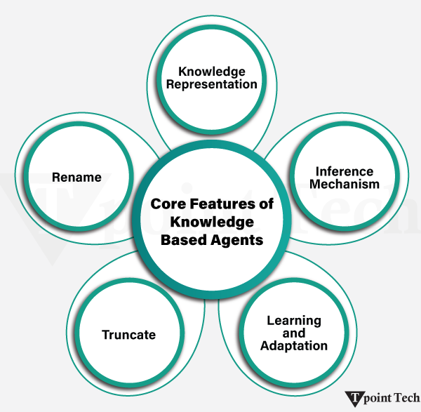
Core Features of Knowledge-Based Agents
The intelligent nature of a knowledge-based agent in AI is due to the fact that this agent can store information, think rationally, and generate intelligent inferences. They replicate human thought processes, which in turn helps them to resolve complicated issues and make informed decisions. The important characteristics that characterize them are as follows:
Knowledge Representation
The agents arrange and store information in well-structured formats like ontologies, semantic networks, or frames. Such a structured representation assists them in discovering connections between concepts, finding data effectively, and reasoning similarly to the way human minds do, which eventually helps them make wiser decisions.
Inference Mechanism
One of the distinguishing characteristics of knowledge-based agents is their reasoning capabilities in terms of stored knowledge. They derive new facts, prove ideas, and come to logical conclusions using such techniques as forward chaining and backward chaining. This rational process enables them to make decisions, foresee future events, and react efficiently to a changing situation.
Learning and Adaptation
Such agents do not just exist there; they are dynamic and learn through experiences and amend their knowledge base with new information. This process of continuous learning will enhance their accuracy and flexibility, which should enable them to cope with emerging challenges and improve their reaction to the previous feedback.
Autonomy
KBA agents can operate autonomously without the human touch. They interpret information, consider potential courses of action, and implement solutions independently. Such freedom is especially significant in applications where real-time or automated decisions are needed.
Problem-Solving Abilities
The ability of knowledge-based agents to solve complex problems is one of the greatest strengths of such agents. They are able to provide effective solutions in different fields such as medical diagnosis, legal analysis, or customer service by applying their knowledge database and inference processes. They are effective because they know facts, rules, and how they are related to each other.
The Working of Knowledge-Based Agents
AI knowledge-based agents operate through the integration of structured knowledge, logical reasoning, and adaptive learning to make intelligent decisions. They depend on systematized systems of knowledge and rational processes to find solutions, give opinions, and take a course of action. The step-by-step process can be illustrated:
Knowledge Acquisition
The initial action is to collect information either by means of human expertise or by computer, by means of data sources. This information is conveyed in the forms that include rules, facts, or relationships. A well-organized body of knowledge increases the capability of the agent to do work in an accurate and efficient manner.
Knowledge Representation
The knowledge should be structured once it is acquired. The information is represented with the help of such techniques as semantic networks, frames, and ontologies. This computerized structure enables the agent to grasp concept connections, find information, and implement the appropriate knowledge when and where it is required.
Inference and Reasoning
The decision-making heart of the agent is the inference engine. It uses forward chaining, backward chaining, deduction, and induction as reasoning methods to process knowledge. By these methods, the agent is able to make conclusions, create new information, solve problems, and identify the best possible course of action.
Learning and Adaptation
Experience can also lead to improved performance by many knowledge-based agents. They refresh their knowledge base according to the relations with the environment or user feedback. This lifelong learning sharpens them and makes them flexible. As an example, a diagnostic system is able to improve its recommendations through past medical cases and results.
Execution of Actions
The agent makes a suitable reaction after reasoning. This may include giving a recommendation, corrective actions, or performing certain duties. As examples, a virtual assistant could recommend a time meeting, a self-driving car could change its route, or a healthcare system could recommend treatment.
Feedback and Evaluation
Lastly, the agent analyses its performance on the basis of the environmental or user feedback. The feedback assists it in gauging its success, detecting errors, and updating its knowledge base. The decision-making skills of the agent are enhanced with time as this cycle of enhancement and feedback builds up.
Various Levels of Knowledge-Based Agents
It is possible to imagine a knowledge-based agent at each of various levels, which describe the representation, processing, and application of knowledge:
Knowledge Level
Here, we determine what is known and what its objectives are. The behavior of the agent can be ascertained based on this knowledge and objectives.
Example: When an automated taxi agent has to go between Station A and Station B and the agent already knows the path between the two, this can be configured at the knowledge level.
Logical Level
This level is concerned with the manner of knowledge representation and storage. Data is coded in rational sentences that can be reasoned on.
Example: On this level, the taxi agent is able to deductively arrive at a logical conclusion of the route to get to Station B based on Station A, using encoded knowledge.
Implementation Level
It is the physical instantiation of logic and knowledge. In this case, the agent carries out the actions based on the knowledge and logical levels.
Example: It is at this point that the taxi agent drives to Station B with its knowledge and reasoning.
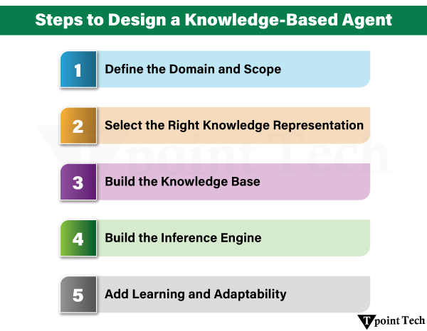
Steps to Design a Knowledge-Based Agent
Creating a knowledge-based agent is a complex process of steps organized in order to make it work smart, evolve, and achieve the desired objectives. Every step lays a foundation for a solid and trusting agent.
1. Define the Domain and Scope
The initial one involves the precise identification of the area in which the agent will work and what functions it will carry out. This does not mean that the agent should have no limits, but rather there must be clearly defined objectives to help the agent not go too wide or lose focus. As an example, a medical diagnosis agent can be programmed to pay attention to a specific group of diseases, where patient symptoms and medical tests can be used to make informed judgments.
2. Select the Right Knowledge Representation
When the scope is established, the second thing to do is to determine how knowledge will be modelled in the system. They may be in the form of semantic networks, logic-based approaches, frames, or ontologies. The implemented method must be appropriate to the domain requirements, but must enable effective reasoning and scalability. As an example, a chatbot on customer service can have pre-established rules or decision trees on which it bases structured responses when it converses with a customer.
3. Build the Knowledge Base
The performance of a knowledge-based agent is very sensitive to the correctness and thoroughness of the knowledge base. The step involves collecting data using experts, databases, or documents, and arranging it according to the form of representation that has been selected. It is also important to update periodically so that the knowledge base remains credible over time. Due to this, a personal assistant application could have up-to-date information like calendar items, contacts, and location data to be useful to its users.
4. Build the Inference Engine
The inference engine is the decision-making arm of the agent that derives logical conclusions from the knowledge base. Depending on the problem field, it could employ reasoning methods like forward chaining, backward chaining, or probabilistic methods. An example medical diagnostic system may use forward chaining to relate observed symptoms to possible diseases.
5. Add Learning and Adaptability
The agent should be able to learn based on new information and respond to it so that it can be dynamic. This may entail machine learning, such as supervised, unsupervised, or reinforcement learning. The agent is expected to improve its knowledge base as time progresses as a result of experience and interaction with the user. An effective example is a recommendation system, e.g., Netflix, which constantly gets better in its suggestions depending on how its users act and what they provide.
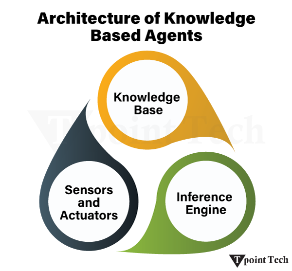
Architecture of Knowledge-Based Agents
Knowledge-based agents (KBAs) are created to store, process, and apply knowledge to make intelligent decisions. They are architected with three key elements:
Knowledge Base
The knowledge base is a source of facts, rules, and organized information that can be used in reasoning. As an illustration, a medical diagnostic system can have information on symptoms, diseases, and treatment options.
Inference Engine
The inference engine uses logical arguments on the knowledge base that will enable the agent to make new inferences and arrive at a decision. As an example, it would be able to examine the symptoms of the patient and deduce the probable medical diagnosis.
Sensors and Actuators
The sensors help the agent read the environment by providing external information, and the actuators provide the means of communicating with and responding to the world. Indicatively, in robotics, the sensors can sense an obstacle, and actuators make the appropriate adjustment in the movement of the robot.
Activities of the Knowledge-Based Agents in AI
Knowledge-based agents perform key functions that can facilitate intelligent thinking, flexibility, and decision-making in different applications.
Perception and Representation
In response to its environment, agents sense the environment with sensors and organize the information gained in the knowledge base. This structured expression enables the factual and rule retrieval and logical processing of rules and facts.
Examples: Customer queries are captured and classified to give an automated response.
Reasoning
Agents make logical deductions from knowledge depositories through reasoning. With the use of rules of inference, they will be able to make predictions or the optimal action to take.
Example: A chess engine that examines the possible moves and derives conclusions based on predefined strategies.
Learning and Updating
Knowledge-based agents evolve with time and change in response to new experiences. They refresh their knowledge base with new information, and thus they are relevant and up to date in changing environments.
Example: A recommendation system that optimizes the suggestions according to user preferences and behavior.
The Knowledge-Based Agent Operations in AI
Knowledge-based agents are developed to handle reasoning, decision making, and task execution on the basis of a structured knowledge base and an inference engine. They are operating based on three main processes that enable them to process information and behave in an intelligent manner.
Tell
The tell operation enables users/systems to give new information to the agent. This entails the addition of facts, rules, or data points to the knowledge base of the agent. Through the new input, the agent is better positioned to adjust to new situations as well as to manage new problems more efficiently.
Ask
Ask operation allows the agent to question its knowledge base or environment to extract the information. This will make sure that the agent verifies facts, gets details, and clears doubts before he/ she make decisions. By questioning, the agent can make sure that it possesses the right knowledge to produce correct answers, practical suggestions, or rational courses of action.
Perform
Putting the reasoning of the agent into action is called performing an operation. Based on the received information in the form of tell and the information obtained in the form of ask, the agent performs tasks, resolves issues, or satisfies user requests. It is highly dependent on the quality of its reasoning powers and the quality of its knowledge base, which makes it very effective in this stage.
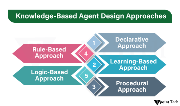
Creating Knowledge-Based Agent Design Approaches
Two main methods of designing a knowledge-based agent are the declarative and the procedural approaches. Both are different in the knowledge representation and reasoning with knowledge by the agent.
Declarative Approach
The declarative approach entails knowledge being expressed in a descriptive way; this can be facts, rules, and logical statements. In this case, emphasis is on what the agent knows as opposed to the use of the information. The reasoning process itself is also distinctly separated into the knowledge, so that the inference engine may apply general processes (such as forward or backwards chaining) to reach conclusions.
Procedural Approach
Within the procedural approach, we can give knowledge in step-wise form, e.g., in the form of algorithms, procedures, or sequences of instructions. The focus is on the way the agent applies the knowledge to problem-solving. The knowledge and reasoning processes are strongly connected in such a method because the inference engine directly performs such processes in order to draw inferences.
Apart from the above, there are various methods of designing knowledge-based agents (KBAs) to use the knowledge to make intelligent decisions. Every approach contains its advantages and disadvantages, so it is only appropriate for certain application cases.
Rule-Based Approach
In this strategy, predefined problems are solved by using a set of rules of the form of if-then. The rules take particular inputs and give particular outputs, with which fast and efficient reasoning in structured fields can be carried out.
Advantages:
Simple and easy to implement
Provides fast and efficient reasoning
High accuracy in well-defined, narrow domains
Simple to interpret and give results.
Limitations:
Lacks adaptability to new or unseen scenarios
Scalability becomes hard with an increase in the number of rules.
Where rules overlap or are in conflict, maintenance is difficult.
Limited flexibility in dynamic environments
Logic-Based Approach
It is a method based on predicate logic that defines facts, relationships, and rules. A logical reasoning engine then uses reasoning on the underlying knowledge to come up with new conclusions, allowing general-purpose reasoning in a variety of situations.
Advantages:
Very expressive, capable of depicting complicated knowledge.
Generalizable across multiple domains
Adaptable to ambiguous or changing situations.
Favors openness as it displays coherent logic.
Limitations:
Computationally expensive, especially for large problems
Requires complete, precise, and consistent knowledge representations
Not easy to apply in complicated real-world systems.
Struggles with incomplete or uncertain data
Learning-Based Approach
The approach implements machine learning to create adaptive knowledge bases that develop with time. The system can learn using new data, and as the user interacts with it, it becomes more adaptable in complex, changing environments.
Advantages:
Always enhances and changes itself.
Prepared to scale to large and changing datasets.
Ability to work with unstructured data (e.g., text, images, audio).
More flexible in uncertain and dynamic conditions
Limitations:
Requires large, high-quality training datasets
Many trainees are biased by training data.
The reasoning process is usually a black box, non-transparent.
Requires frequent retraining to be accurate.
Applications of Knowledge-Based Agents
Knowledge-based agents (KBAs) are changing various industries through the power to competently process and reason through information:
Education
Knowledge-based agents in education have been used to analyse the strengths, weaknesses, and learning styles of students so as to personalise learning experiences. They prescribe customized study plans, materials, and activities, marking assignments and giving instant feedback. This is an adaptive style of approaching students to better them.
Legal Sector
These agents facilitate the research and document analysis in law. They are able to search huge volumes of case laws, precedents, and legal documents quickly, assisting lawyers and paralegals in locating important information quickly, saving time, and enhancing productivity.
Healthcare
One of the largest areas of beneficiaries of knowledge-based agents is healthcare. These agents assist physicians in diagnosis and treatment recommendations by evaluating the data of patients, their medical histories, and the recent research. As an example, AI can identify disease trends, including the symptoms of cancer or diabetes at its beginning, helping clinicians make timely and correct decisions.
Business Intelligence
These are agents utilized by businesses to process large volumes of data and derive information they can act on. Following the monitoring of market trends, the observation of customer behavior, the optimization of internal processes, and so on, such tools are used in companies such as eBay to improve coding, roll out targeted campaigns, and become more efficient.
Customer Support
The knowledge-based agents provide fast and efficient customer service through chatbots and virtual assistants. They are also able to comprehend customer queries, offer precise solutions, and solve frequent challenges in real time together with natural language processing (NLP), which translates to greater satisfaction and reduced workload on human agents.
Financial Services
In finance, these agents enhance decision-making, detect fraud, and manage risks. They can detect trends and anomalies, as well as provide personalized investment advice through analytics of large volumes of data, which makes financial services smarter and more trustworthy.
The Reason for Knowledge-Based Agents Being Effective
The intelligent reasoning coupled with automation is redefining the industries through knowledge-based agents. They are effective because they have the following advantages:
Improved Decision-Making
Such agents work with mass data to produce relevant and precise data-driven insights and limit human errors. In the medical field, they may analyze patient records to propose an accurate diagnosis and treatment.
Automation of Complex Tasks
Automation is possible in tasks that require higher reasoning skills, like legal research, financial reporting, or troubleshooting technical problems. This will save time, enhance accuracy, and allow employees to concentrate on creative and critical work.
Higher Efficiency and Productivity
Knowledge-based agents reduce the speed of processes by displacing repetitive tasks. They are used in finance to help organizations deliver results in a faster and more scalable way because they are more effective at detecting fraud than manual checks.
Personalized Experiences
The agents provide custom services by analyzing user data and preferences. In e-commerce, they suggest what has been viewed in the past, but in education, they modify course content to suit the students’ interests, increasing interaction and satisfaction.
Scalability and Flexibility
With the growth of businesses, agents that are knowledge-based evolve by acquiring new processes and working on larger datasets. In logistics, as an example, they improve supply chains, making sure that they deliver on time regardless of fluctuating needs.
Problems of Knowledge-Based Agents
Although they have potential, there are multiple limitations that knowledge-based agents face, and they influence their performance and adoption:
Data Quality and Availability
Inaccurate results are caused by poor or old data. Mistaken records in health care may lead to misdiagnosis. It is essential to keep updated and clean datasets as a prerequisite to sound decisions.
Complexity in Knowledge Representation
Practical issues tend to need more complex approaches, such as ontologies to plot relationships. Such structures are hard and time-consuming to design and maintain, thus diminishing the effectiveness of the agent.
Scalability and Adaptability
With the change in industries, agents have to acquire new knowledge and processes. They would be out of place in fast-paced environments without scalable systems.
Ethical and Security Concerns
The management of sensitive information in such areas of life as healthcare or finance causes privacy and equity concerns. Decisions made by AI, including those made in the courts of justice or autonomous driving, have ethical consequences that must be strictly regulated.
Computational Demands
The hardware and algorithms needed to operate advanced knowledge-based systems are expensive. Smaller organizations might not have access to them without low-cost solutions.
Future of Knowledge-Based Agents in AI
Knowledge-based agents have a bright future as they become more autonomous, intelligent, and adaptable systems. They will be at the heart of decision-making and automation with further development of machine learning, NLP, and analytics.
Human-AI Collaboration
Agents will turn into co-workers who can give real-time information and suggestions, leaving the final choice to people. As an example, doctors can refer to AI-based recommendations on treatments and make their decision based on their knowledge.
AI-Driven Decision-Making
As early as 2028, knowledge-based agents will be able to process an increasing proportion of business decisions autonomously, simplifying operations across financial, logistics, and manufacturing domains.
Integration with Smart Devices
These agents will communicate with smart environments without any disruption with IoT. Between smart homes changing the energy consumption and industrial sensors anticipating machine breakages, integration will enhance automation and efficiency.
Advanced Language Understanding
Agents will have greater contextual and emotional awareness, which will result in more natural interactions. They will not only answer the questions effectively in customer support, but also change their tone depending on the emotions of the user.
Ethical AI
With increasing autonomy of the agents, high morals will be of importance. The systems of governance will make sure there is responsible decision-making in areas such as law, healthcare, and autonomous systems.
Alpha-beta pruning is a modified version of the minimax algorithm. It is an optimisation technique for the minimax algorithm.
As we have seen in the minimax search algorithm, the number of game states it must examine is exponential in the depth of the tree. Since we cannot eliminate the exponent, we can cut it in half. Hence, there is a technique by which, without checking each node of the game tree, we can compute the correct minimax decision, and this technique is called pruning. This involves two threshold parameters, Alpha and Beta, for future expansion, so it is called alpha-beta pruning. It is also called the Alpha-Beta Algorithm.
Alpha-beta pruning can be applied at any depth of a tree, and sometimes, it affects not only the tree leaves but also the entire sub-tree. The two-parameter can be defined as:
Alpha: The best (highest-value) choice we have found so far at any point along the path of Maximiser. The initial value of alpha is -∞.
Beta: The best (lowest-value) choice we have found so far at any point along the path of Minimiser. The initial value of beta is +∞.
The Alpha-beta pruning to a standard minimax algorithm returns the same move as the standard algorithm does, but it removes all the nodes that are not really affecting the final decision, making the algorithm slow. Hence, by pruning these nodes, it makes the algorithm faster.
Note: To better understand this topic, kindly study the minimax algorithm.
Conditions for Alpha-beta Pruning
The main condition required for alpha-beta pruning is:
α>=β
Key Points about Alpha-beta Pruning:
The Max player will only update the value of alpha.
The Min player will only update the value of beta.
While backtracking the tree, the node values will be passed to the upper nodes instead of the values of alpha and beta.
We will only pass the alpha and beta values to the child nodes.
Pseudo-code for Alpha-beta Pruning
function minimax(node, depth, alpha, beta, maximizingPlayer) is
if depth ==0 or node is a terminal node, then
return static evaluation of node
if MaximizingPlayer then // for Maximiser Player
maxEva= -infinity
for each child of node do
eva= minimax(child, depth-1, alpha, beta, False)
maxmaxEva= max(maxEva, eva)
alpha= max(alpha, maxEva)
if beta<=alpha
break
return maxEva
else // for Minimiser player
minEva= +infinity
for each child of node do
eva= minimax(child, depth-1, alpha, beta, true)
minminEva= min(minEva, eva)
beta= min(beta, eva)
if beta<=alpha
break
return minEva
Working of Alpha-Beta Pruning
Let’s take an example of a two-player search tree to understand the working of Alpha-beta pruning:
Step 1: At the first step, the Max player will start the first move from node A, where α= -∞ and β= +∞; these values of alpha and beta are passed down to node B, where again α= -∞ and β= +∞, and Node B passes the same value to its child D.
Step 2: At Node D, the value of α will be calculated as its turn for Max. The value of α is compared with firstly 2 and then 3, and the max (2, 3) = 3 will be the value of α at node D, and the node value will also be 3.
Step 3: Now the algorithm backtracks to node B, where the value of β will change as this is a turn of Min. Now β= +∞will compare with the available subsequent nodes’ value, i.e., min (∞, 3) = 3, hence at node B, now α= -∞, and β= 3.
In the next step, the algorithm traverses the next successor of Node B, which is Node E, and the values of α= -∞and β= 3 will also be passed.
Step 4: At node E, Max will take its turn, and the value of α will change. The current value of α will be compared with 5, so max (−∞, 5) = 5, hence at node E α = 5 and β = 3, where α>=β, so the right successor of E will be pruned, and the algorithm will not traverse it, and the value at node E will be 5.
Step 5: At the next step, the algorithm again backtracks the tree from node B to node A. At node A, the value of alpha will be changed to the maximum available value of 3 as max (-∞, 3)= 3, and β= +∞; these two values now pass to the right successor of A, which is Node C.
At node C, α=3 and β= +∞, and the same values will be passed on to node F.
Step 6: At node F, again, the value of α will be compared with the left child, which is 0, and max(3,0)= 3, and then compared with the right child, which is 1, and max(3,1)= 3 still α remains 3, but the node value of F will become 1.
Step 7: Node F returns the node value 1 to node C, at C α = 3 and β = +∞; here, the value of β will be changed, and it will compare with 1, so min (∞, 1) = 1. Now at C, α = 3 and β = 1, and again it satisfies the condition α>=β, so the next child of C, which is G, will be pruned, and the algorithm will not compute the entire sub-tree G.
Step 8: C now returns the value of 1 to A. Here, the best value for A is max (3, 1) = 3. Following is the final game tree, which shows the nodes that are computed and the nodes that have never been calculated. Hence, the optimal value for the maximiser is 3 for this example.
Move Ordering in Alpha-Beta Pruning
The effectiveness of alpha-beta pruning is highly dependent on the order in which each node is examined. Move order is an important aspect of alpha-beta pruning.
It can be of two types:
Worst ordering: In some cases, the alpha-beta pruning algorithm does not prune any of the leaves of the tree and works exactly as the minimax algorithm. In this case, it also consumes more time because of alpha-beta factors, such as a move of pruning, which is called worst ordering. In this case, the best move occurs on the right side of the tree. The time complexity for such an order is O(bm).
Ideal ordering: The ideal ordering for alpha-beta pruning occurs when lots of pruning happens in the tree, and the best moves occur at the left side of the tree. We apply DFS. Hence, it first searches the left of the tree and goes deep twice as the minimax algorithm does in the same amount of time. Complexity in ideal ordering is O(bm/2).
Rules to Find a Good Ordering
The following are some rules to find good ordering in alpha-beta pruning:
Occur the best move from the shallowest node.
Order the nodes in the tree such that the best nodes are checked first.
Use domain knowledge while finding the best move. Ex: for Chess, try order: captures first, then threats, then forward moves, backward moves.
We can bookkeep the states, as there is a possibility that states may repeat.
Applications of Alpha-Beta Pruning
Usage of AI for Board Games
Chess: Stockfish uses techniques like Alpha Beta Pruning. This prune branches that will not affect the final decision, so it allows the evaluation of millions of possible board configurations in a reasonable time. An example is if a sequence of some moves that are already known to lead to a loss is provided, the algorithm will skip going further.
Checkers: In Checkers, the algorithm must evaluate possible moves with the purpose of maximizing the AI score and minimizing the chance of the opponent. Alpha Beta Pruning avoids unnecessary exploration, and this reduces the planning time for a deep strategy.
Tic-Tac-Toe: Even though the game is much simpler, Alpha-Beta Pruning efficiently figures out which moves are best by pruning paths that end in draws or losses before reaching the end of the decision process.
Decision-Making in Adversarial Search Problems
Security Systems: In the area of cybersecurity, Alpha-Beta Pruning is used in intrusion detection systems for decision-making. Thus, it can act as a model of adversarial behavior as well as determine optimal strategies to counter threats while minimizing system vulnerabilities.
Economic Modelling: The alpha-beta Pruning technique helps companies in competitive markets to simulate adversarial scenarios to derive the best strategies, maximizing their profit and decreasing the impact of competitor moves.
Robotics and Automation: Such pruning is used by robots to decide efficient paths and responses when using adversarial planning for tasks, such as competitive tasks or navigation in dynamic environments.
Enhancements in Real-Time Strategy Games
Combat Simulations: As an example, in RTS games that most resemble StarCraft, the possible attack and defence strategies are evaluated using Alpha-Beta Pruning. This allows the AI to predict an opponent’s move and take actions for the best in a situation and to gain an advantage over the opponent.
Resource Management: In the case of RTS games, the decisions are related to allocating resources; for instance, should I spend my time amassing more resources or building armies? Alpha Beta pruning allows AI to find its way to balance these competing objectives at a greatly more economical tradeoff.
Dynamic Scenarios: RTS games are different from turn-based games because, in RTS games, there is always continuous play, and player decisions must change in real-time. Real-time execution of Alpha Beta pruning, however, requires a minor adaptation to make it work and is critical for pruning away the unnecessary options in its considered moves so as to keep the computational efficiency.
Advantages and Disadvantages of Alpha-Beta Pruning
Advantages
Enhanced Efficiency Compared to Plain Minimax: Alpha-Beta Pruning can considerably enhance the performance of the Minimax algorithm by drilling down the decision tree from an increasing number of nodes. The efficiency comes from pruning branches that do not affect the result. This means that the algorithm is only interested in the most promising paths, and since there can be many paths to the goal, this speeds up decision making in such cases as chess or checkers.
Applicability to Large Decision Trees: This algorithm is especially useful for large search space games and decision problems. Removing unneeded branches permits deeper searching of the tree for the same computational budget. The depth advantage is very important for making better decisions, primarily in a competitive environment where precise foresight is essential.
Disadvantages
Dependency on the Order of Node Evaluation: As an order controls the ordering of nodes in Alpha Beta Pruning, its efficiency depends greatly on that order. Therefore, if the algorithm processes the most promising moves first, so-called “node ordering”, then the pruning effect is at its maximum. However, node ordering can also harm computational efficiency negatively if it results in suboptimal pruning. Consequently, proper implementation with heuristics or preprocessing is typically necessary to obtain optimal performance.
Computational Overhead for Deep and Complex Trees: Alpha-Beta Pruning reduces the exploration of the nodes but cannot be efficient on highly complex trees with extremely high depth. In particular, the algorithm may still require an amount of computational effort that is at least as high as in the worst case if no good heuristics for ordering nodes are available. However, when the problem domain calls for such methods, Monte Carlo Tree Search may be a more appropriate way to solve such problems.
Mini-max algorithm is a recursive or backtracking algorithm which is used in decision-making and game theory. It provides an optimal move for the player assuming that opponent is also playing optimally.
Mini-Max algorithm uses recursion to search through the game-tree.
Min-Max algorithm is mostly used for game playing in AI. Such as Chess, Checkers, tic-tac-toe, go, and various tow-players game. This Algorithm computes the minimax decision for the current state.
In this algorithm two players play the game, one is called MAX and other is called MIN.
Both the players fight it as the opponent player gets the minimum benefit while they get the maximum benefit.
Both Players of the game are opponent of each other, where MAX will select the maximized value and MIN will select the minimized value.
The minimax algorithm performs a depth-first search algorithm for the exploration of the complete game tree.
The minimax algorithm proceeds all the way down to the terminal node of the tree, then backtrack the tree as the recursion.
Pseudo-code for MinMax Algorithm:
function minimax(node, depth, maximizingPlayer) is
if depth ==0 or node is a terminal node then
returnstatic evaluation of node
if MaximizingPlayer then // for Maximizer Player
maxEva= -infinity
for each child of node do
eva= minimax(child, depth-1, false)
maxEva= max(maxEva,eva) //gives Maximum of the values
return maxEva
else// for Minimizer player
minEva= +infinity
for each child of node do
eva= minimax(child, depth-1, true)
minEva= min(minEva, eva) //gives minimum of the values
return minEva
Initial call:
Minimax(node, 3, true)
Working of Min-Max Algorithm:
The working of the minimax algorithm can be easily described using an example. Below we have taken an example of game-tree which is representing the two-player game.
In this example, there are two players one is called Maximizer and other is called Minimizer.
Maximizer will try to get the Maximum possible score, and Minimizer will try to get the minimum possible score.
This algorithm applies DFS, so in this game-tree, we have to go all the way through the leaves to reach the terminal nodes.
At the terminal node, the terminal values are given so we will compare those value and backtrack the tree until the initial state occurs. Following are the main steps involved in solving the two-player game tree:
Step-1: In the first step, the algorithm generates the entire game-tree and apply the utility function to get the utility values for the terminal states. In the below tree diagram, let’s take A is the initial state of the tree. Suppose maximizer takes first turn which has worst-case initial value =- infinity, and minimizer will take next turn which has worst-case initial value = +infinity.
Step 2: Now, first we find the utilities value for the Maximizer, its initial value is -∞, so we will compare each value in terminal state with initial value of Maximizer and determines the higher nodes values. It will find the maximum among the all.
For node D max(-1,- -∞) => max(-1,4)= 4
For Node E max(2, -∞) => max(2, 6)= 6
For Node F max(-3, -∞) => max(-3,-5) = -3
For node G max(0, -∞) = max(0, 7) = 7
Step 3: In the next step, it’s a turn for minimizer, so it will compare all nodes value with +∞, and will find the 3rd layer node values.
For node B= min(4,6) = 4
For node C= min (-3, 7) = -3
Step 4: Now it’s a turn for Maximizer, and it will again choose the maximum of all nodes value and find the maximum value for the root node. In this game tree, there are only 4 layers, hence we reach immediately to the root node, but in real games, there will be more than 4 layers.
For node A max(4, -3)= 4
That was the complete workflow of the minimax two player game.
Properties of Mini-Max algorithm:
Complete- Min-Max algorithm is Complete. It will definitely find a solution (if exist), in the finite search tree.
Optimal- Min-Max algorithm is optimal if both opponents are playing optimally.
Time complexity- As it performs DFS for the game-tree, so the time complexity of Min-Max algorithm is O(bm), where b is branching factor of the game-tree, and m is the maximum depth of the tree.
Space Complexity- Space complexity of Mini-max algorithm is also similar to DFS which is O(bm).
Limitation of the minimax Algorithm:
The main drawback of the minimax algorithm is that it gets really slow for complex games such as Chess, go, etc. This type of games has a huge branching factor, and the player has lots of choices to decide. This limitation of the minimax algorithm can be improved from alpha-beta pruning which we have discussed in the next topic.
Adversarial search is a subfield of artificial intelligence that aims at identifying algorithms and strategies involved in decision-making processes in environments where an individual or a group of players with different aspirations develop strategies to counter each other during play, business, etc. Adversarial search, therefore, aims at identifying suitable moves for a player and consider the probable responses from the opponents.
The purpose of the adversarial search is to develop strategies that can enable an agent to select the most effective action in situations where agents are competing or in conflict with each other, as well as predicting an action of an opponent and anticipating a counteraction. In order to determine the best next move or decision to make, most adversarial search algorithms traverse a game tree that defines all the possible game states and their transitions.
In general, adversarial search can be regarded as a very challenging and promising area of AI research that requires an understanding of game theory as well as decision-making and optimization concepts such as mixed strategies. It finds applications in many fields and is still one of the active areas of research in the context of AI.
Importance of Adversarial Search in AI
Analyzing the Adversarial search concept, it is necessary to note that it plays an essential role in artificial intelligence. Interestingly, it is of great importance in two important areas:
Game-Playing: One of the key areas where adversarial search is applied is games. From Chess, checkers, and Go to complex video games, AI agents make use of adversarial search to analyze and decide on the right moves in a nutshell competition. One of the interesting aspects of AI that can be applied in the game is the capacity to defeat the competitor. For instance, Deep Blue – a computer developed by IBM that can play Chess against a human- was recently able to beat the world chess champion Garry Kasparov in 1997 as a result of what is known as adversarial search.
Decision-Making: Apart from games, the application of adversarial search occurs in any decision-making process. It is applicable where the objective of the individuals varies, and they have to find the most optimal solution. It is useful in other fields, such as economics, robotics, or even military planning and strategy, as the agents have to factor in their decisions based on the actions and goals of the opponents. Adversarial search equips organizations with AI tools and methodologies to solve problems in settings that may be complicated, dynamic, uncertain, and even sometimes hostile.
Different Game Scenarios using Adversarial Search
Perfect information: A game with the ideal information is one in which agents can look into the complete board. Agents have all the information about the game, and they can see each other’s moves. Examples are Chess, Checkers, Go, etc.
Imperfect information: If in a game, agents do not have all the information about the game and are not aware of what’s going on, such types of games are called games with imperfect information, such as tic-tac-toe, Battleship, blind, Bridge, etc.
Deterministic games: Deterministic games follow a strict pattern and set of rules for the games, and there is no randomness associated with them. Examples are Chess, Checkers, Go, Tic-Tac-Toe, etc.
Non-deterministic games: Non-deterministic games have various unpredictable events and involve a factor of chance or luck. Either dice or cards introduce this factor of chance or luck. These are random, and each action response is not fixed. Such games are also called stochastic games. Examples are Backgammon, Monopoly, Poker, etc.
Zero-sum games: These are exclusively competitive games in which the enhancement of one player’s position is equal to a decrement in the position of another. Each of the players in these games will have different strategies across the opposition, and the net gain or loss is zero. Each person always seeks to achieve the maximum amount of profit or minimize the amount of loss with regard to the context of the game. Chess and tic-tac-toe are examples of a Zero-sum game.
Zero-sum Game: Embedded Thinking
The Zero-sum game involved embedded thinking in which one agent or player is trying to figure out:
What to do.
How to decide the move
Needs to think about his opponent as well
The opponent also thinks about what to do
Each of the players is trying to find out the response of their opponent to their actions. This requires embedded thinking or backward reasoning to solve the game problems in AI.
Formalization of the problem:
A game can be defined as a type of search in AI that involves the following elements:
Initial state: It specifies how the game is set up at the start.
Player(s): It specifies which player has moved in the state space.
Action(s): It returns the set of legal moves in the state space.
Result(s, a): It is the transition model, which specifies the result of moves in the state space.
Terminal-Test(s): The terminal test is true if the game is over; otherwise, it is false in any case. The state where the game ends is called a terminal state.
Utility(s, p): A utility function gives the final numeric value for a game that ends in terminal states s for player p. It is also called the payoff function. For Chess, the outcomes are a win, a loss, or a draw, and its payoff values are +1, 0, and ½. And for tic-tac-toe, utility values are +1, -1, and 0.
Game Tree
A game tree is a tree where nodes of the tree are the game states, and Edges of the tree are the moves by players. The game tree involves the initial state, action function, and result function.
It has several nodes, the highest of which is the Root node. Every node stands for the current position of the game, and the latter is indicated at the edge of the node. The attempts of the two players, referred to as Maximizer and Minimizer, are included in turns on each layer of the tree. Minimizer keeps the loss and minimizes the maximum amount of loss, while Maximizer increases the minimum amount of gain. Depending on the context of the game and the moves that the other player has created, a player becomes the Maximizer or the Minimizer..
Example: Tic-Tac-Toe Game Tree
The following figure shows part of the game tree for the tic-tac-toe game. Following are some key points of the game:
There are two players, MAX and MIN.
Players have an alternate turn and start with MAX.
MAX maximizes the result of the game tree
MIN minimizes the result.
Example Explanation:
From the initial state, MAX has nine possible moves as it starts first. MAX places ‘X’ and MIN places ‘O’, and both players play alternatively until we reach a leaf node where one player has three in a row or all squares are filled.
Both players will compute each node, minimax, the minimax value which is the best achievable utility against an optimal adversary.
Suppose both the players are well aware of the tic-tac-toe and playing the best play. Each player is doing their best to prevent another one from winning. MIN is acting against Max in the game.
So, in the game tree, we have a layer of Max and a layer of MIN, and each layer is called Ply. Max places ‘X’, then MIN puts ‘O’ to prevent Max from winning, and this game continues until the terminal node.
This is the situation where MIN wins, MAX wins, or it’s a draw. This game tree is the whole search space of possibilities where MIN and MAX are playing tic-tac-toe and taking turns alternately.
The Minimax Algorithm in Adversarial Search
It is one of the most central ideas in adversarial search since it is most suitable for two-player games. It assists in decision-making since it presupposes that each player is making their best decision. The algorithm operates to establish the least amount that can be lost in the worst-case situation considered.
Game Tree Construction: The algorithm builds a game tree with nodes representing game states and edges representing possible moves.
Maximizer and Minimizer: The algorithm alternates between two players: the Maximizer, who tries to maximize the score, and the Minimizer, who tries to minimize it.
Evaluation: At the terminal nodes of the tree, a utility function evaluates the game’s outcome. The algorithm backtracks from these terminal nodes to determine the optimal move for the current player.
Introduction to Alpha-Beta Pruning
Alpha-Beta Pruning is a search optimization method of the Minimax algorithm that helps eliminate most of the nodes from the game tree. It aids in the optimization of the algorithm by removing the so-called “subtrees” that do not require further examination because none of the paths under them can lead to choosing one over the other.
Alpha and Beta values: Alpha is the value that is best for the Maximizer at that level and above, while Beta is the best value that the Minimizer can offer at that level and above.
Pruning: If a node has an evaluation less than alpha or Beta, it is unnecessary to continue assessing the node’s descendants, and the search is pruned.
Speed: By reducing the number of nodes expanded, Alpha-Beta Pruning is able to find an optimal solution quickly than the use of the simple Minimax algorithm.
How Alpha-Beta Pruning Reduces Node Exploration?
Alpha-Beta Pruning greatly limits the use of the game tree by not expanding nodes that have no impact on the outcome.
Early Termination: These branches that can never have an impact on the final result are pruned as early as possible so as to save unnecessary computation.
Reduced Complexity: The complexity of the search process is reduced from exponential to polynomial in many cases, improving performance.
Optimal Decisions: Even though Alpha-Beta Pruning involves the elimination of certain nodes, optimal decisions are still made because only unnecessary calculations are omitted.
Real-World Applications of Adversarial Search beyond Games
It is therefore important to stress that Minimax and Alpha-Beta Pruning are not necessarily limited to games but have a wider use:
Strategic Planning: This kind of planning is essential wherever strategic decision-making is needed, for instance, in the military or the placement of resources.
Robotics: It can be used in robotics where it is needed in path planning and decision-making in competitive domains.
Economics: Used in the context of the model where agents or actors are struggling for resources or market stakes.
Cybersecurity: Employed in adversarial scenarios such as threat detection and mitigation strategies against cyber-attacks.
Important Features of Adversarial Search
Adversarial search is an important area in artificial intelligence. This is about making decisions in hostile circumstances. Below are some major aspects of adversarial search:
Perfect or Imperfect Information
In games, there are two major categories of information that players can access: perfect and imperfect. In games with perfect information, the players all have full knowledge of the current state of a match. However, in games with imperfect information, players are not presented with all the details.
Adversarial Search Algorithms
As in any competitive game like Chess, a contender can use a technique known as the min-max strategy or alpha-beta pruning in order to understand the best move. Such algorithms calculate the possible results of each move and provide hints that tell what platform is appropriate for the player.
Thumb Rule
The tree can get rather large, and it may, therefore, mean that the full search of the tree cannot be completed. In such situations, the algorithm uses heuristics, i.e., shortcut rules, enabling it to move faster over the game tree, bypassing the evaluation of all of the possible moves. These small rules give an idea of the best possible move to make without actually traversing the entire game tree.
Challenges in Adversarial Search
There are several disadvantages of the adversarial search:
Computational Complexity
Exponential Growth: The problem is also that with the increase in the number of moves, the overall size of the game tree increases, and it may become practically impossible to complete it to the end.
Memory Usage: It also has its demerit of requiring a huge amount of memory to store large game trees.
Heuristic Evaluation
Accuracy: It was seen that even when a proper heuristic evaluation function is designed, it may not actually represent the real game situation.
Scalability: Specifically, heuristic functions may not be very well suited for large problems and complex problem space
Opponent Modeling
Unpredictability: Frequently, it is not easy to model and predict an opponent’s actions, particularly when the opponent operates in a complex environment.
Adaptability: It becomes even more challenging if one has to counter an opponent’s form of play, as this has to be done on the fly.
Real-Time Decision Making
Time Constraints: Real-time decision-making within vast search spaces can be very difficult, depending on the time it takes to make a decision, with such concerns being compounded by time-related factors.
Optimality vs. Speed: Thus, making the best decisions and utilizing their time at the same time will be a big challenge.
Conclusion
Adversarial search, the essential technique in artificial intelligence, has been helping in game-solving and other critical decision-making processes. AI planning consequently provides a systematic and efficient way of interacting with the environment and making choices in competitive cases, estimating the plans of the adversaries. From the crudest minimax algorithm to alpha-beta pruning and heuristic evaluation, adversarial search has gone a step ahead due to the fact of high branching factor, horizon effect and limited computation power.