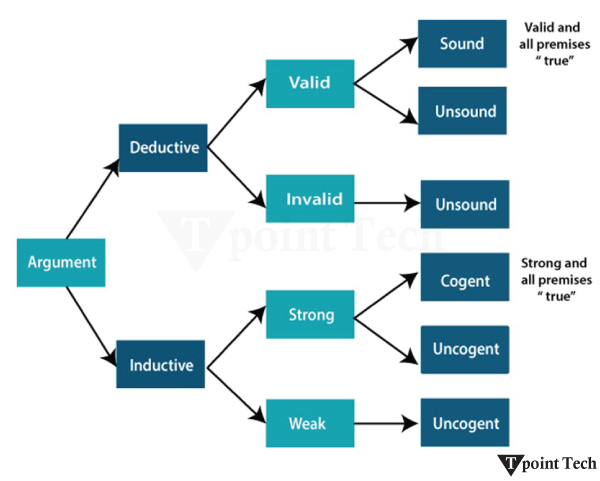
Author: saqibkhan

  • Spacing

    This chapter discusses about the utility classes provided by Bootstrap for spacing.

    Bootstrap provides predefined range of responsive margin, padding and gap utility classes that can be used to modify the appearance of an element. These utility classes work for all types of breakpoints, such as:

    breakpointsize
    xs
    sm>=576px
    md>=768px
    lg>=992px
    xl>=1200px
    xxl>=1400px

    The naming format of these classes is as follows:

    breakpointnaming format
    xs{property}{sides}-{size}
    sm, md, lg, xl, xxl{property}{sides}-{breakpoint}-{size}

    where property can be one of the following:

    propertyvalue
    mmargin
    ppadding

    where sides can be one of the following:

    sidevalue
    tmargin-top/padding-top
    bmargin-bottom/padding-bottom
    smargin-left/padding-left
    emargin-right/padding-right
    xmargin-left and margin-right or padding-left and padding-right
    ymargin-top and margin-bottom or padding-top and padding-bottom
    blankmargin and padding on all four sides

    where size can be one of the following:

    sizevalue
    0margin/padding – 0
    1margin/padding – 0.25rem
    2margin/padding – 0.5rem
    3margin/padding – 1rem
    4margin/padding – 1.5rem
    5margin/padding – 3rem
    automargin – auto

    Note: More sizes can be added by adding entries to the $spacers Sass map variable.

    Let us see an example for margin utilities:https://www.tutorialspoint.com/bootstrap/examples/spacing_margin_utilities.php

    Example

    You can edit and try running this code using the Edit & Run option.

    <!DOCTYPE html><html><head><title>Bootstrap - Spacing</title><meta charset="UTF-8"><meta http-equiv="X-UA-Compatible" content="IE=edge"><meta name="viewport" content="width=device-width, initial-scale=1.0"><link href="https://cdn.jsdelivr.net/npm/[email protected]/dist/css/bootstrap.min.css" rel="stylesheet"><script src="https://cdn.jsdelivr.net/npm/[email protected]/dist/js/bootstrap.bundle.min.js"></script></head><body><div class="container mt-3"><h4 class="display-4">Spacing margin utilities</h4><p><u>Set the spacing (margin) of an element with the {property}{sides}-{breakpoint}-{size} classes.</u></p><div class="mt-4 bg-info">Only top margin (1.5rem)</div><div class="mb-5 bg-light">Only bottom margin (1rem)</div><div class="ms-5 bg-warning">Only left margin (3rem)</div><div class="me-5 bg-warning">Only right margin (3rem)</div><div class="mx-5 text-bg-secondary">Both left and right margins (3rem)</div><div class="my-5 bg-primary">Both top and bottom margins (3rem)</div></div></body></html>

    Let us see an example for padding utilities:https://www.tutorialspoint.com/bootstrap/examples/spacing_padding_utilities.php

    Example

    You can edit and try running this code using the Edit & Run option.

    <!DOCTYPE html><html><head><title>Bootstrap - Spacing</title><meta charset="UTF-8"><meta http-equiv="X-UA-Compatible" content="IE=edge"><meta name="viewport" content="width=device-width, initial-scale=1.0"><link href="https://cdn.jsdelivr.net/npm/[email protected]/dist/css/bootstrap.min.css" rel="stylesheet"><script src="https://cdn.jsdelivr.net/npm/[email protected]/dist/js/bootstrap.bundle.min.js"></script></head><body><div class="container mt-3"><h4 class="display-4">Spacing padding utilities</h4><p><u>Set the spacing (padding) of an element with the {property){sides}-{breakpoint}-{size} classes.</u></p><div class="pt-4 bg-info">Only top padding (1.5rem)</div><div class="pb-5 text-bg-success">Only bottom padding (1rem)</div><div class="ps-5 bg-warning">Only left padding (3rem)</div><div class="pe-5 text-bg-danger">Only right padding (3rem)</div><div class="px-5 text-bg-secondary">Both left and right padding (3rem)</div><div class="py-5 text-bg-primary">Both top and bottom padding (3rem)</div></div></body></html>

    Horizontal centering

    For horizontal centering fixed-width block level content, Bootstrap provides .mx-auto class.

    Let us see an example:https://www.tutorialspoint.com/bootstrap/examples/spacing_horizontal_centering.php

    Example

    You can edit and try running this code using the Edit & Run option.

    <!DOCTYPE html><html><head><title>Bootstrap - Spacing</title><meta charset="UTF-8"><meta http-equiv="X-UA-Compatible" content="IE=edge"><meta name="viewport" content="width=device-width, initial-scale=1.0"><link href="https://cdn.jsdelivr.net/npm/[email protected]/dist/css/bootstrap.min.css" rel="stylesheet"><script src="https://cdn.jsdelivr.net/npm/[email protected]/dist/js/bootstrap.bundle.min.js"></script></head><body><div class="container mt-3"><h4 class="display-5">Horizontal centering</h4><br><div class="mx-auto p-2 text-bg-success" style="width: 200px;">
    
          Horizontally centered
        &lt;/div&gt;&lt;/div&gt;&lt;/body&gt;&lt;/html&gt;</pre>
    • By default, negative values can be used with margin properties in CSS.
    • The negative values cannot be used with padding.
    • It is possible to enable the negative margins by setting the variable $enable-negative-margins to true.

    Gap utilities

    You can make use of gap utilities on the parent element, while using display: grid or display: flex. By default the gap utilities are responsive.

    It can hold the values for all the six sizes from the $spacers map (0-5). There is no .gap-auto class, as it is same as .gap-0.

    Let us see an example:https://www.tutorialspoint.com/bootstrap/examples/spacing_gap_utility.php

    Example

    You can edit and try running this code using the Edit & Run option.

    <!DOCTYPE html><html><head><title>Bootstrap - Spacing</title><meta charset="UTF-8"><meta http-equiv="X-UA-Compatible" content="IE=edge"><meta name="viewport" content="width=device-width, initial-scale=1.0"><link href="https://cdn.jsdelivr.net/npm/[email protected]/dist/css/bootstrap.min.css" rel="stylesheet"><script src="https://cdn.jsdelivr.net/npm/[email protected]/dist/js/bootstrap.bundle.min.js"></script></head><body><div class="container mt-3"><h4 class="display-6">
    
          gap utility
      &lt;/h4&gt;&lt;h4&gt;gap utility class &lt;i&gt;.gap-*&lt;/i&gt;&lt;/h4&gt;&lt;div class="d-grid gap-0 p-3 border border-primary bg-light"&gt;&lt;div class="p-2 bg-light border"&gt;
              gap-0
          &lt;/div&gt;&lt;div class="p-2 bg-light border"&gt;
              gap-0
          &lt;/div&gt;&lt;/div&gt;&lt;div class="d-grid gap-1 p-3 border border-danger bg-primary-subtle"&gt;&lt;div class="p-2 bg-light border"&gt;
            gap-1
          &lt;/div&gt;&lt;div class="p-2 bg-light border"&gt;
            gap-1
          &lt;/div&gt;&lt;/div&gt;&lt;div class="d-grid gap-2 p-3 border border-success bg-danger-subtle"&gt;&lt;div class="p-2 bg-light border"&gt;
            gap-2
          &lt;/div&gt;&lt;div class="p-2 bg-light border"&gt;
            gap-2
          &lt;/div&gt;&lt;/div&gt;&lt;/div&gt;&lt;/body&gt;&lt;/html&gt;</pre>

    row-gap

    In order to set the vertical space between children items in a specified container, use the utility class .row-gap.

    Let us see an example:https://www.tutorialspoint.com/bootstrap/examples/spacing_row_gap.php

    Example

    You can edit and try running this code using the Edit & Run option.

    <!DOCTYPE html><html><head><title>Bootstrap - Spacing</title><meta charset="UTF-8"><meta http-equiv="X-UA-Compatible" content="IE=edge"><meta name="viewport" content="width=device-width, initial-scale=1.0"><link href="https://cdn.jsdelivr.net/npm/[email protected]/dist/css/bootstrap.min.css" rel="stylesheet"><script src="https://cdn.jsdelivr.net/npm/[email protected]/dist/js/bootstrap.bundle.min.js"></script></head><body><div class="container mt-3"><h4 class="display-6">
    
         gap utility
        &lt;/h4&gt;&lt;h4&gt;row gap utility class &lt;i&gt;.row-gap-*&lt;/i&gt;&lt;/h4&gt;&lt;div class="d-grid gap-0 row-gap-4"&gt;&lt;div class="p-2 border bg-primary"&gt;
            row gap-4
          &lt;/div&gt;&lt;div class="p-2 border bg-info"&gt;
            row gap-4
          &lt;/div&gt;&lt;div class="p-2 border bg-warning"&gt;
            row gap-4
          &lt;/div&gt;&lt;div class="p-2 border bg-danger-subtle"&gt;
            row gap-4
          &lt;/div&gt;&lt;/div&gt;&lt;/div&gt;&lt;/div&gt;&lt;/body&gt;&lt;/html&gt;</pre>

    column-gap

    In order to set the horizontal space between children items in a specified container, use the utility class .column-gap.

    Let us see an example.

    Example

    You can edit and try running this code using the Edit & Run option.

    <!DOCTYPE html><html><head><title>Bootstrap - Spacing</title><meta charset="UTF-8"><meta http-equiv="X-UA-Compatible" content="IE=edge"><meta name="viewport" content="width=device-width, initial-scale=1.0"><link href="https://cdn.jsdelivr.net/npm/[email protected]/dist/css/bootstrap.min.css" rel="stylesheet"><script src="https://cdn.jsdelivr.net/npm/[email protected]/dist/js/bootstrap.bundle.min.js"></script></head><body><div class="container mt-3"><h4 class="display-4">
    
        gap utility
      &lt;/h4&gt;&lt;h4&gt;column gap utility class &lt;i&gt;.column-gap-*&lt;/i&gt;&lt;/h4&gt;&lt;div class="d-flex gap-0 column-gap-4"&gt;&lt;div class="p-2 g-col-6 border border-primary"&gt;Grid item 1&lt;/div&gt;&lt;div class="p-2 g-col-6 border border-primary"&gt;Grid item 2&lt;/div&gt;&lt;div class="p-2 g-col-6 border border-primary"&gt;Grid item 3&lt;/div&gt;&lt;div class="p-2 g-col-6 border border-primary"&gt;Grid item 4&lt;/div&gt;&lt;/div&gt;&lt;div class="d-flex gap-0 column-gap-2"&gt;&lt;div class="p-2 g-col-6 border border-success"&gt;Grid item 1&lt;/div&gt;&lt;div class="p-2 g-col-6 border border-success"&gt;Grid item 2&lt;/div&gt;&lt;div class="p-2 g-col-6 border border-success"&gt;Grid item 3&lt;/div&gt;&lt;div class="p-2 g-col-6 border border-success"&gt;Grid item 4&lt;/div&gt;&lt;/div&gt;&lt;/div&gt;&lt;/body&gt;&lt;/html&gt;</pre>

  • Sizing

    This chapter discusses about Bootstrap sizing. Sizing allows you to adjust the height and width of an element through the utility classes.

    Relative to the parent

    The width and height utilities are created using the utility API found in _utilities.scss. They come with default support for values like 25%50%75%100%, and auto. You can customize these values to generate different utilities.

    Relative to the width

    The w-25w-50w-75w-100, and w-auto classes define the width of each div element.https://www.tutorialspoint.com/bootstrap/examples/sizing_relative_to_the_width.php

    Example

    You can edit and try running this code using Edit & Run option.

    <!DOCTYPE html><html lang="en"><head><title>Bootstrap - Sizing</title><meta charset="UTF-8"><meta http-equiv="X-UA-Compatible" content="IE=edge"><meta name="viewport" content="width=device-width, initial-scale=1.0"><link href="https://cdn.jsdelivr.net/npm/[email protected]/dist/css/bootstrap.min.css" rel="stylesheet"><script src="https://cdn.jsdelivr.net/npm/[email protected]/dist/js/bootstrap.bundle.min.js"></script></head><body><div class="w-25 p-3 text-bg-primary">25% width</div><div class="w-50 p-3 text-bg-secondary">50% width</div><div class="w-75 p-3 text-bg-warning">75% width</div><div class="w-100 p-3 text-bg-info">Full width (100%)</div><div class="w-auto p-3 text-bg-danger">Auto width</div></body></html>

    Relative to the height

    The classes h-25h-50h-75h-100, and h-auto are responsible for setting the height of each div element.https://www.tutorialspoint.com/bootstrap/examples/sizing_relative_to_the_height.php

    Example

    You can edit and try running this code using Edit & Run option.

    <!DOCTYPE html><html lang="en"><head><title>Bootstrap - Sizing</title><meta charset="UTF-8"><meta http-equiv="X-UA-Compatible" content="IE=edge"><meta name="viewport" content="width=device-width, initial-scale=1.0"><link href="https://cdn.jsdelivr.net/npm/[email protected]/dist/css/bootstrap.min.css" rel="stylesheet"><script src="https://cdn.jsdelivr.net/npm/[email protected]/dist/js/bootstrap.bundle.min.js"></script></head><body><div class="text-bg-light" style="height: 100px;"><div class="h-25 d-inline-block text-bg-primary text-center" style="width: 150px;">25% Height</div><div class="h-50 d-inline-block text-bg-secondary text-center" style="width: 150px;">50% Height</div><div class="h-75 d-inline-block bg-warning text-center" style="width: 150px;">75% Height</div><div class="h-100 d-inline-block text-bg-info text-center" style="width: 150px;">100% Height </div><div class="h-auto d-inline-block text-bg-danger text-center" style="width: 150px;">Auto Height</div></div></body></html>

    Use class mw-100 to set the max-width: 100%. In the following example, we demonstrate the use of this class:https://www.tutorialspoint.com/bootstrap/examples/sizing_relative_maximum_width.php

    Example

    You can edit and try running this code using Edit & Run option.

    <!DOCTYPE html><html lang="en"><head><title>Bootstrap - Sizing</title><meta charset="UTF-8"><meta http-equiv="X-UA-Compatible" content="IE=edge"><meta name="viewport" content="width=device-width, initial-scale=1.0"><link href="https://cdn.jsdelivr.net/npm/[email protected]/dist/css/bootstrap.min.css" rel="stylesheet"><script src="https://cdn.jsdelivr.net/npm/[email protected]/dist/js/bootstrap.bundle.min.js"></script></head><body><div class="text-bg-light" style="width: 50%; height: 100px;"><div class="mw-100 text-bg-warning text-center" style="width: 200%;">Maximum width 100%</div></div></body></html>

    Use class mh-100 to set the max-height: 100%. In the following example, we demonstrate the use of this class:https://www.tutorialspoint.com/bootstrap/examples/sizing_relative_maximum_height.php

    Example

    You can edit and try running this code using Edit & Run option.

    <!DOCTYPE html><html lang="en"><head><title>Bootstrap - Sizing</title><meta charset="UTF-8"><meta http-equiv="X-UA-Compatible" content="IE=edge"><meta name="viewport" content="width=device-width, initial-scale=1.0"><link href="https://cdn.jsdelivr.net/npm/[email protected]/dist/css/bootstrap.min.css" rel="stylesheet"><script src="https://cdn.jsdelivr.net/npm/[email protected]/dist/js/bootstrap.bundle.min.js"></script></head><body><div class="text-bg-light" style="height: 100px;"><div class="mh-100 text-bg-warning" style="width: 100px; height: 200px;">Maximum height 100%</div></div></body></html>

    Relative to the viewport

    It is possible to modify the width and height of elements relative to the viewport.

    • min-vw-100 – sets a minimum width of 100 viewport width.
    • min-vh-100 – sets a minimum height of 100 viewport height.
    • vw-100 – sets the width of the element to be exactly 100 viewport width.
    • vh-100 – sets the height of the element to be exactly 100 viewport height.

    Example

    You can edit and try running this code using Edit & Run option.

    <!DOCTYPE html><html lang="en"><head><title>Bootstrap - Sizing</title><meta charset="UTF-8"><meta http-equiv="X-UA-Compatible" content="IE=edge"><meta name="viewport" content="width=device-width, initial-scale=1.0"><link href="https://cdn.jsdelivr.net/npm/[email protected]/dist/css/bootstrap.min.css" rel="stylesheet"><script src="https://cdn.jsdelivr.net/npm/[email protected]/dist/js/bootstrap.bundle.min.js"></script></head><body><div  class="container text-bg-light" ><div class="min-vw-100 text-bg-primary p-3  my-2 d-inline-block">Minimum width (min-vw-100)</div><div class="vw-100 text-bg-warning p-3 my-2 d-inline-block">Width (vw-100)</div><div class="min-vh-100 text-bg-secondary p-3 mx-2 d-inline-block ">Minium height (min-vh-100)</div><div class="vh-100 text-bg-danger p-3 mx-2 d-inline-block">Height (vh-100)</div></div></body></html>

  • Shadows

    This chapter discusses about the box-shadow utilities. Bootstrap provides a set of CSS classes that allows you to apply different types of box shadows to elements.

    The predefined classes available are as follows:

    ClassDescription
    .shadow-noneNo shadow effect.
    .shadow-smAdds a small and subtle shadow effect.
    .shadowApplies a medium strength shadow effect.
    .shadow-lgApplies a large and prominent shadow effect.

    Let us see an example:https://www.tutorialspoint.com/bootstrap/examples/shadows_add.php

    Example

    You can edit and try running this code using the Edit & Run option.

    <!DOCTYPE html><html><head><title>Bootstrap - Shadows</title><meta charset="UTF-8"><meta http-equiv="X-UA-Compatible" content="IE=edge"><meta name="viewport" content="width=device-width, initial-scale=1.0"><link href="https://cdn.jsdelivr.net/npm/[email protected]/dist/css/bootstrap.min.css" rel="stylesheet"><script src="https://cdn.jsdelivr.net/npm/[email protected]/dist/js/bootstrap.bundle.min.js"></script></head><body><div class="container mt-3"><h4>Shadow effect</h4><div><button class="btn shadow-none">Button with no shadow</button></div><div><button class="btn shadow">Button with a subtle shadow</button></div><div><button class="btn shadow-sm">Button with a regular shadow</button></div><div><button class="btn shadow-lg">Button with a larger shadow</button></div></div></body></html>

  • Position

    This chapter discusses about the .position utility classes for quick configuration of the position of an element.

    Position values

    The .position classes are available for quick positioning, but they are not responsive in nature.

    The various values for position class are as follows:

    • .position-static
    • .position-relative
    • .position-absolute
    • .position-fixed
    • .position-sticky

    Let us see an example:https://www.tutorialspoint.com/bootstrap/examples/position_values.php

    Example

    You can edit and try running this code using the Edit & Run option.

    <!DOCTYPE html><html lang="en"><head><title>Bootstrap - Position</title><meta charset="UTF-8"><meta http-equiv="X-UA-Compatible" content="IE=edge"><meta name="viewport" content="width=device-width, initial-scale=1.0"><link href="https://cdn.jsdelivr.net/npm/[email protected]/dist/css/bootstrap.min.css" rel="stylesheet"><script src="https://cdn.jsdelivr.net/npm/[email protected]/dist/js/bootstrap.bundle.min.js"></script></head><body class="m-2"><h4 class="mb-4">Position values</h4><div class="container mt-4 bg-light border border-dark">
    
    	  Position: static states that the top, right,
    	  bottom, and left properties will be the same no matter
    	  &lt;p class="position-static bg-info top-50 start-50 text-light"&gt;position: static&lt;/p&gt;
    	  This part is out of the paragraph.
    </div><div class="container mt-4 bg-light border border-dark">
    	  Position: relative sets its position to be relative
    	  with respect to the elements on top of it
    	  &lt;p class="position-relative bg-success top-50	start-50 text-light w-50"&gt;
    position: relative;
    	  &lt;/p&gt;
    	  This means that the top, right, bottom, and
    	  left properties will
    	  affect the position of the Paragraph.
    </div><div class="container mt-4 bg-light border border-dark">
    	  Position: absolute sets its position relative to
    	  the closest parent and it set its position absolute
    	  with that.
    	  &lt;p class="position-absolute bg-warning bottom-0 end-50 text-light"&gt;
    position: absolute;
    	  &lt;/p&gt;
    	  This means that the top, right, bottom, and left
    	  properties will get adjusted with respect to the
    	  nearest ancestor and then the position is set.
    </div></body></html>

    Arrange elements

    Elements can be arranged easily with the edge positioning utility classes.

    The format for arranging the elements is {property}-{position}.

    where property can hold following values:

    propertydescription
    topvertical top position
    starthorizontal left position (LTR)
    bottomvertical bottom position
    endhorizontal right position (LTR)

    where position can hold following values:

    positiondescription
    00 edge position
    5050% edge position
    100100% edge position

    Note: More position values can be added by making entries to the $position-values Sass map variable.

    Let us see an example of arrangement of elements using the .position-* class:https://www.tutorialspoint.com/bootstrap/examples/position_arrange_elements.php

    Example

    You can edit and try running this code using the Edit & Run option.

    <!DOCTYPE html><html lang="en"><head><title>Bootstrap - Position</title><meta charset="UTF-8"><meta http-equiv="X-UA-Compatible" content="IE=edge"><meta name="viewport" content="width=device-width, initial-scale=1.0"><link href="https://cdn.jsdelivr.net/npm/[email protected]/dist/css/bootstrap.min.css" rel="stylesheet"><script src="https://cdn.jsdelivr.net/npm/[email protected]/dist/js/bootstrap.bundle.min.js"></script></head><body class="container p-3 m-5"><div class="position-absolute top-0 start-0 mb-2"><button type="button" class="btn btn-primary">top-0 start-0</button></div><div class="position-absolute top-50 start-50 mb-2"><button type="button" class="btn btn-secondary">top-50 start-50</button></div><div class="position-absolute top-0 end-0 mb-2"><button type="button" class="btn btn-success">top-0 end-0</button></div><div class="position-absolute bottom-0 start-0 mb-2"><button type="button" class="btn btn-warning">bottom-0 start-0</button></div><div class="position-absolute bottom-50 end-50 mb-2"><button type="button" class="btn btn-danger">bottom-50 end-50</button></div><div class="position-absolute bottom-0 end-0 mb-2"><button type="button" class="btn btn-info">bottom-0 end-0</button></div></div></body></html>

    Center elements

    • Using the transform utility class .translate-middle, you can arrange the elements in the center.
    • The transform class applies the transformations translateX(-50%) and translateY(-50%) to an element.
    • This element then combines with edge positioning utilities and thus centers the element.

    Let us see an example:https://www.tutorialspoint.com/bootstrap/examples/position_center_elements.php

    Example

    You can edit and try running this code using the Edit & Run option.

    <!DOCTYPE html><html lang="en"><head><title>Bootstrap - Position</title><meta charset="UTF-8"><meta http-equiv="X-UA-Compatible" content="IE=edge"><meta name="viewport" content="width=device-width, initial-scale=1.0"><link href="https://cdn.jsdelivr.net/npm/[email protected]/dist/css/bootstrap.min.css" rel="stylesheet"><script src="https://cdn.jsdelivr.net/npm/[email protected]/dist/js/bootstrap.bundle.min.js"></script><style>
    
      span {
          border: 2px solid rgb(26, 58, 241);
          padding: 30px;
          background:#1ae3f1;
      }
    &lt;/style&gt;&lt;/head&gt;&lt;body&gt;&lt;div class="container"&gt;&lt;div class="position-absolute top-0 start-0 translate-middle"&gt;&lt;span&gt;&lt;/span&gt;&lt;/div&gt;&lt;div class="position-absolute top-0 start-50 translate-middle"&gt;&lt;span&gt;&lt;/span&gt;&lt;/div&gt;&lt;div class="position-absolute top-0 start-100 translate-middle"&gt;&lt;span&gt;&lt;/span&gt;&lt;/div&gt;&lt;div class="position-absolute top-50 start-0 translate-middle"&gt;&lt;span&gt;&lt;/span&gt;&lt;/div&gt;&lt;div class="position-absolute top-50 start-50 translate-middle"&gt;&lt;span&gt;&lt;/span&gt;&lt;/div&gt;&lt;div class="position-absolute top-50 start-100 translate-middle"&gt;&lt;span&gt;&lt;/span&gt;&lt;/div&gt;&lt;div class="position-absolute top-100 start-0 translate-middle"&gt;&lt;span&gt;&lt;/span&gt;&lt;/div&gt;&lt;div class="position-absolute top-100 start-50 translate-middle"&gt;&lt;span&gt;&lt;/span&gt;&lt;/div&gt;&lt;div class="position-absolute top-100 start-100 translate-middle"&gt;&lt;span&gt;&lt;/span&gt;&lt;/div&gt;&lt;/div&gt;&lt;/body&gt;&lt;/html&gt;</pre>

    Use .translate-middle-x or .translate-middle-y classes, in order to position the elements only in horizontal or vertical direction.

    Let us see an example:https://www.tutorialspoint.com/bootstrap/examples/position_translate.php

    Example

    You can edit and try running this code using the Edit & Run option.

    <!DOCTYPE html><html lang="en"><head><title>Bootstrap - Position</title><meta charset="UTF-8"><meta http-equiv="X-UA-Compatible" content="IE=edge"><meta name="viewport" content="width=device-width, initial-scale=1.0"><link href="https://cdn.jsdelivr.net/npm/[email protected]/dist/css/bootstrap.min.css" rel="stylesheet"><script src="https://cdn.jsdelivr.net/npm/[email protected]/dist/js/bootstrap.bundle.min.js"></script><style>
    
      span {
          border: 2px solid rgb(26, 58, 241);
          padding: 30px;
          background:#dd1c8c;
      }
    &lt;/style&gt;&lt;/head&gt;&lt;body&gt;&lt;div class="position-static"&gt;&lt;div class="position-absolute top-0 start-0"&gt;&lt;span&gt;&lt;/span&gt;&lt;/div&gt;&lt;div class="position-absolute top-0 start-50 translate-middle-x"&gt;&lt;span&gt;&lt;/span&gt;&lt;/div&gt;&lt;div class="position-absolute top-0 end-0"&gt;&lt;span&gt;&lt;/span&gt;&lt;/div&gt;&lt;div class="position-absolute top-50 start-0 translate-middle-y"&gt;&lt;span&gt;&lt;/span&gt;&lt;/div&gt;&lt;div class="position-absolute top-50 start-50 translate-middle"&gt;&lt;span&gt;&lt;/span&gt;&lt;/div&gt;&lt;div class="position-absolute top-50 end-0 translate-middle-y"&gt;&lt;span&gt;&lt;/span&gt;&lt;/div&gt;&lt;div class="position-absolute bottom-0 start-0"&gt;&lt;span&gt;&lt;/span&gt;&lt;/div&gt;&lt;div class="position-absolute bottom-0 start-50 translate-middle-x"&gt;&lt;span&gt;&lt;/span&gt;&lt;/div&gt;&lt;div class="position-absolute bottom-0 end-0"&gt;&lt;span&gt;&lt;/span&gt;&lt;/div&gt;&lt;/div&gt;&lt;/body&gt;&lt;/html&gt;</pre>

    Few more examples

    Some more examples are shown below, where .position class is used along with other utility classes provided by Bootstrap:https://www.tutorialspoint.com/bootstrap/examples/position_example.php

    Example

    You can edit and try running this code using the Edit & Run option.

    <!DOCTYPE html><html lang="en"><head><title>Bootstrap - Position</title><meta charset="UTF-8"><meta http-equiv="X-UA-Compatible" content="IE=edge"><meta name="viewport" content="width=device-width, initial-scale=1.0"><link href="https://cdn.jsdelivr.net/npm/[email protected]/dist/css/bootstrap.min.css" rel="stylesheet"><script src="https://cdn.jsdelivr.net/npm/[email protected]/dist/js/bootstrap.bundle.min.js"></script></head><body><div class="d-flex p-5 gap-5"><button type="button" class="btn btn-success position-relative">
    
      Notifications&lt;span class="position-absolute top-0 start-100 translate-middle p-2 bg-danger border border-light rounded-circle"&gt;&lt;span class="visually-hidden"&gt;unread messages&lt;/span&gt;&lt;/span&gt;&lt;/button&gt;&lt;button type="button" class="btn btn-primary position-relative"&gt;
      Inbox
      &lt;span class="position-absolute top-0 start-100 translate-middle badge rounded-pill bg-danger"&gt;
        99+
        &lt;span class="visually-hidden"&gt;unread messages&lt;/span&gt;&lt;/span&gt;&lt;/button&gt;&lt;button type="button" class="btn btn-warning position-relative"&gt;
      Messages &lt;span class="position-absolute top-0 start-100 translate-middle badge border border-light rounded-circle bg-danger p-2"&gt;&lt;span class="visually-hidden"&gt;unread messages&lt;/span&gt;&lt;/span&gt;&lt;/button&gt;&lt;/div&gt;&lt;/body&gt;&lt;/html&gt;</pre>

    These classes can be used along with other Bootstrap components to create new ones.

    Let us see an example where progress-bar is used with .position utility class:https://www.tutorialspoint.com/bootstrap/examples/position_example_1.php

    Example

    You can edit and try running this code using the Edit & Run option.

    <!DOCTYPE html><html lang="en"><head><title>Bootstrap - Position</title><meta charset="UTF-8"><meta http-equiv="X-UA-Compatible" content="IE=edge"><meta name="viewport" content="width=device-width, initial-scale=1.0"><link href="https://cdn.jsdelivr.net/npm/[email protected]/dist/css/bootstrap.min.css" rel="stylesheet"><script src="https://cdn.jsdelivr.net/npm/[email protected]/dist/js/bootstrap.bundle.min.js"></script></head><body class="mb-5 p-3"><h2 class="text-center">Position</h2><div><div class="position-relative m-4"><div class="progress" ><div class="progress-bar" role="progressbar"></div></div><button type="button" class="position-absolute top-0 start-0 translate-middle btn btn-sm btn-success rounded-pill">1</button><button type="button" class="position-absolute top-0 start-50 translate-middle btn btn-sm btn-warning rounded-pill">2</button><button type="button" class="position-absolute top-0 start-100 translate-middle btn btn-sm btn-info rounded-pill">3</button><button type="button" class="position-absolute top-50 end-50 translate-middle btn btn-sm btn-danger rounded-pill">4</button></div></div></body></html>

    Print Page

  • Overflow

    This chapter discusses about the overflow utility of Bootstrap. The overflow utility classes are used to control the behavior of overflowing content within an element.

    Bootstrap provides several utility classes related to overflow. By default these classes are not responsive.

    ClassDescription
    .overflow-autoautomatically adds the scrollbar to the element if the content exceeds the dimensions of the element.
    .overflow-hiddenhides the content when it exceeds the dimensions of the element.
    .overflow-scrolladds the scrollbar to the element regardless of whether the content exceeds the dimensions of the element or not.
    .overflow-visibleallows the content to overflow the dimensions of the element without clipping or scrolling.

    Let us see an example:https://www.tutorialspoint.com/bootstrap/examples/overflow_add.php

    Example

    You can edit and try running this code using the Edit & Run option.

    <!DOCTYPE html><html><head><title>Bootstrap - Overflow</title><meta charset="UTF-8"><meta http-equiv="X-UA-Compatible" content="IE=edge"><meta name="viewport" content="width=device-width, initial-scale=1.0"><link href="https://cdn.jsdelivr.net/npm/[email protected]/dist/css/bootstrap.min.css" rel="stylesheet"><script src="https://cdn.jsdelivr.net/npm/[email protected]/dist/js/bootstrap.bundle.min.js"></script></head><body><div class="container p-3"><h4 class="text-start text-primary">
    
      Overflow utility example&lt;/h4&gt;&lt;div class="overflow-auto mt-3 pb-5 bg-light" 
     style="max-width: 360px; max-height: 80px;"&gt;&lt;code&gt;.overflow-auto&lt;/code&gt; is a class applied 
        on an element with set width and height dimensions. 
          By design, this content will vertically scroll, if overflowing.
    &lt;/div&gt;&lt;div class="overflow-hidden mt-5 pb-5 bg-light" 
         style="max-width: 360px; max-height: 80px;"&gt;&lt;code&gt;.overflow-hidden&lt;/code&gt; is a utility class that is applied
          on an element with set width and height dimensions. This will hide the contents, when overflowing.
    &lt;/div&gt;&lt;div class="overflow-visible mt-5 pb-5 bg-light" 
         style="max-width: 360px; max-height: 80px;"&gt;&lt;code&gt;.overflow-visible&lt;/code&gt; is a utility class that is applied
          on an element with set width and height dimensions. This will not hide the contents, when overflowing.
    &lt;/div&gt;&lt;div class="overflow-scroll mt-5 pb-5 bg-light" 
         style="max-width: 360px; max-height: 80px;"&gt;&lt;code&gt;.overflow-scroll&lt;/code&gt; is a utility class that is applied
          on an element with set width and height dimensions. This will always show a scroll bar irrespective of whether the content will overflow or not.
    &lt;/div&gt;&lt;div class="overflow-scroll mt-5 pb-5 bg-light" 
         style="max-width: 360px; max-height: 80px;"&gt;&lt;code&gt;.overflow-scroll&lt;/code&gt; is a utility class that shows a scroll bar always.
    &lt;/div&gt;&lt;/div&gt;&lt;/body&gt;&lt;/html&gt;</pre>

    overflow-x

    The overflow-x property is used to control the horizontal overflow behavior of an element. It determines what happens when the content within an element exceeds its width along the horizontal axis.

    The overflow-x property can have the following values:

    ClassDescription
    .overflow-x-autoautomatically adds the horizontal scrollbar to the element if the content exceeds the width of the element.
    .overflow-x-hiddenhides the content when it exceeds the width of the element along the horizontal axis.
    .overflow-x-scrolladds the horizontal scrollbar to the element regardless of whether the content exceeds the width of the element or not.
    .overflow-x-visibleallows the content to overflow the dimensions of the element along the horizontal axis without clipping or scrolling.

    Let us see an example:https://www.tutorialspoint.com/bootstrap/examples/overflow_x_axis.php

    Example

    You can edit and try running this code using the Edit & Run option.

    <!DOCTYPE html><html><head><title>Bootstrap - Overflow</title><meta charset="UTF-8"><meta http-equiv="X-UA-Compatible" content="IE=edge"><meta name="viewport" content="width=device-width, initial-scale=1.0"><link href="https://cdn.jsdelivr.net/npm/[email protected]/dist/css/bootstrap.min.css" rel="stylesheet"><script src="https://cdn.jsdelivr.net/npm/[email protected]/dist/js/bootstrap.bundle.min.js"></script></head><body><div class="container p-3"><h4>Overflow-x-* Example</h4><div class="overflow-x-auto mt-3 pb-5"
    
        style="max-width: 340px; max-height: 90px;"&gt;&lt;code&gt;.overflow-x-auto&lt;/code&gt; allows the users to scroll horizontally and view the overflowed content.
        &lt;/div&gt;&lt;div class="overflow-x-hidden mt-5 pb-5"
        style="max-width: 340px; max-height: 85px;"&gt;&lt;code&gt;.overflow-x-hidden&lt;/code&gt; is a class applied 
        on an element with set width and height dimensions. 
        This will hide the contents, when overflowing, along the x-axis.
        &lt;/div&gt;&lt;div class="overflow-x-visible mt-5 pb-5"
        style="max-width: 340px; max-height: 80px;"&gt;&lt;code&gt;.overflow-x-visible&lt;/code&gt; is a class applied 
        on an element with set width and height dimensions. 
        This will not hide the contents, even when overflowing, along the x-axis.
        &lt;/div&gt;&lt;div class="overflow-x-scroll mt-5 pb-5"
        style="max-width: 340px; max-height: 120px;"&gt;&lt;code&gt;.overflow-x-scroll&lt;/code&gt; 
        This ensures that a horizontal scrollbar is always present, even if there is no actual overflow along the horizontal axis.
        &lt;/div&gt;&lt;/div&gt;&lt;/body&gt;&lt;/html&gt;</pre>

    overflow-y

    The overflow-y property is used to control the vertical overflow behavior of an element. It determines what happens when the content within an element exceeds its height along the vertical axis.

    The overflow-y property can have the following values:

    ClassDescription
    .overflow-y-autoautomatically adds the vertical scrollbar to the element if the content exceeds the height of the element.
    .overflow-y-hiddenhides the content when it exceeds the height of the element along the vertical axis.
    .overflow-y-scrolladds the vertical scrollbar to the element regardless of whether the content exceeds the height of the element or not.
    .overflow-y-visibleallows the content to overflow the dimensions of the element along the vertical axis without clipping or scrolling.

    Let us see an example:https://www.tutorialspoint.com/bootstrap/examples/overflow_y_axis.php

    Example

    You can edit and try running this code using the Edit & Run option.

    <!DOCTYPE html><html><head><title>Bootstrap - Overflow</title><meta charset="UTF-8"><meta http-equiv="X-UA-Compatible" content="IE=edge"><meta name="viewport" content="width=device-width, initial-scale=1.0"><link href="https://cdn.jsdelivr.net/npm/[email protected]/dist/css/bootstrap.min.css" rel="stylesheet"><script src="https://cdn.jsdelivr.net/npm/[email protected]/dist/js/bootstrap.bundle.min.js"></script></head><body><div class="container mt-3"><h4>Overflow-y-* Example</h4><div class="overflow-y-auto mt-3 pb-5"
    
        style="max-width: 340px; max-height: 80px;"&gt;&lt;code&gt;.overflow-y-auto&lt;/code&gt; allows the users to scroll vertically and view the overflowed content. 
        In order to adjust the content, a vertical scroll bar should appear.
        &lt;/div&gt;&lt;div class="overflow-y-hidden mt-5 pb-5"
        style="max-width: 340px; max-height: 80px;"&gt;&lt;code&gt;.overflow-y-hidden&lt;/code&gt; is a class applied 
        on an element with set width and height dimensions. 
        This will hide the contents, when overflowing, along the y-axis.
        &lt;/div&gt;&lt;div class="overflow-y-visible mt-5 pb-5"
        style="max-width: 340px; max-height: 70px;"&gt;&lt;code&gt;.overflow-y-visible&lt;/code&gt; is a class applied 
        on an element with set width and height dimensions. 
        This will not hide the contents, even when overflowing, along the y-axis.
        &lt;/div&gt;&lt;div class="overflow-y-scroll mt-5"
        style="max-width: 340px; max-height: 80px;"&gt;&lt;code&gt;.overflow-y-scroll&lt;/code&gt; 
        This ensures that a vertical scrollbar is always present, even if there is no actual overflow along the vertical axis.
        &lt;/div&gt;&lt;/div&gt;&lt;/body&gt;&lt;/html&gt;</pre>

    Print Page

  • Opacity

    This chapter discusses about the opacity of elements. The opacity property in CSS determines the transparency of an element.

    Bootstrap provides a set of predefined opacity classes for convenience, allowing you to easily apply different levels of transparency to elements. These classes are named opacity-{value}, where {value} can be a number from 0 to 100.

    Let us see an example:https://www.tutorialspoint.com/bootstrap/examples/opacity_add.php

    Example

    You can edit and try running this code using the Edit & Run option.

    <!DOCTYPE html><html><head><title>Bootstrap - Opacity</title><meta charset="UTF-8"><meta http-equiv="X-UA-Compatible" content="IE=edge"><meta name="viewport" content="width=device-width, initial-scale=1.0"><link href="https://cdn.jsdelivr.net/npm/[email protected]/dist/css/bootstrap.min.css" rel="stylesheet"><script src="https://cdn.jsdelivr.net/npm/[email protected]/dist/js/bootstrap.bundle.min.js"></script></head><body><div class="container text-center m-3 p-3"><h3>Opacity</h3><div class="opacity-0 pb-3 bg-primary border border-dark"><p class="text-center text-dark display-6">5</p></div><p>opacity-0 will not display the text</p><div class="opacity-25 pb-3 bg-primary border border-dark"><p class="text-center text-dark display-6">25</p></div><div class="opacity-50 pb-3 bg-primary border border-dark"><p class="text-center text-dark display-6">50</p></div><div class="opacity-75 pb-3 bg-primary border border-dark"><p class="text-center text-dark display-6">75</p></div><div class="opacity-100 pb-3 bg-primary border border-dark"><p class="text-center text-dark display-6">100</p></div></div></body></html>

  • Object fit

    This chapter discusses about the object fit utilities. These utility classes are used to resize the content of the replaced elements, such as <img> or <video> to fit its container.

    The object-fit property either preserves the aspect ratio or stretches to take up as much as space available of the content in the container.

    The format of this property is .object-fit-{value}. Following are the values that .object-fit class takes up:

    • contain – The entire content will be scaled down or up to fit within the container, while maintaining its original aspect ratio.
    • cover – The content will be scaled to cover the entire container, potentially cropping parts of it. The aspect ratio will be maintained.
    • fill – This is the default value. The image or video will fill the entire container, possibly stretching or squishing its original aspect ratio.
    • scale (for scale down) – The content will be scaled down to fit within the container, but only if it would be scaled up by using the contain value. Otherwise, it behaves as none.
    • none – This does not bring any change in the display of the content.

    Let us see an example for .object-fit: none:https://www.tutorialspoint.com/bootstrap/examples/object_fit_none.php

    Example

    You can edit and try running this code using the Edit & Run option.

    <!DOCTYPE html><html><head><title>Bootstrap - Object fit</title><meta charset="UTF-8"><meta http-equiv="X-UA-Compatible" content="IE=edge"><meta name="viewport" content="width=device-width, initial-scale=1.0"><link href="https://cdn.jsdelivr.net/npm/[email protected]/dist/css/bootstrap.min.css" rel="stylesheet"><script src="https://cdn.jsdelivr.net/npm/[email protected]/dist/js/bootstrap.bundle.min.js"></script><style>
    
      img {
        width:200px;
        height:400px;
        }
      &lt;/style&gt;&lt;/head&gt;&lt;body&gt;&lt;div class="container mt-3"&gt;&lt;h4&gt;Object fit value - none&lt;/h4&gt;&lt;img src="/bootstrap/images/tutimg.png" width="667" height="184" class="object-fit-none"&gt;&lt;/div&gt;&lt;/body&gt;&lt;/html&gt;</pre>

    Let us see an example for another value object-fit: contain:https://www.tutorialspoint.com/bootstrap/examples/object_fit_contain.php

    Example

    You can edit and try running this code using the Edit & Run option.

    <!DOCTYPE html><html><head><title>Bootstrap - Object fit</title><meta charset="UTF-8"><meta http-equiv="X-UA-Compatible" content="IE=edge"><meta name="viewport" content="width=device-width, initial-scale=1.0"><link href="https://cdn.jsdelivr.net/npm/[email protected]/dist/css/bootstrap.min.css" rel="stylesheet"><script src="https://cdn.jsdelivr.net/npm/[email protected]/dist/js/bootstrap.bundle.min.js"></script><style>
    
      img {
        width:200px;
        height:400px;
        }
      &lt;/style&gt;&lt;/head&gt;&lt;body&gt;&lt;div class="container mt-3"&gt;&lt;h4&gt;Object fit value - contain&lt;/h4&gt;&lt;img src="/bootstrap/images/tutimg.png" width="667" height="184" class="object-fit-contain"&gt;&lt;/div&gt;&lt;/body&gt;&lt;/html&gt;</pre>

    Responsive

    The utility class .object-fit includes responsive variations for various breakpoints, such as sm, md, lg, xl, xxl, using the format .object-fit-{breakpoint}-{value}.

    Let us see an example for breakpoint (md):https://www.tutorialspoint.com/bootstrap/examples/object_fit_responsive_md.php

    Example

    You can edit and try running this code using the Edit & Run option.

    <!DOCTYPE html><html><head><title>Bootstrap - Object fit</title><meta charset="UTF-8"><meta http-equiv="X-UA-Compatible" content="IE=edge"><meta name="viewport" content="width=device-width, initial-scale=1.0"><link href="https://cdn.jsdelivr.net/npm/[email protected]/dist/css/bootstrap.min.css" rel="stylesheet"><script src="https://cdn.jsdelivr.net/npm/[email protected]/dist/js/bootstrap.bundle.min.js"></script><style>
    
      img {
        width:200px;
        height:400px;
       }
      &lt;/style&gt;&lt;/head&gt;&lt;body&gt;&lt;div class="container mt-3"&gt;&lt;h4&gt;Object fit value (contain) - breakpoint (md)&lt;/h4&gt;&lt;img src="/bootstrap/images/tutimg.png" width="667" height="184" class="object-fit-md-contain"&gt;&lt;/div&gt;&lt;/body&gt;&lt;/html&gt;</pre>

    Let us see an example for breakpoint (xxl):https://www.tutorialspoint.com/bootstrap/examples/object_fit_responsive_xxl.php

    Example

    You can edit and try running this code using the Edit & Run option.

    <!DOCTYPE html><html><head><title>Bootstrap - Object fit</title><meta charset="UTF-8"><meta http-equiv="X-UA-Compatible" content="IE=edge"><meta name="viewport" content="width=device-width, initial-scale=1.0"><link href="https://cdn.jsdelivr.net/npm/[email protected]/dist/css/bootstrap.min.css" rel="stylesheet"><script src="https://cdn.jsdelivr.net/npm/[email protected]/dist/js/bootstrap.bundle.min.js"></script><style>
    
      img {
        width:200px;
        height:400px;
       }
      &lt;/style&gt;&lt;/head&gt;&lt;body&gt;&lt;div class="container mt-3"&gt;&lt;h4&gt;Object fit value (fill) - breakpoint (xxl)&lt;/h4&gt;&lt;img src="/bootstrap/images/tutimg.png" width="667" height="184" class="object-fit-xxl-fill"&gt;&lt;/div&gt;&lt;/body&gt;&lt;/html&gt;</pre>

    Video

    The .object-fit utility classes also work on <video> elements.

    Let us see an example:https://www.tutorialspoint.com/bootstrap/examples/object_fit_video.php

    Example

    You can edit and try running this code using the Edit & Run option.

    <!DOCTYPE html><html><head><title>Bootstrap - Object fit</title><meta charset="UTF-8"><meta http-equiv="X-UA-Compatible" content="IE=edge"><meta name="viewport" content="width=device-width, initial-scale=1.0"><link href="https://cdn.jsdelivr.net/npm/[email protected]/dist/css/bootstrap.min.css" rel="stylesheet"><script src="https://cdn.jsdelivr.net/npm/[email protected]/dist/js/bootstrap.bundle.min.js"></script><style>
    
      video {
      border: 5px groove darkblue;
      padding: 30px;
      width: auto;
      height: auto;
      }
    &lt;/style&gt;&lt;/head&gt;&lt;body&gt;&lt;div class="container mt-3"&gt;&lt;h4&gt;Object fit value (cover) - video&lt;/h4&gt;&lt;video src="/bootstrap/images/foo.mp4" class="object-fit-cover" autoplay&gt;&lt;/video&gt;&lt;/div&gt;&lt;/body&gt;&lt;/html&gt;</pre>

  • Link

    This chapter discusses about the link utility classes that help in customizing the appearance and behavior of hyperlinks.

    The .link utility classes make it more easier and consistent to style and control the behavior of links.

    Link opacity

    Opacity of the links can be changed using the .link-opacity-* class.

    The * can hold values like 10, 25, 50, 75, 100.

    Note: The change in the color’s opacity may lead to insufficient color contrast.

    Let us see an example of the .link-opacity-* class:https://www.tutorialspoint.com/bootstrap/examples/link_opacity.php

    Example

    You can edit and try running this code using the Edit & Run option.

    <!DOCTYPE html><html lang="en"><head><title>Bootstrap - Link</title><meta charset="UTF-8"><meta http-equiv="X-UA-Compatible" content="IE=edge"><meta name="viewport" content="width=device-width, initial-scale=1.0"><link href="https://cdn.jsdelivr.net/npm/[email protected]/dist/css/bootstrap.min.css" rel="stylesheet"><script src="https://cdn.jsdelivr.net/npm/[email protected]/dist/js/bootstrap.bundle.min.js"></script></head><body><div class="container p-4"><h4>Link opacity</h4><p><a class="link-opacity-10" href="#">Opacity of link 10</a></p><p><a class="link-opacity-25" href="#">Opacity of link 25</a></p><p><a class="link-opacity-50" href="#">Opacity of link 50</a></p><p><a class="link-opacity-75" href="#">Opacity of link 75</a></p><p><a class="link-opacity-100" href="#">Opacity of link 100</a></p></div></body></html>

    Opacity level can also be changed on hover. Let us see an example:https://www.tutorialspoint.com/bootstrap/examples/link_opacity_hover.php

    Example

    You can edit and try running this code using the Edit & Run option.

    <!DOCTYPE html><html lang="en"><head><title>Bootstrap - Link</title><meta charset="UTF-8"><meta http-equiv="X-UA-Compatible" content="IE=edge"><meta name="viewport" content="width=device-width, initial-scale=1.0"><link href="https://cdn.jsdelivr.net/npm/[email protected]/dist/css/bootstrap.min.css" rel="stylesheet"><script src="https://cdn.jsdelivr.net/npm/[email protected]/dist/js/bootstrap.bundle.min.js"></script></head><body><div class="container p-4"><h4>Link opacity - on hover</h4><p><a class="link-opacity-10-hover" href="#">Opacity on hover 10</a></p><p><a class="link-opacity-25-hover" href="#">Opacity on hover 25</a></p><p><a class="link-opacity-50-hover" href="#">Opacity on hover 50</a></p><p><a class="link-opacity-75-hover" href="#">Opacity on hover 75</a></p><p><a class="link-opacity-100" href="#">No opacity change on hover</a></p></div></body></html>

    Link underlines

    A set of utility classes are provided by Bootstrap to adjust the link underlines.

    Underline color

    You can change the underline’s color, independent of the link text color, using the .link-underline-* class.

    Let us see an example showcasing all the various colors you can use for the underline of a link:https://www.tutorialspoint.com/bootstrap/examples/link_underline_color.php

    Example

    You can edit and try running this code using the Edit & Run option.

    <!DOCTYPE html><html lang="en"><head><title>Bootstrap - Link</title><meta charset="UTF-8"><meta http-equiv="X-UA-Compatible" content="IE=edge"><meta name="viewport" content="width=device-width, initial-scale=1.0"><link href="https://cdn.jsdelivr.net/npm/[email protected]/dist/css/bootstrap.min.css" rel="stylesheet"><script src="https://cdn.jsdelivr.net/npm/[email protected]/dist/js/bootstrap.bundle.min.js"></script></head><body><div class="container p-4"><h4>Link underline color</h4><p><a class="link-underline-primary" href="#">Underline-Primary</a></p><p><a class="link-underline-danger" href="#">Underline-Danger</a></p><p><a class="link-underline-secondary" href="#">Underline-Secondary</a></p><p><a class="link-underline-warning" href="#">Underline-Warning</a></p><p><a class="link-underline-info" href="#">Underline-Info</a></p><p><a class="link-underline-success" href="#">Underline-Success</a></p><p><a class="link-underline-light" href="#">Underline-Light</a></p><p><a class="link-underline-dark" href="#">Underline-Dark</a></p></div></body></html>

    Underline offset

    The underline offset refers to the gap or space between the underline and the text. Through the .link-offset-* class, you can adjust the space between the text and the link.

    Offset automatically adjusts with the element’s current font-size.

    Let us see an example of .link-offset-* class:https://www.tutorialspoint.com/bootstrap/examples/link_underline_offset.php

    Example

    You can edit and try running this code using the Edit & Run option.

    <!DOCTYPE html><html lang="en"><head><title>Bootstrap - Link</title><meta charset="UTF-8"><meta http-equiv="X-UA-Compatible" content="IE=edge"><meta name="viewport" content="width=device-width, initial-scale=1.0"><link href="https://cdn.jsdelivr.net/npm/[email protected]/dist/css/bootstrap.min.css" rel="stylesheet"><script src="https://cdn.jsdelivr.net/npm/[email protected]/dist/js/bootstrap.bundle.min.js"></script></head><body><div class="container p-4"><h4>Link underline offset</h4><p><a class="link-offset-1" href="#">Link offset - 1</a></p><p><a class="link-offset-2" href="#">Link offset - 2</a></p><p><a class="link-offset-3" href="#">Link offset - 3</a></p><p><a href="#">No offset</a></p></div></body></html>

    Underline opacity

    You can change the underline’s opacity too.

    • Use the .link-underline-opacity-* class to achieve this feature.
    • You need to add .link-underline class, before using the .link-underline-opacity-* class.

    Let us see an example:https://www.tutorialspoint.com/bootstrap/examples/link_underline_opacity.php

    Example

    You can edit and try running this code using the Edit & Run option.

    <!DOCTYPE html><html lang="en"><head><title>Bootstrap - Link</title><meta charset="UTF-8"><meta http-equiv="X-UA-Compatible" content="IE=edge"><meta name="viewport" content="width=device-width, initial-scale=1.0"><link href="https://cdn.jsdelivr.net/npm/[email protected]/dist/css/bootstrap.min.css" rel="stylesheet"><script src="https://cdn.jsdelivr.net/npm/[email protected]/dist/js/bootstrap.bundle.min.js"></script></head><body><div class="container p-4"><h4>Link underline opacity</h4><p><a class="link-offset-3 link-underline link-underline-opacity-0" href="#">Opacity of underline 0</a></p><p><a class="link-offset-3 link-underline link-underline-opacity-10" href="#">Opacity of underline 10</a></p><p><a class="link-offset-3 link-underline link-underline-opacity-25" href="#">Opacity of underline 25</a></p><p><a class="link-offset-3 link-underline link-underline-opacity-50" href="#">Opacity of underline 50</a></p><p><a class="link-offset-3 link-underline link-underline-opacity-75" href="#">Opacity of underline 75</a></p><p><a class="link-offset-3 link-underline link-underline-opacity-100" href="#">Opacity of underline 100</a></p></div></body></html>

    Hover variants

    :hover variants are available for .link-offset and .link-underline-opacity, apart from .link-opacity-*-hover.

    You can use all these utility classes in combinations, as per your requirement.

    Let us see an example:https://www.tutorialspoint.com/bootstrap/examples/link_hover_variants.php

    Example

    You can edit and try running this code using the Edit & Run option.

    <!DOCTYPE html><html lang="en"><head><title>Bootstrap - Link</title><meta charset="UTF-8"><meta http-equiv="X-UA-Compatible" content="IE=edge"><meta name="viewport" content="width=device-width, initial-scale=1.0"><link href="https://cdn.jsdelivr.net/npm/[email protected]/dist/css/bootstrap.min.css" rel="stylesheet"><script src="https://cdn.jsdelivr.net/npm/[email protected]/dist/js/bootstrap.bundle.min.js"></script></head><body><div class="container p-4"><h4>Link hover variants</h4><p><a href="#" class="link-offset-3-hover">link-offset-3-hover</a></p><p><a href="#" class="link-offset-3-hover link-underline link-underline-opacity-75-hover">link-underline link-underline-opacity-75-hover</a></p></div></body></html>

    Colored links

    The .link utility classes can be paired with the colored link helpers.

    You can use these new utility classes to adjust the link color, opacity, underline opacity and underline offset.

    Let us see an example:https://www.tutorialspoint.com/bootstrap/examples/link_coloredlinks.php

    Example

    You can edit and try running this code using the Edit & Run option.

    <!DOCTYPE html><html lang="en"><head><title>Bootstrap - Link</title><meta charset="UTF-8"><meta http-equiv="X-UA-Compatible" content="IE=edge"><meta name="viewport" content="width=device-width, initial-scale=1.0"><link href="https://cdn.jsdelivr.net/npm/[email protected]/dist/css/bootstrap.min.css" rel="stylesheet"><script src="https://cdn.jsdelivr.net/npm/[email protected]/dist/js/bootstrap.bundle.min.js"></script></head><body><div class="container p-4"><h4>Link utilities with colored links</h4><p><a href="#" class="link-primary link-offset-3 link-underline-opacity-75 link-underline-opacity-100-hover">Primary colored link</a></p><p><a href="#" class="link-secondary link-offset-3 link-underline-opacity-75 link-underline-opacity-100-hover">Secondary colored link</a></p><p><a href="#" class="link-success link-offset-3 link-underline-opacity-50 link-underline-opacity-100-hover">Success colored link</a></p><p><a href="#" class="link-danger link-offset-3 link-underline-opacity-50 link-underline-opacity-100-hover">Danger colored link</a></p><p><a href="#" class="link-warning link-offset-3 link-underline-opacity-25 link-underline-opacity-100-hover">Warning colored link</a></p><p><a href="#" class="link-info link-offset-3 link-underline-opacity-25 link-underline-opacity-100-hover">Info colored link</a></p><p><a href="#" class="link-light link-offset-3 link-underline-opacity-100 link-underline-opacity-100-hover">Light colored link</a></p><p><a href="#" class="link-dark link-offset-3 link-underline-opacity-100 link-underline-opacity-100-hover">Dark colored link</a></p><p><a href="#" class="link-body-emphasis link-offset-3 link-underline-opacity-75 link-underline-opacity-75-hover">Emphasis colored link</a></p></div></body></html>

    Print Page

  • Interactions

    This chapter discuss about Bootstrap utility classess that change the way users interact with contents of a website.

    Text selection

    This section demostrates how Bootstrap utility classess user-select-* change the way in which content is selected during user interactions.https://www.tutorialspoint.com/bootstrap/examples/interaction_text_selection.php

    Example

    You can edit and try running this code using Edit & Run option.

    <!DOCTYPE html><html lang="en"><head><title>Bootstrap - Interactions</title><meta charset="UTF-8"><meta http-equiv="X-UA-Compatible" content="IE=edge"><meta name="viewport" content="width=device-width, initial-scale=1.0"><link href="https://cdn.jsdelivr.net/npm/[email protected]/dist/css/bootstrap.min.css" rel="stylesheet"><script src="https://cdn.jsdelivr.net/npm/[email protected]/dist/js/bootstrap.bundle.min.js"></script></head><body><p class="user-select-all">When the user clicks on this paragraph, the entire text will be selected.</p><p class="user-select-auto">The select behavior of this paragraph is set to its default state.</p><p class="user-select-none">When the user clicks on this paragraph, it will not be selectable.</p></body></html>

    Pointer events

    Bootstrap classes .pe-none and .pe-auto classes prevents and enabling of element interactions as demostrated in the following example.https://www.tutorialspoint.com/bootstrap/examples/interactions_pointer_events.php

    Example

    You can edit and try running this code using Edit & Run option.

    <!DOCTYPE html><html lang="en"><head><title>Bootstrap - Interactions</title><meta charset="UTF-8"><meta http-equiv="X-UA-Compatible" content="IE=edge"><meta name="viewport" content="width=device-width, initial-scale=1.0"><link href="https://cdn.jsdelivr.net/npm/[email protected]/dist/css/bootstrap.min.css" rel="stylesheet"><script src="https://cdn.jsdelivr.net/npm/[email protected]/dist/js/bootstrap.bundle.min.js"></script></head><body><p>Use the "pe-none" class to make the <a href="#" class="pe-none" tabindex="-1" aria-disabled="true">link</a> inactive.</p><p>Use the "pe-auto" class to make the <a href="#" class="pe-auto">link</a> active.</p><p class="pe-none"><a href="#" tabindex="-1" aria-disabled="true">This link </a> is not active due to the inherited pointer-events property. Now, <a href="#" class="pe-auto">This link</a> is an active.</p></body></html>
    • The .pe-none class, along with the pointer-events CSS property it applies, is designed to disable interactions specifically with a pointer, such as a mouse, stylus, or touch input. By default, links, and controls with .pe-none remain functional and accessible for keyboard users.
    • In order to achieve full neutralization for keyboard users, additional attributes can be included for keyboard users. These attributes may include tabindex=”-1″ to prevent keyboard focus, aria-disabled=”true” to indicate their disabled state to assistive technologies, and JavaScript could also be utilized to fully prevent any action on them.

    If possible, it can be done in a simpler way:

    • For form controls: You can add the disabled attribute in the HTML.
    • For links: Remove the “href” attribute from links, effectively making them non-interactive or placeholder elements.
  • Float

    This chapter discusses about the utility class .float-*.

    Overview

    • The .float class is used to control the positioning and alignment of elements within a grid system.
    • It is primarily used in conjunction with the grid system’s column classes to create responsive layouts.
    • The .float classes help in floating an element to the left or right, or disable floating, as per the current viewport size.
    • These utility classes use the same viewport breakpoints as the grid system.
    • The .float utility classes have no effect on flex items.

    The .float classes available in Bootstrap are as follows:

    • .float-start – This class is used to float an element to the left within a grid column.
    • .float-end – This class is used to float an element to the right within a grid column.
    • .float-none – This class does not apply any float class to the element.

    Let us see an example:https://www.tutorialspoint.com/bootstrap/examples/float_utility.php

    Example

    You can edit and try running this code using the Edit & Run option.

    <!DOCTYPE html><html lang="en"><head><title>Bootstrap Float</title><meta charset="UTF-8"><meta http-equiv="X-UA-Compatible" content="IE=edge"><meta name="viewport" content="width=device-width, initial-scale=1.0"><link href="https://cdn.jsdelivr.net/npm/[email protected]/dist/css/bootstrap.min.css" rel="stylesheet"><script src="https://cdn.jsdelivr.net/npm/[email protected]/dist/js/bootstrap.bundle.min.js"></script></head><body><div class="container mt-3"><h4>Float utilities</h4><div class="float-start"><button class="btn btn-success">Float start (on left)</button></div><div class="float-end"><button class="btn btn-primary">Float end (on right)</button></div><div class="float-none"><button class="btn btn-warning">Float none</button></div></body></html>

    Responsive

    Each .float value can be applied to all the responsive variations of viewports, such as, sm, md, lg, xl and xxl.

    Here is the list of all the support .float classes:

    • .float_start
    • .float_end
    • .float_none
    • .float_sm_start
    • .float_sm_end
    • .float_sm_none
    • .float_md_start
    • .float_md_end
    • .float_md_none
    • .float_lg_start
    • .float_lg_end
    • .float_lg_none
    • .float_xl_start
    • .float_xl_end
    • .float_xl_none
    • .float_xxl_start
    • .float_xxl_end
    • .float_xxl_none

    Note: Kindly resize the browser, to see the floating of text.

    Let us see an example of these utility classes on various viewports:https://www.tutorialspoint.com/bootstrap/examples/float_responsive_utility.php

    Example

    You can edit and try running this code using the Edit & Run option.

    <!DOCTYPE html><html lang="en"><head><title>Bootstrap Float</title><meta charset="UTF-8"><meta http-equiv="X-UA-Compatible" content="IE=edge"><meta name="viewport" content="width=device-width, initial-scale=1.0"><link href="https://cdn.jsdelivr.net/npm/[email protected]/dist/css/bootstrap.min.css" rel="stylesheet"><script src="https://cdn.jsdelivr.net/npm/[email protected]/dist/js/bootstrap.bundle.min.js"></script></head><body><div class="container mt-3"><h4><u>Responsive float utilities</u></h4><div class="float-sm-start p-2 text-primary">
    
          The text floats to the left when the screen size is small or wider.
      &lt;/div&gt;&lt;div class="float-md-end p-2 text-success"&gt;
          The text floats to the right when the screen size is medium or wider.
      &lt;/div&gt;&lt;div class="float-lg-none p-2 text-danger"&gt;
          The text does not float to the right when the screen size is large or wider.
      &lt;/div&gt;&lt;div class="float-xl-end p-2 text-info"&gt;
          The text floats to the right when the screen size is extra large or wider.
      &lt;/div&gt;&lt;/div&gt;&lt;/body&gt;&lt;/html&gt;</pre>