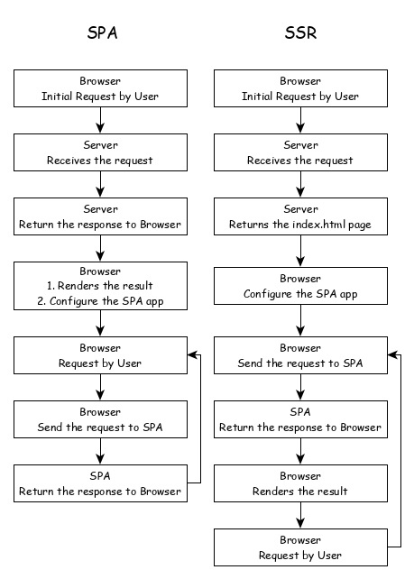
Server side Rendering (SSR) is a modern technique to convert a Single Page Application (SPA) running in the browser into a server based application. Usually, in SPA, the server returns a simple index.html file with the reference to the JavaScript based SPA app. The SPA app take over from there, configure the entire application, process the request and then send the final response.
But in SSR supported application, the server as well do all the necessary configuration and then send the final response to the browser. The browser renders the response and start the SPA app. SPA app takeover from there and further request are diverted to SPA app. The flow of SPA and SSR is as shown in below diagram.
Converting a SPA application to SSR provides certain advantages and they are as follows −
Speed: First request is relatively fast. One of the main drawback of SPA is slow initial rendering. Once the application is rendered, SPA app is quite fast. SSR fixes the initial rendering issue.
SEO Friendly: Enables the site to be SEO friendly. Another main disadvantage of SPA is not able to crawled by web crawler for the purpose of SEO. SSR fixes the issue.
Angular Universal
To enable SSR in Angular, Angular should be able to rendered in the server. To make it happen, Angular provides a special technology called Angular Universal. It is quite new technology and it is continuously evolving. Angular Universal knows how to render Angular application in the server. We can upgrade our application to Angular Universal to support SSR.
Web workers enables JavaScript application to run the CPU-intensive in the background so that the application main thread concentrate on the smooth operation of UI. Angular provides support for including Web workers in the application. Let us write a simple Angular application and try to use web workers.
Create a new Angular application using below command −
app refers the location of the web worker to be created.
Angular CLI will generate two new files, tsconfig.worker.json and src/app/app.worker.ts and update three files, tsconfig.app.json, angular.json and src/app/app.component.ts file.
tsconfig.worker.json extends tsconfig.json and includes options to compile web workers.
// tsconfig.app.json [only a snippet]"exclude":["src/test.ts","src/**/*.spec.ts","src/**/*.worker.ts"]
Here,
Basically, it excludes all the worker from compiling as it has separate configuration.
// angular.json (only a snippet) "webWorkerTsConfig": "tsconfig.worker.json"
Here,
angular.json includes the web worker configuration file, tsconfig.worker.json.
// src/app/app.worker.tsaddEventListener('message',({ data })=>{const response =worker response to ${data};postMessage(response);});
Here,
A web worker is created. Web worker is basically a function, which will be called when a message event is fired. The web worker will receive the data send by the caller, process it and then send the response back to the caller.
// src/app/app.component.ts [only a snippet]if(typeof Worker !=='undefined'){// Create a newconst worker =newWorker('./app.worker',{ type:'module'});
   worker.onmessage=({ data })=>{console.log(page got message: ${data});};
   worker.postMessage('hello');}else{// Web Workers are not supported in this environment.// You should add a fallback so that your program still executes correctly.}
Here,
AppComponent create a new worker instance, create a callback function to receive the response and then post the message to the worker.
Restart the application. Since the angular.json file is changed, which is not watched by Angular runner, it is necessary to restart the application. Otherwise, Angular does not identify the new web worker and does not compile it.
Let us create Typescript class, src/app/app.prime.ts to find nth prime numbers.
worker.onmessage=({ data })=>{this.prime10000 = data;};
worker.postMessage(10000);}else{// Web Workers are not supported in this environment.// You should add a fallback so that your program still executes correctly.}}}</pre>
Here,
find10thPrimeNumber is directly using the PrimeCalculator. But, find10000thPrimeNumber is delegating the calculation to web worker, which in turn uses PrimeCalculator.
Change the AppComponent template, src/app/app.commands.html and include two option, one to find 10th prime number and another to find the 10000th prime number.
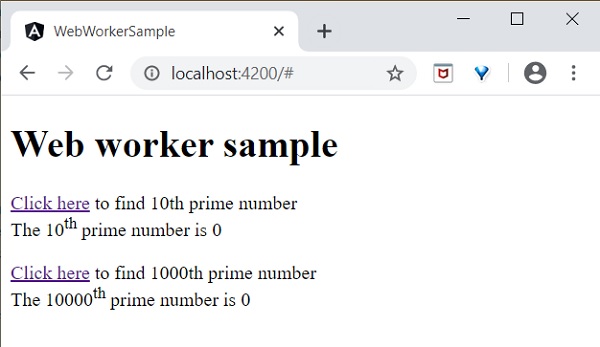
<h1>{{ title }}</h1><div><a href="#"(click)="find10thPrimeNumber()">Click here</a> to find 10th prime number<div>The 10<sup>th</sup> prime numberis{{ prime10 }}</div><br/><a href="#"(click)="find10000thPrimeNumber()">Click here</a> to find 10000th prime number<div>The 10000<sup>th</sup> prime numberis{{ prime10000 }}</div></div>
Here,
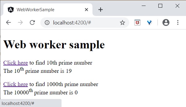
Finding 10000th prime number will take few seconds, but it will not affect other process as it is uses web workers. Just try to find the 10000th prime number first and then, the 10th prime number.
Since, the web worker is calculating 10000th prime number, the UI does not freeze. We can check 10th prime number in the meantime. If we have not used web worker, we could not do anything in the browser as it is actively processing the 10000th prime number.
The result of the application is as follows −
Initial state of the application.
Click and try to find the 10000th prime number and then try to find the 10th prime number. The application finds the 10th prime number quite fast and shows it. The application is still processing in the background to find the 10000th prime number.
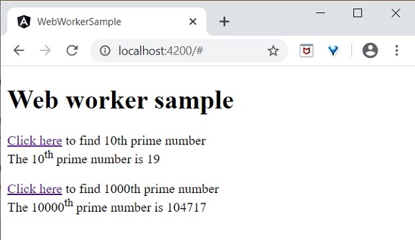
Both processes are completed.
Web worker enhances the user experience of web application by doing the complex operation in the background and it is quite easy to do it in Angular Application as well.
Accessibility support is one of the important feature of every UI based application. Accessibility is a way of designing the application so that, it is accessible for those having certain disabilities as well. Let us learn the support provided by Angular to develop application with good accessibility.
While using attribute binding, use attr. prefix for ARIA attributes.
Use Angular material component for Accessibility. Some of the useful components are LiveAnnouncer and cdkTrapFocu.
Use native HTML elements wherever possible because native HTML element provides maximum accessibility features. When creating a component, select native html element matching your use case instead of redeveloping the native functionality.
Use NavigationEnd to track and control the focus of the application as it greatly helps in accessibility.
In Angular, Standalone components provide a simplified way to build Angular applications. As the name suggests, standalone components are independent and do not rely on other modules or components.
Note! Yes, standalone components are independent; they no longer depend on the @NgModule. If you try to import a standalone component into an @NgModule, you might encounter errors
Important! The Standalone components were introduced in Angular version 14. Learn more about Angular’s various versions: See more
Standalone components are suitable for small applications that do not require module dependencies. However, when developing a large or complex application with mandatory dependencies for components, this becomes a drawback for standalone components.
Important! Any existing angular applications can optionally and incrementally adopt the new standalone style without any breaking changes.
Standalone vs Non-Standalone Components
Below is a list which differentiate between standalone and non-standalone component:
Standalone
Non-Standalone
Independent: Standalone components do not depend on @NgModule.
Module Dependency: These components must be declared in an @NgModule to be used.
Simplified Structure: Ideal for creating reusable components, directives, or pipes without the need to involve Angular modules.
Complex Structure: Suitable for larger, more complex applications where components are part of a bigger module structure.
The standalone @Component directive contains standalone: true and imports: [].
The non-standalone component does not include these configurations.
How to Create a Standalone Component?
To create an standalone component in your angular application, you need to run the following command:
ng generate component component_name
In the latest version of Angular, this command will automatically create a standalone component, as the application itself supports standalone components by default.
However, in older versions of Angular, running the above command may not create a standalone component. In that case, we need to use the following command or manually set the standalone property and specify the imports.
ng generate component component_name --standalone
The standalone component initial data will look like:
import{ Component}from'@angular/core';@Component({
  selector:'app-root',
  standalone:true,
  imports:[],
  templateUrl:'./app.component.html',
  styleUrl:'./app.component.css'})exportclassAppComponent{
  title ='my-crud-app';}
Here,
The standalone: true property identifies this component as a standalone component.
The imports array is where you can add all the required dependencies for this component.
Verify the Standalone Components
You might be wondering how to determine if a component is standalone. To verify if a component is standalone in Angular, you can check using the following guide lines:
Standalone Property: Check the standalone property in the component’s TypeScript file (.ts file). If the standalone property is set to true, then it’s a standalone component.
Importing Standalone Component: If you try to import the standalone component into a non-standalone module, it should throw an error:
Component imports must be standalone component
Advantages of Standalone Components
Below is a list of some advantages of the Standalone components:
Reusability: These components are self-contained, making them easy to reuse in different parts of the application without any module dependency.
Faster Development: As there is no need to import within the modules, developers can quickly create and integrate new components, speeding up the development process.
Modularity: The Standalone components enable a modular approach, allowing for better organization and maintainability of the codebase.
Internationalization (i18n) is a must required feature for any modern web application. Internationalization enables the application to target any language in the world. Localization is a part of the Internationalization and it enables the application to render in a targeted local language. Angular provides complete support for internationalization and localization feature.
Let us learn how to use Internationalization in Angular by creating a simple hello world application in different languages.
Internationalization in Angular
Follow the steps given below to enable internationalization in Angular:
Step 1: Create a new Angular application using below command −
ng newi18n-sample
Step 2: Navigate to the app folder using the given command −
cd i18n-sample
Step 3: Change the AppComponent’s template as specified below −
<h2>{{ title }}</h2><div>Hello</div><div>The Current time is {{ currentDate | date :'medium'}}</div>
Step 4: Add localize module using below command −
ng add @angular/localize
Step 5: The LOCALE_ID is the Angular variable to refer the current locale. By default, it is set as en_US. Let us change the locale by using useValue: ‘hi’ (for Hindi) in the providers array of app.component.ts. Import the locale data from @angular/common/locales/hi and then, register it using registerLocaleData method. Also, define a local variable named CurrentDate and set current time using Date.now() as specified below:
Authentication is the process matching the visitor of a web application with the pre-defined set of user identity in the system. In other word, it is the process of recognizing the users identity. Authentication is very important process in the system with respect to security.
Authorization is the process of giving permission to the user to access certain resource in the system. Only the authenticated user can be authorized to access a resource.
Let us learn how to do Authentication and Authorization in Angular application in this tutorial.
Guards in Routing
In a web application, a resource is referred by url. Every user in the system will be allowed access a set of urls. For example, an administrator may be assigned all the url coming under administration section.
As we know already, URLs are handled by Routing. Angular routing enables the urls to be guarded and restricted based on programming logic. So, a url may be denied for a normal user and allowed for an administrator.
Angular provides a concept called Router Guards which can be used to prevent unauthorized access to certain part of the application through routing. Angular provides multiple guards and they are as follows:
CanActivate: Used to stop the access to a route.
CanActivateChild: Used to stop the access to a child route.
CanDeactivate: Used to stop ongoing process getting feedback from user. For example, delete process can be stop if the user replies in negative.
Resolve: Used to pre-fetch the data before navigating to the route.
CanLoad: Used to load assets.
Working Example
In this example, we are going to add login and logout functionality to an angular application and secure it using CanActivate guard. Follow the given steps:
Step 1: Create an angular application using the following command −
ng newnew-app
Step 2: Now, navigate to project root folder.
cd new-app
Step 3: Next, we include the Bootstrap into our new-app application using styles option and change the default template to use Bootstrap components. Use the below command to install Bootstrap and JQuery in the project −
npm install --save bootstrap jquery
Now, open angular.json file and set bootstrap and jquery library path −
scripts option is used to include JavaScript library.
Step 4: Create a new service named AuthService to authenticate the user. The command given below will create a service with the name auth inside Services folder.
ng generate service Services/auth
On successful creation of service, you may see the below output on Angular CLI −
import{ Injectable }from'@angular/core';import{ Observable,of, BehaviorSubject }from'rxjs';import{ tap, delay }from'rxjs/operators';
@Injectable({
providedIn:'root'})exportclassAuthService{// Track login state with BehaviorSubjectprivate isUserLoggedInSubject =newBehaviorSubject<boolean>(false);constructor(){// Only initialize sessionStorage on the client-side (browser)if(typeof window !=='undefined'&& window.sessionStorage){const storedLoginState = sessionStorage.getItem('isUserLoggedIn')==='true';this.isUserLoggedInSubject.next(storedLoginState);}}login(userName: string, password: string): Observable<boolean>{const isLoggedIn = userName ==='admin'&& password ==='admin';if(typeof window !=='undefined'&& window.sessionStorage){
sessionStorage.setItem('isUserLoggedIn', isLoggedIn ?'true':'false');}// Update the BehaviorSubject with new login statethis.isUserLoggedInSubject.next(isLoggedIn);returnof(isLoggedIn).pipe(delay(1000),tap(val=> console.log("Is User Authentication successful: "+ val)));}logout():void{if(typeof window !=='undefined'&& window.sessionStorage){
sessionStorage.removeItem('isUserLoggedIn');}// Update the BehaviorSubject to false when logged outthis.isUserLoggedInSubject.next(false);}// Expose the login status as an observablegetisUserLoggedIn$(): Observable<boolean>{returnthis.isUserLoggedInSubject.asObservable();}}</pre>
Here,
We have written two methods, login and logout.
The purpose of the login method is to validate the user and if the user successfully validated, it stores the information in localStorage and then returns true.
Authentication validation is that the user name and password should be admin.
We have not used any backend. Instead, we have simulated a delay of 1s using Observables.
The purpose of the logout method is to invalidate the user and removes the information stored in localStorage.
Step 6: Create a login component using below command −
ng generate component login
Following output will be produced on running the above code −
next: ActivatedRouteSnapshot,
state: RouterStateSnapshot): boolean | UrlTree {let url: string = state.url;returnthis.checkLogin(url);}checkLogin(url: string):true| UrlTree {
console.log("Url: "+ url);// Check if sessionStorage is available (only in the browser)if(typeof window !=='undefined'&& window.sessionStorage){let val = sessionStorage.getItem('isUserLoggedIn');// Check if the value is 'true'if(val ==="true"&& val !=null){// If the user is already logged in and trying to access the login page, redirect to /expensesif(url ==="/login"){returnthis.router.parseUrl('/expenses');}else{returntrue;// User is allowed to proceed}}else{// If the user is not logged in, redirect to /loginreturnthis.router.parseUrl('/login');}}// In case sessionStorage isn't available (for SSR)returnthis.router.parseUrl('/login');}}</pre>
Here,
checkLogin will check whether the localStorage has the user information and if it is available, then it returns true.
If the user is logged in and goes to login page, it will redirect the user to expenses page
If the user is not logged in, then the user will be redirected to login page.
Step 14: Let's add a new component in our application. User will be redirected to this page on successful login.
Here, the command creates the ExpenseEntryList Component and add the necessary code by default.
Step 15: Create a ExpenseEntry interface within src/app/expense-entry-list.component.ts file. Then, add a method named getExpenseEntries() to return list of expense entry (mock items) in ExpenseEntryListComponent. Also, declare a local variable, expenseEntries and load the mock list of expense entries.
title ='Angular Authentication';
isUserLoggedIn: any =false;
router: any;constructor(private authService: AuthService){}ngOnInit(){// Subscribe to the isUserLoggedIn observable from AuthServicethis.authService.isUserLoggedIn$.subscribe(status=>{this.isUserLoggedIn = status;
console.log("Is User Logged In: ",this.isUserLoggedIn);});}logout():void{// Trigger logout in AuthServicethis.authService.logout();// Redirect to the homepage after logoutthis.router.navigate(['/']);}}</pre>
Here, we have added the logic to identify the user status so that we can show login/logout functionality.
Step 20: Start the application using following command −
ng serve
Enter admin as username and password and then, click submit. The application process the login and redirects the user to expense list page as shown below −
A Signal is a wrapper around a value that notifies interested consumers when that value changes. A signal can contain any value, from primitives to complex data structures.
In Angular, Signals are a system (or reactive primitives) that granularly (closely) tracks and updates how and where your state is used throughout the application, allowing the framework to optimize rendering updates.
When a signal value changes, it automatically triggers updates to any dependent components or services that are observing it. For example:
// Declaring a regular variable
count1:number=0;// Declaring a variable using signals
count2 =signal(0);
In this case, count1 will not automatically reflect the latest value when it changes. However, count2, which is a signal, will automatically update and reflect the latest value whenever it changes.
Important! In Angular, the signals were introduced in version 16.0 and became stable in version 17.0.
Note:  To read a signal, you need to call its getter function, which allows angular to track where the signal is used. The signals in angular may be either writable or read-only.
Reactive Primitives in Angular Signals
Here is a list of the commonly used Signals or reactive primitives (constructs) in Angular:
In Angular, the writable signals are specific types of signals that allow you to “modify the value directly”. In addition, they are used to represent the value that can be changed.
These signals provide an API for “updating their values directly”. You can create writable signals by calling the signal function with the signal’s initial value.
Syntax
Following is the syntax of the Angular Writable Signal −
count =signal(initial_value =0);
Here,
The count is a variable whose “initial signal value” is 0 (can be any value).
Signal() is a constructor that “defines the writable signal”.
Here are “two” commonly used methods to set or update the writable signal value:
set()
update()
The set() method
To “change” the value of the writable signal, you can use the set() method to set it directly.
Syntax
Below is the syntax of the set() method −
//Initializing a signal with an initial value
count.set(initial_value);
Here, count is a variable for which we ‘set’ the initial_value.
The update() method
You can use the update() method or operation to compute a “new value” from the “previous one”.
Syntax
Below is the syntax of the update() method −
count.update(value => value + new_value);
Here, the value is the previous “value”, which will be updated by adding a new_value in it.
Note! The writable signals have the type WritableSignal.
Example of Writable Signal in Angular
We create a Signal with an initial value of 0 using the signal(0) constructor. We will use the set() and update() methods in different functions to “increase” and “decrease” the count value on each click of the given button −
TypeScript code (component.ts)
import{ Component, OnInit, Signal, signal }from'@angular/core';import{ CommonModule }from'@angular/common';import{ RouterOutlet }from'@angular/router';@Component({
  selector:'app-root',
  standalone:true,
  imports:[CommonModule, RouterOutlet],
  templateUrl:'./app.component.html',
  styleUrl:'./app.component.css'})exportclassAppComponent{//declaring a singnal
  count =signal(0);increase(){//using .set() method to increase count valuethis.count.set(this.count()+1);}decrease(){//using .update() method to decrease count valuethis.count.update(value =>this.count()-1);}}
In Angular, the Computed Signals are read-only signals, which means they “can’t be edited” by the user. The computed signals drive their values from other signals (e.g., writable signals).
You can define the Computed signal using the computed() function by specifying the derivation.
Syntax
Following is the syntax of the Angular Computed Signal −
// Initializing a signal with an initial value
count =signal(initial_value);// Creating a computed signal
new_count: Signal<number>=computed(()=>count()+ new_value);
Here,
In the above snippet of code, the new_count signal depends on the count signal, so whenever the count signal updates, angular knows that the new_count also needs to be updated.
Important Points of the Computed Signals
1. Computed signals are both lazily evaluated and memorized
In angular, the Computed (read-only) signals are both lazily evaluated and memorized, so the new_count derivation function does not run to calculate its value until the first time you read the “new_count”.
2. Computed signals are not writable signals
The Computed signals are “not writable signals”, because you can not directly assign values to them as:
new_count.set(10);
The above snippet of code in the application will produce a compilation error because new_count is “not” a Writable Signal.
Example of Computed Signal in Angular
We will create two writable signals named length and breadth with initial values of 20 and 40. Then we will create a Computed signal named area, which will be the “product” of both writable signal −
Note: When the Writable signals (length and breadth) values will change the Computed signal (area) value will change automatically.
Effects
In Angular, the effects is an “operation” that “runs” when “one or more signal values changed” at a time. The effect always runs at least once.
Similar to the Angular signals, effects keep track of their dependencies dynamically.
Hint: The good place to create effects is within the constructor because the effect function requests an “injection context”.
Syntax
Following is the syntax of the Angular effects −
effect(()=>{//statement or expressions....})
effect accepts a “function”, within which will perform all the tasks.
Example of Effect in Angular Signal
We will create “two effects” for count and color signal within the constructor, which will run when one or more signal values change or at least once when the application runs −
TypeScript code (component.ts)
import{ Component, effect, signal }from'@angular/core';import{ CommonModule }from'@angular/common';import{ RouterOutlet }from'@angular/router';@Component({
  selector:'app-root',
  standalone:true,
  imports:[CommonModule, RouterOutlet],
  templateUrl:'./app.component.html',
  styleUrl:'./app.component.css'})exportclassAppComponent{constructor(){//count signaleffect(()=>{console.log("Effect due to count signal is trigger: "+this.count());});//color signaleffect(()=>{console.log("Effect due to color signal is trigger: "+this.color());});}

  count =signal(0);
  color =signal(["red","green"]);display(){this.count.set(30);this.color.update(value =>[...value,"Yellow"]);}}
When the signal “values are not changed”, the effect runs at least once:
When signal “values changed”:
Why to use Signals in Angular?
Here are some points that tell about why to use the Signals in Angular project:
Automatic updates: Signals are automatically update any dependent computed signals or view when their values changes.
Efficient Change Detection: Signals are optimized for minimal change detection cycles, which enhance the application performance.
Composable Logic: Signals and computed signals can be used together to build complex reactive logic in a flexible and reusable manner.
Advantages of Signals in Angular
Below is a list of the advantages of the Angular Signals −
Signals make Angular lighter and point the way to a future without Zone.js (used for change detection). They enable Angular to find out about components that need to be updated directly.
We will be notified when the signal value changes, and then do something in response to the new signal value.
It is avoiding unnecessary checks of components whose data didn’t change.
In computing, Reactive programming is a way of writing code, where you deal with “data streams” and “changes automatically”. It is telling the computer what you want to do, rather than how to do it step by step. This approach helps you to keep your program structured and easier to understand for others.
Example
In the following example we use the reactive programming, so the value of variable a is automatically updated whenever the values of b or c change, without the program having to explicitly re-state the statement a := b + c to re-assign the value of a:
//normal programvar b =5;var c =7;var a = b + c;
b =5;console.log(a);// 12//reactive programvar b =5;var c =7;var a $= b + c;
b =5;console.log(a);// 17
The other one is a reactive program, which emits real-time updates when the related or its own value propagates (changed).
How does Reactive Programming work?
Reactive programming is a programming paradigm that deals with asynchronous data streams and the propagation of changes. It allows developers to model and manage data flows in a better way. It is simplifying the handling of asynchronous tasks such as UI updates, event handling, and managing data that changes over time.
What is RxJS?
The RxJS stands for “Reactive Extensions for JavaScript”, which is a library for “reactive programming” using observable’s that make easier to compose “asynchronous” or “callback-based” code.
In addition, the RxJS library is used to compose the “asynchronous” and “event-based” programs by using observable sequences. It provides one core type, the “Observable”, “satellite” types (Observer, Schedulers, Subjects), and “operators” inspired by Array methods (map, filter, reduce, every, etc) to allow handling asynchronous events as collections.
Note! Asynchronous data refers to data that is processed or retrieved at different times, rather than in a sequential or synchronous manner.
Key Concepts
Here are some key concepts of the RxJS library that solve Async event management:
Observable: An Observable in Angular is a key part of reactive programming, providing support for passing messages (data) between publishers and subscribers asynchronously.
Observer: It is a collection of callbacks that knows how to “listen” to values delivered by the Observable.
Subscription: It represents the “execution of an Observable” and is primarily used to cancel the execution.
Operators: These are the pure functions that enable a functional programming style of dealing with collections with operations like map, filter, concat, reduce, etc.
Subject It’s “equivalent to an EventEmitter“, and it is the only way of multicasting a value or event to multiple Observers.
Schedulers: These are “centralized dispatchers” that control concurrency, allowing us to coordinate when computation happens.
This library also provides utility functions for creating and working with “observables”. These utility functions can be used for:
Converting existing code for async operations into observables.
Iterating through the values in a stream.
Mapping values to different types.
Filtering streams.
Composing multiple streams.
Examples of RxJS
Here are a few examples that help you understand the “RxJS library”, “observable concept”, and “reactive programming” better:
Example 1: Register Event Listener
In HTML, you normally register an event listener using the addEventListener() method as:
The scan operator in RxJS works similarly to the reduce() function for arrays. It takes an initial value and a callback. Each time the callback runs, it returns a value that will be used as the input for the next iteration.
Using RxJS with Angular
The RxJS library provides several functions that can be used to “create new Observable” in Angular Project.
These functions can simplify the process of creating observables from various sources such as events, timers, and promises. For example:
Create an observable from a promise
In the following snippet of code, we create an observable using the from operator with a promise returned by the “fetch API” in Angular −
import{ from, Observable }from'rxjs';// Create an Observable from out of promiseconst data =from(fetch('/api/endpoint'));// Subscribe to start listening for async output
data.subscribe({next(res){console.log(res);},error(err){console.error('Error: '+ err);},complete(){console.log('Completed');}});
Create an observable from a counter
In this example, we will create an observable that emits incrementing numbers every 1000 milliseconds (1 second) in Angular −
import{ interval }from'rxjs';// Create an Observable const secondsCounter =interval(1000);// Subscribe to start interval valuesconst subscription = secondsCounter.subscribe(n =>console.log(It's been ${n + 1} seconds since the subscription started!));
Why to use RxJS in Angular?
Below is the list of several benefits that define why to use RxJS Library in Angular:
Reactive Programming: It allows for Reactive programming, which makes it easier to simplify the asynchronous code.
Error Handling:RxJS provides robust error-handling mechanisms, allowing you to smoothly handle and recover from errors in your asynchronous operations.
Data Transfer: Using the RxJS operators, you can easily transform data streams, such as mapping, filtering, and reducing data.
Angular Integration: Angular has built-in support for RxJS, and many Angular modules, such as HttpClient, are designed to work easily with observables.
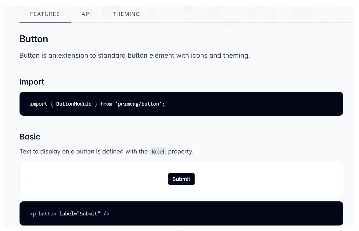
PrimeNG is a cohesiveUI component library specifically designed for Angular applications. It provides a collection of ready-to-use UI components (e.g., themes, icons, and components) such as “input fields,” “buttons,” “tables,” “lists,” “cards,” etc, for building user interfaces. It allows developers to integrate these into their applications rather than building them from scratch.
However, PrimeNG is not directly compatible with “React”, “Vue”, or other front-end frameworks, as it is designed for Angular.
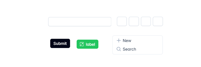
Here are a few UI components of the PrimeNG library which code you can directly use in your angular application:
Why to use a PrimeNG in Angular?
Here are several reasons to use the PrimeNG library in your Angular project:
Easy Integration:PrimeNG is very easy to integrate with your Angular application.
Responsive and Mobile-friendly: Angular applications developed using PrimeNG UI components are very compatible and responsive across various screen sizes.
OpenSource & paid version:PrimeNG offers a free version with many useful and powerful components and a premium version (i.e., paid) as well for the advanced features.
Frequent Updates: The library is actively maintained and regularly updated, which enables the latest features with best practices.
Installations and Setups
The PrimeNG UI Component library is a third-party library. To use its components in your application or project, you need to install it and add all the required dependencies first; only then can you use it.
Here is a step-by-step process for installing the PrimeNG library in your project:
Step 1: Use the following command to install the PrimeNG library in your Angular project:
npm install primeng@<version>
Here, @<version> refers to the version you want to install, which should be compatible with your project. For example: npm install [email protected].
Important! If you do not specify a specific version, it might throw an error because the project version could be different from the version of the library you are installing when using the simple npm install primeNG command without specifying a version.
Step 2: Open the angular.json file and add the code below within the styles section, in both the build and test sections:
After completing the above steps, the installation is done, and now we are ready to use the PrimeNG library components in our project.
Use the following command to install PrimeNG icons, which provide different icons such as “social media icons”, “trash”, “view”, “edit” icons, etc., and add the same inside the styles section:
npm install primeng@version primeicons
How to use PrimeNG in our Project?
Follow these steps to use the PrimeNG components in your application as needed:
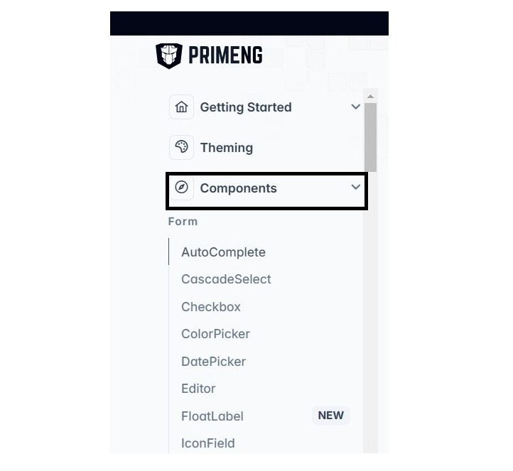
Step 1: Open the primeNG website and explore all the components:
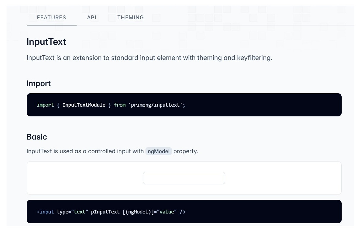
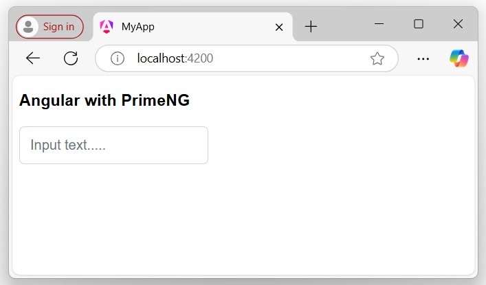
Adding InputText Component
InputText is an extension to a standard input element with “theming” and “keyfiltering”. To add the InputText component to your project template, you need to follow these steps:
Step 2: Open the InputText component documentation on the PrimeNG website that you want to use it in your template:
Step 3: Import and add the InputText component API in your component or module to access and use it in your template:
Angular Material is a UI component library developed by the Angular team to integrate easily with your Angular applications. This library is “specific” to the Angular framework and provides a set of reusable, accessible, well-tested components that help create a responsive modern user interface (UI).
It also provides tools that help developers to create custom UI components with common interaction patterns. Angular applications developed using Angular Material components ensure “responsiveness” on different screen sizes, such as “phones”, “tablets”, and “laptops”.
Notes! Angular Material provides a huge collection of high-quality and ready-made Angular components based on Material Design, such as input fields, forms, buttons, cards, tables, lists, etc.
Let us learn how to install Angular Material Library in your Angular project and how to use its components.
Important! This guide assumes that an Angular application has already been created and the Angular CLI has already been installed.
How to Install Angular Material in an Angular Project?
To install Angular Material Library in your Angular project or application, ensure that the Angular CLI is already installed and that the application has been created successfully.
Follow the steps given below and implement each step in your existing project one by one to install Angular Material Library:
Step 1: Open any “existing Angular project” in your preferred code editor (e.g., vs code) −
cd /go/to/materialApp
Here, materialApp is your project folder name.
Step 2: Open the terminal in your editor and go to the application directory −
cd material-app
Step 3: Add Angular Material to your application by running the following command −
ng add @angular/material
The ng add command will “install Angular Material” in your application.
Once you run the above command, Angular CLI will ask certain questions regarding “theme”, “gesture recognition”, and “browser animations”.
Select any theme of your choice and then answer positively for gesture recognition and browser animation.
â Packages successfully installed.
? Choose a prebuilt theme name, or "custom" for a custom theme: (Use arrow keys)
> Indigo/Pink [Preview: https://material.angular.io?theme=indigo-pink]
Deep Purple/Amber [Preview: https://material.angular.io?theme=deeppurple-amber]
Pink/Blue Grey [Preview: https://material.angular.io?theme=pink-bluegrey]
Purple/Green [Preview: https://material.angular.io?theme=purple-green]
Custom
? Choose a prebuilt theme name, or "custom" for a custom theme: Indigo/Pink
Set up “global Angular Material typography” styles:
? Set up global Angular Material typography styles? Yes
Include browser animations for Angular Material:
? Include the Angular animations module? (Use arrow keys)
> Include and enable animations
  Include, but disable animations
  Do not include
Hint! To choose different options use the down arrow key in your keyboard.
Set up “browser animations” for Angular Material:
Importing the BrowserAnimationsModule into your application enables Angular’s animation system.
Once the Material gets installed successfully you will be able to see the message below:
Step 5: Go to the examples section and you will see various examples of button components:
Step 6: Open the AppComponent (i.e., app.component.htm) and place the code below to see the different types of buttons:
<h2>Welcome to Angular Material Example</h2><button mat-button>Basic</button><button mat-raised-button>Basic</button><button mat-button disabled>Disabled</button><button mat-flat-button>Basic</button>
Here,
mat-button is the class name for the “basic button”.
mat-button disabled is the class name for the ‘disabled button.
Step 6: Run your application to see the changes:
ng serve
Then navigate your browser to http://localhost:4200 URL.
Here, the application clearly shows the Angular different Material buttons.
List of Common used Components
Below is the some of the important UI elements provided by Angular Material package:
UI Element
Description
Form field
The <mat-form-field> is a component used to wrap several Angular Material components.
Input
The matInput is a directive that allows native <input> and <textarea> elements to work with <mat-form-field>.
Checkbox
The <mat-checkbox> provides the same functionality as a native <input type=”checkbox”> enhanced with Material Design styling and animations.
Radio button
The <mat-radio-button> provides the same functionality as a native <input type=”radio”> enhanced with Material Design styling and animations.
Select
The <mat-select> is a form control for selecting a value from a set of options, similar to the native <select> element.
Button
The Angular Material buttons are native <button> or <a> elements enhanced with Material Design styling and ink ripples.
DatePicker
The datepicker allows users to enter a date either through text input, or by choosing a date from the calendar.
List
The <mat-list> is a container component that wraps and formats a series of <mat-list-item>.
Card
The <mat-card> is a content container for text, photos, and actions in the context of a single subject.
Grid list
The mat-grid-list is a “two-dimensional” list view that arranges cells into “grid-based” layout.
Table
The mat-table provides a Material Design styled data-table that can be used to display rows of data.
Paginator
The <mat-paginator> provides navigation for paged information, typically used with a table.
Tabs
Angular Material tabs organize content into separate views where only one view can be visible at a time.
Toolbar
The <mat-toolbar> is a container for “headers”, “titles”, or “actions”.
Menu
The <mat-menu> is a floating panel containing list of options.
Dialog
The MatDialog service can be used to “open modal dialogs” with Material Design styling and animations.
Snackbar
The MatSnackBar is a service for displaying snack-bar notifications.
Progress bar
The <mat-progress-bar> is a horizontal progress-bar for indicating progress and activity.
Icon
The mat-icon makes it easier to use vector-based icons in your app.
Divider
The <mat-divider> is a component that allows for Material styling of a line separator with various orientation options.
Why to use Angular Material?
Use Angular Material because it provides built-in UI components that are easy to integrate with Angular applications, saving developers time by offering ready-to-use elements like “buttons”, “cards”, and “input” fields. It also ensures the application is “responsive” and fully functional across various screen sizes.