Author: saqibkhan

  • Installation

    To develop a web application using Ruby on Rails Framework, you need to install the following software −

    • Ruby
    • The Rails Framework
    • A Web Server
    • A Database System

    Ruby is a programming language, whereas Rails is a web development framework built on Ruby. Rails includes a built-in web server called Puma for local development purposes. For Production: You’ll need a proper web server setup like Puma with Nginx, lightTPD or Apache.

    Rails works with many database systems, including MySQL, PostgreSQL, SQLite, Oracle, DB2 and SQL Server. Please refer to a corresponding Database System Setup manual to set up your database.

    Let’s look at the installation instructions for:

    • Linux (Ubuntu)
    • Windows
    • macOS

    Installing Rails on Linux (Ubuntu)

    We are installing Ruby on Rails on Ubuntu Linux using RVM (Ruby Version Manager). You can also use rbenv, it is also a lightweight Ruby Version Management Tool.

    • RVM Installs Ruby in its own environment. It provides built-in gemset support.
    • On the other hand, rbenv provides an easy installation, it works by shimming Ruby versions into PATH, but requires additional plugins for gemsets.

    Follow the steps given below to install Ruby on Rails using RVM tool.

    Update System Packages

    Start by updating the system package list and upgrading existing packages −

    $ sudo apt update && sudo apt upgrade -y
    

    Install Dependencies

    Install the required dependencies for Ruby and Rails −

    $ sudo apt install -y curl gnupg2 dirmngr git-core zlib1g-dev build-essential \
    libssl-dev libreadline-dev libyaml-dev libsqlite3-dev sqlite3 \
    libxml2-dev libxslt1-dev libcurl4-openssl-dev software-properties-common \
    libffi-dev
    

    It installs the general development tools, libraries for Rails, XML and HTML Processing, networking and software management.

    You also need to install Node.js. Rails uses Node.js to handle JavaScript assets. Installation of Yarn is optional, used for managing JavaScript dependencies in Rails projects.

    Install the latest version of Node.JS −

    $ curl -fsSL https://deb.nodesource.com/setup_22.x | sudo -E bash 
    $ sudo apt install -y nodejs
    

    Install Ruby Version Manager RVM

    $ gpg2 --keyserver hkp://keyserver.ubuntu.com --recv-keys 
    409B6B1796C275462A1703113804BB82D39DC0E3 
    7D2BAF1CF37B13E2069D6956105BD0E739499BDB
    

    Load RVM into your Shell

    $ source ~/.rvm/scripts/rvm
    

    Install Ruby

    $ rvm install 3.4.1
    $ rvm use 3.4.1--default
    

    Check the Ruby version

    $ ruby -v
    	ruby 3.4.1(2024-12-25 revision 48d4efcb85)+PRISM[x86_64-linux]

    Installation using rbenv

    If you prefer using rbenv, then install rbenv and ruby-build &minus

    $ git clone https://github.com/rbenv/rbenv.git ~/.rbenv
    $ echo 'export PATH="$HOME/.rbenv/bin:$PATH"'>>~/.bashrc
    $ echo 'eval "$(rbenv init -)"'>>~/.bashrc
    $ source ~/.bashrc
    $ git clone https://github.com/rbenv/ruby-build.git ~/.rbenv/plugins/ruby-build
    

    Now, install Ruby −

    $ rbenv install 3.2.2
    $ rbenv global 3.2.2

    Verify the Ruby version −

    $ ruby -v
    	ruby 3.4.1(2024-12-25 revision 48d4efcb85)+PRISM[x86_64-linux]

    Install Bundler

    Bundler is used to manage gems in Rails projects −

    $ gem install bundler
    Fetching bundler-2.6.3.gem
    Successfully installed bundler-2.6.31 gem installed
    

    You can now install Rails

    $ gem install rails
    

    Verify the installation

    $ rails -v
    Rails8.0.1

    Installing Rails on Windows

    The recommended way to install Ruby on Rails on Windows is to use the Windows Subsystem for Linux (WSL). Alternately, you can install Ruby by Using RubyInstaller for Windows and then install Rails on it.

    Installation Using WSL

    Windows Subsystem for Linux (WSL) is a new feature of Microsoft Windows with which you can use a Linux environment without the need for a separate virtual machine or dual booting. WSL is installed by default in Windows 11. It can also be enabled on Windows 10 by turning on the Virtual Machine Platform.

    Open PowerShell or Windows Command Prompt and run −

    $ wsl --install --distribution Ubuntu-24.04

    You may need to reboot during the installation process. You can now open Ubuntu from the Start menu. Enter a username and password for your Ubuntu user when prompted.

    To run a command as administrator (user "root"), use "sudo <command>".See"man sudo_root"for details.Welcome to Ubuntu24.04.1LTS(GNU/Linux5.15.167.4-microsoft-standard-WSL2 x86_64)
    
    lathkar@GNVBGL3:~$
    

    You can now install Ruby and Ruby on Rails, by following the steps explained in the previous section (Installation on Ubuntu Linux)

    Installation Using RubyInstaller

    This Method offers a simpler alternative, its a native Windows installation without requiring WSL. Hence you dont need to switch between Windows and WSL. This is especially suitable for smaller projects or learning Rails. RubyInstaller for Windows installs Ruby for system-wide use by default and not a virtual environment (RVM or rbenv)

    Go to the RubyInstaller website and download the recommended version from https://rubyinstaller.org/downloads/. Ruby+Devkit 3.3.7.1 version is a stable version, hence download and install the same.

    Installation Using RubyInstaller

    During installation, ensure the MSYS2 development toolchain option is selected. MSYS2 is a software distribution and development environment for Windows that provides a minimal Linux-like shell and a package management system.

    After the wizard steps are completed, the command terminal open up and asks you to install MSYS2 and MINGW toolchains.

    RubyInstaller

    You should run the ridk enable command before installing Rails when using RubyInstaller on Windows. This step ensures that the MSYS2 development toolchain and its environment are properly set up, allowing Ruby and Rails to work seamlessly.

    C:\Users\mlath>ridk enable
    

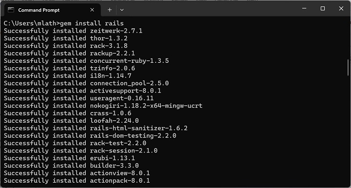
    Now you can install Rails using the gem install rails command −

    Gem Install Rails

    Check the Rails version −

    C:\Users\mlath>rails -v
    Rails8.0.1

    Installing Rails on MacOS

    The macOS environment is very much like Unix. You need to install Xcode Command Line Tools, which include essential tools like git and make.

    xcode-select install
    

    Install Homebrew

    Homebrew is a package manager for macOS that simplifies installing software.

    /bin/bash -c "$(curl -fsSL https://raw.githubusercontent.com/Homebrew/install/HEAD/install.sh)"

    The subsequent steps of installation of RVM/rbenv, Ruby and Rails are similar to those explained in the installation of Ubuntu Linux section.

    Installation Verification

    After performing the installation by following the steps explained above, you can test the installation by creating a new Rails app with the following command −

    $ rails new myapp
    
    Installation Verification

    Navigate into the app directory −

    cd myapp
    

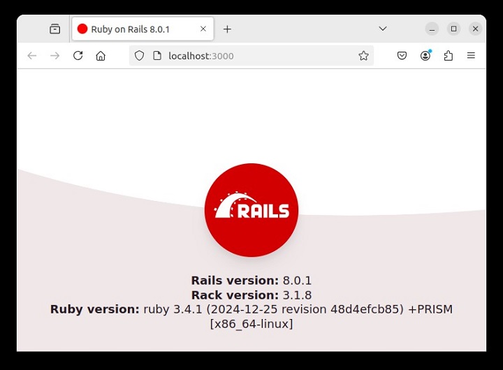
    Start the Rails server with the following command −

    bin/rails server
    

    Visit http://localhost:3000 in your browser to see the Rails welcome page.

    Installation Verification

    To stop the server, press “Ctrl + C”.

    ^C-Gracefully stopping, waiting for requests to finish
    === puma shutdown:2025-01-2700:48:24+0530===-Goodbye!Exiting

    You have thus successfully installed Ruby on Rails on your system.

  • Introduction

    What is Ruby?

    Before we ride on Rails, let us recapitulate a few points of Ruby, which is the base of Rails.

    Ruby is the successful combination of −

    • Smalltalk’s conceptual elegance,
    • Python’s ease of use and learning, and
    • Perl’s pragmatism.

    Ruby is −

    • A high-level programming language.
    • Interpreted like Perl, Python, Tcl/TK.
    • Object-oriented like Smalltalk, Eiffel, Ada, Java.

    Why Ruby?

    Ruby originated in Japan and now it is gaining popularity in US and Europe as well. The following factors contribute towards its popularity −

    • Easy to learn
    • Open source (very liberal license)
    • Rich libraries
    • Very easy to extend
    • Truly object-oriented
    • Less coding with fewer bugs
    • Helpful community

    Although we have many reasons to use Ruby, there are a few drawbacks as well that you may have to consider before implementing Ruby −

    • Performance Issues − Although it rivals Perl and Python, it is still an interpreted language and we cannot compare it with high-level programming languages like C or C++.
    • Threading model − Ruby does not use native threads. Ruby threads are simulated in the VM rather than running as native OS threads.

    Sample Ruby Code

    Here is a sample Ruby code to print “Hello Ruby”

    # The Hello ClassclassHellodefinitialize( name )@name= name.capitalize
       enddefsalute
    
      puts "Hello #{@name}!"endend# Create a new object
    h =Hello.new("Ruby")# Output "Hello Ruby!" h.salute

    Output − This will produce the following result −

    Hello Ruby!
    

    Embedded Ruby

    Ruby provides a program called ERB (Embedded Ruby), written by Seki Masatoshi. ERB allows you to put Ruby codes inside an HTML file. ERB reads along, word for word, and then at a certain point, when it encounters a Ruby code embedded in the document, it starts executing the Ruby code.

    You need to know only two things to prepare an ERB document −

    • If you want some Ruby code executed, enclose it between <% and %>.
    • If you want the result of the code execution to be printed out, as a part of the output, enclose the code between <%= and %>.

    Here’s an example. Save the code in erbdemo.rb file. Note that a Ruby file will have an extension .rb −

    <% page_title ="Demonstration of ERB"%>
    <% salutation = "Dear programmer," %><html><head><title><%= page_title %></title>
       </head>
    	
       <body>
    
      &lt;p&gt;&lt;%= salutation %&gt;&lt;/p&gt;&lt;p&gt;This is an example of how ERB fills out a template.&lt;/p&gt;&lt;/body&gt;&lt;/html&gt;</pre>

    Now, run the program using the command-line utility erb.

    tp> erb erbdemo.rb
    

    This will produce the following result −

    <html><head><title>Demonstration of ERb</title></head><body><p>Dear programmer,</p><p>This is an example  of how ERb fills out a template.</p></body></html>

    What is Rails?

    • An extremely productive web-application framework.
    • Written in Ruby by David Heinemeier Hansson.
    • You could develop a web application at least ten times faster with Rails than you could with a typical Java framework.
    • An open source Ruby framework for developing database-backed web applications.
    • Configure your code with Database Schema.
    • No compilation phase required.

    Full Stack Framework

    • Includes everything needed to create a database-driven web application, using the Model-View-Controller pattern.
    • Being a full-stack framework means all the layers are built to work seamlessly together with less code.
    • Requires fewer lines of code than other frameworks.

    Convention over Configuration

    • Rails shuns configuration files in favor of conventions, reflection, and dynamic runtime extensions.
    • Your application code and your running database already contain everything that Rails needs to know!

    Rails Strengths

    Rails is packed with features that make you more productive, with many of the following features building on one other.

    Metaprogramming

    Where other frameworks use extensive code generation from scratch, Rail framework uses Metaprogramming techniques to write programs. Ruby is one of the best languages for Metaprogramming, and Rails uses this capability well. Rails also uses code generation but relies much more on Metaprogramming for the heavy lifting.

    Active Record

    Rails introduces the Active Record framework, which saves objects into the database. The Rails version of the Active Record discovers the columns in a database schema and automatically attaches them to your domain objects using metaprogramming.

    Convention over configuration

    Most web development frameworks for .NET or Java force you to write pages of configuration code. If you follow the suggested naming conventions, Rails doesn't need much configuration.

    Scaffolding

    You often create temporary code in the early stages of development to help get an application up quickly and see how major components work together. Rails automatically creates much of the scaffolding you'll need.

    Built-in testing

    Rails creates simple automated tests you can then extend. Rails also provides supporting code called harnesses and fixtures that make test cases easier to write and run. Ruby can then execute all your automated tests with the rake utility.

    Three environments

    Rails gives you three default environments: development, testing, and production. Each behaves slightly differently, making your entire software development cycle easier. For example, Rails creates a fresh copy of the Test database for each test run.

  • Ruby on Rails Tutorial

    Ruby on Rails is an extremely productive web application framework written in Ruby. This tutorial gives you a complete understanding on Ruby on Rails.

    What is Ruby on Rails?

    Ruby on Rails (or simply Rails) is a server-side web framework. It follows the MVC (model view controller) pattern for the application development. It is written in Ruby programming language.

    Rails is a full-stack framework that comes with all the tools that facilitate rapid application development. In addition to the web apps, Rails is also used in developing APIs and SaaS (software-as-a-service) applications.

    Ruby on Rails Features

    Some of the important features of Rails are as follows −

    MVC

    MVC stands for Model-View-Controller. It is a well-known software architectural pattern that enables the separation of concerns in an application and hence it makes the code easier to understand and maintain.

    CoC: Convention over Configuration

    Rails follows a set of naming conventions, which allows you to focus on solving business-specific problems. For example, if your code has a model called Employee, Rails associates with the employee table, thus it becomes easier to query the database without explicitly writing SQL queries.

    DRY: Don’t repeat yourself

    Rails follows this established principle in software development, whereby the repetition of same piece of code or information is avoided.

    Scaffolding

    Rails provides this useful feature which lets you generate a standard structure of the project and autogenerates the models, its controllers and the corresponding views for a given resource in a single operation. It is an important feature that greatly contributes to the rapid application development.

    Testing

    Testing the application is an important aspect of web development. Rails offers testing tools such as RSpec and Minitest.

    Installing Ruby on Rails

    Rails can be installed on Windows, Linux as well as MacOS operating systems.

    To develop a Rails application, you need to have Ruby installed on your system, which you can download from https://rubyinstaller.org/downloads/ (for Windows) or for Linux and MacOS, use the gem install command for the purpose.

    Note that you may need to install certain dependencies for Linux and MacOS installation. You can also install Ruby as well as Rails in WSL if using the latest versions of Windows.

    Getting Started with Ruby on Rails

    Make sure that you have installed Ruby and Ruby on Rails on your machine. Create a new Rails app with the following command −

    rails new myapp
    

    Change to the myapp directory and run the following command to create a controller named index and action named index.

    rails generate controller index index
    

    Create a new file in the src folder with the name index_controller.rb and add the index action.

    classIndexController<ApplicationControllerdefindexendend

    Create a Rails template with name index.html.erb and add the following code −

    <h1>Hello World</h1>

    Edit the config/routes.rb file and define a route

    Rails.application.routes.draw do
       root "index#index"end

    Run the Puma server built-in with the Rails installation

    bin/rails server
    

    Visit the URL https://localhost:3000/ to get Hello world text displayed in the browser.

    What is Ruby on Rails Used for?

    Ruby on Rails is used to build web applications and services. It is employed in developing eCommerce sites, social media platforms and other custom web applications. Rails finds its use in building Software as a service (SaaS) application.

    Because of its ease of use and open-source licensing, it is adapted by the startups. An active community of Rails developers is also one of its advantages.

    Who Invented Ruby on Rails?

    David Heinemeier Hansson, a Danish programmer, entrepreneur, and writer is credited as the creator of Ruby on Rails. He extended his work on the project management tool Basecamp into this framework. Hansson first released Rails as open source in July 2004. In 2007, Apple shipped this framework with Mac OS X v10.5 “Leopard”.

    Rails is distributed under the MIT license. https://rubyonrails.org/ is the official website for Ruby on Rails. Its latest version 8.0.1 was released in December 2024.

    How to Check Rails Version?

    To check the Rails version, open a command terminal of your operating system and use the command −

    rails -v
    

    This will display the version of Rails software installed on your system.

    How to Learn Rails?

    Start by setting up your Development environment with Ruby and Rails installed. An extensive Ruby on Rails Guide is available on https://guides.rubyonrails.org/index.html. You can learn Ruby on Rails with the help of several online tutorials including the one at Ruby on Rails.

    Like with any technology, it always helps to keep practicing by building simple projects to reinforce your understanding, gradually adding more advanced features as you progress. Rails is frequently updated. Stay in touch with the latest Rails features and employ them by working on real-world projects or contributing to open-source projects to sharpen your skills.

    Disadvantages of Rails

    Ruby on Rails is an opinionated framework which means it guides you into their way of doing things. Due to its “slow” runtime speed, which makes it harder to scale your RoR applications. Another issue is that the frequent updates to the Rails framework make it difficult to maintain compatibility.

    Skills Required for Becoming a Rails Developer

    To become a Rails developer, you will need strong Ruby programming skills, a solid understanding of web development concepts, proficiency in the functioning of MVC framework (on which Rails is built). You also need to be familiar with databases and SQL, and should be able to work with Git.

    Which Companies Use Ruby on Rails?

    Shopify, a leading e-commerce platform that relies heavily on Ruby on Rails for its backend functionality.

    GitHub is built using Ruby on Rails. It is a popular code hosting platform.

    Rails itself was extracted from the project management tool, Basecamp.

    Ruby on Rails is also used by Airbnb, which is a widely popular online accommodation booking system.

    Careers and Opportunities in Ruby and Rails

    Rails is one of the popular web development frameworks. For someone proficient in Rails there are many career opportunities such as a web developer where you’ll be responsible for building and maintaining web applications. A Rails developer is often required to work on both the front-end and back-end of applications. If you prefer focusing on server-side logic, you can specialize as a back-end developer.

    Proficiency in Ruby and Rails along with good knowledge of HTMLCSS, and JavaScript is essential. You should also be comfortable working with databases like PostgreSQL or MySQL. Another desirable skill is Version Control, API design and application testing.

    Who Should Learn Ruby on Rails

    This tutorial has been designed for beginners who would like to use the Ruby framework for developing database-backed web applications.

    Prerequisites to Learn Ruby on Rails

    You need to have a basic knowledge of Ruby and object-oriented programming to understand this tutorial. In addition, you need to be familiar with internet and websites programming in general.

  • height Property

    CSS height property specifies the height of an element. It determines how tall an element will be, affecting its layout and positioning within the document. The property can be applied to block-level elements, inline-block elements, and replaced elements like images.

    Syntax

    height: auto | length | percentage | min-content | max-content | initial | inherit;

    Property Values

    ValueDescription
    autoThe element expands or contracts based on its content. Default.
    lengthIt sets a fixed height for the element using length units (e.g. px, em, rem etc.)
    percentageIt sets the height as a percentage of the height of the element’s containing block.
    min-contentIt makes the element’s height fit the minimum height required by its content, preventing content from overflowing.
    max-contentIt adjusts the element height to fit the tallest content without wrapping or truncating it.
    initialThis sets the property to its default value.
    inheritThis inherits the property from the parent element.

    Examples of CSS Height Property

    The following examples explain the height property with different values.

    Height Property with Auto Value

    To allow the height of an element to be dependent on the length of its content, we use the auto value. This is shown in the following example.

    Example

    <!DOCTYPE html><html><head><style>
    
      .outer {
         background-color: lightgrey;
         height: 200px;
         padding: 10px;
         box-sizing: border-box;
      }
      .inner {
         text-align: center;
         border: 2px solid;
         background-color: lightblue;
         height: auto;
      }
    </style></head><body><h2>
      CSS height property
    </h2><h4>
      height: auto
    </h4><div class="outer"><div class="inner">
         This div is having auto height. 
         The height of this div depends on the content.
      &lt;/div&gt;&lt;/div&gt;&lt;/body&gt;&lt;/html&gt;</pre>

    Height Property with Length Values

    To set a fixed height to an element, we use the length units (e.g. px, em, rem etc.). The element will be having a fixed height, if the content of the element is larger than the size of the element, overflow will occur. This is shown in the following example.

    Example

    <!DOCTYPE html><html><head><style>
    
      .outer {
         background-color: lightgrey;
         height: 200px;
         padding: 10px;
         box-sizing: border-box;
      }
      .inner {
         text-align: center;
         border: 2px solid;
         background-color: lightblue;
      }
      .inner1 {
         height: 40px;
      }
      .inner2 {
         height: 90px;
      }
    </style></head><body><h2>
      CSS height property
    </h2><h4>
      height: 40px 90px
    </h4><div class="outer"><p class="inner inner1">
         This paragraph is having 40px height.
      &lt;/p&gt;&lt;p class="inner inner2"&gt;
         This paragraph is having 90px height.
      &lt;/p&gt;&lt;/div&gt;&lt;/body&gt;&lt;/html&gt;</pre>

    Height Property with Percentage Values

    To set a fixed height to an element, we use the percentage values (e.g. 10%, 20% etc.). The element's height will be relative to the height of its containing block. If the content of the element is greater than the size, overflow will occur. This is shown in the following example.

    Example

    <!DOCTYPE html><html><head><style>
    
      .outer {
         background-color: lightgrey;
         height: 300px;
         padding: 10px;
         box-sizing: border-box;
      }
      .inner {
         text-align: center;
         border: 2px solid;
         background-color: lightblue;
      }
      .inner1 {
         height: 30%;
      }
      .inner2 {
         height: 50%;
      }
    </style></head><body><h2>
      CSS height property
    </h2><h4>
      height: 30% 50%
    </h4><div class="outer"><p class="inner inner1">
         This paragraph is having 30% 
         height of the outer container.
      &lt;/p&gt;&lt;p class="inner inner2"&gt;
         This paragraph is having 50% 
         height of the outer container.
      &lt;/p&gt;&lt;/div&gt;&lt;/body&gt;&lt;/html&gt;</pre>

    Height Property with Min Content Value

    To set the element height to the minimum size required to fit its content without overflow, we use the min-content value. This ensures that the height is just enough to display the content in a single line without wrapping or truncation. This is shown in the following example.

    Example

    <!DOCTYPE html><html><head><style>
    
      .outer {
         background-color: lightgrey;
         height: 200px;
         padding: 10px;
         box-sizing: border-box;
      }
      .inner {
         text-align: center;
         border: 2px solid;
         background-color: lightblue;
         height: min-content;
      }
    </style></head><body><h2>
      CSS height property
    </h2><h4>
      height: min-content
    </h4><div class="outer"><p class="inner ">
         TutorialsPoint is an online educational
         platform offering a vast range of tutorials
         and courses on programming, web development, 
         data science, and other technical subjects, 
         featuring detailed guides and interactive
         content.
      &lt;/p&gt;&lt;/div&gt;&lt;/body&gt;&lt;/html&gt;</pre>

    Height Property with Max Content Value

    To adjust the element height to fit the tallest content within it, we use the max-content. The height expands to accommodate the largest item or content, ensuring that no content is cut off or wrapped. This is shown in the following example.

    Example

    <!DOCTYPE html><html><head><style>
    
      .outer {
         background-color: lightgrey;
         height: 200px;
         padding: 10px;
         box-sizing: border-box;
      }
      .inner {
         text-align: center;
         border: 2px solid;
         background-color: lightblue;
         height: max-content;
      }
    </style></head><body><h2>
      CSS height property
    </h2><h4>
      height: max-content
    </h4><div class="outer"><p class="inner ">
         TutorialsPoint is an online educational
         platform offering a vast range of tutorials
         and courses on programming, web development, 
         data science, and other technical subjects, 
         featuring detailed guides and interactive 
         content.
      &lt;/p&gt;&lt;/div&gt;&lt;/body&gt;&lt;/html&gt;</pre>
  • translate Property

    The translate Property

    The translate property of CSS allows you to move an element along the X-axis (horizontal), Y-axis (vertical), and Z-axis (depth).

    The translate property is similar to the translate() function of the transform property. The only difference between the two is that the latter does not support the Z-axis setting.

    Syntax

    The syntax for the CSS translate property is as follows:

    translate: x-axis y-axis z-axis | none;

    Possible values

    ValueDescription
    noneIt specifies no translation should be applied.
    x-axisIt specifies translation along the X-axis. If one value is specified with the translate property, then it specifies translation in the x-axis.
    y-axisIt specifies translation along the Y-axis. If two values are specified with the translate property, then the first value specifies translation in the x-axis and the second value in the y-axis. To specify translation only the in y-axis, specify the first value as 0px.
    z-axisIt specifies translation along the Z-axis. If three values are specified with the translate property, then the first, second, and third value specifies translation in the x-axis, y-axis, and z-axis respectively. To specify translation only in the z-axis, specify the first two values as 0px.

    You can use either <length> or <percentage> to specify the value of the translate property.

    Applies to

    All the transformable elements.

    CSS translate Property with none Value

    To specify that there should not be any translation effect on any axis, we use the translate property with none value.

    Example

    The following example sets the translate property to none which disables the translation effect on the div box.

    <html><head><style>
    
        .box {
            height: 100px;
            width: 100px;
            display: inline-block;
            padding: 10px;
            border: 1px solid black;
            transition: all 0.3s ease;
        }
        .box:hover {
            background-color: #04af2f;
            translate: none;
        }
    &lt;/style&gt;&lt;/head&gt;&lt;body&gt;&lt;div class="box"&gt;&lt;/div&gt;&lt;/body&gt;&lt;/html&gt;</pre>

    CSS translate on X-Axis

    You can use a single value with the translate property to move an element on the horizontal axis. You can either use length or percentage value for this.

    Example

    In this example, we have used a positive length value on the first box and a negative percentage value on the second box with the translate property. The first box will move to the right and the second box will move to the left on the x-axis.

    <!DOCTYPE html><html lang="en"><head><style>
    
        .container {
            height: 100px;
            width: 200px;
            padding: 10px;
            border: 1px solid black;
            margin: auto;
            display: flex;
            justify-content: space-around;
            align-items: center;
            background-color: #f0f0ff;            
        }
        .box {
            height: 80px;
            width: 80px;
            border: 1px solid black;
            display: inline-block;
            transition: all 0.3s ease;
            background-color: white;
        }
        .box1:hover {
            background-color: #04af2f;
            translate: 10px;
        }
        .box2:hover {
            background-color: #031926;
            translate: -10%;
        }
    &lt;/style&gt;&lt;/head&gt;&lt;body&gt;&lt;h2&gt;CSS translate Property&lt;/h2&gt;&lt;p&gt;Translation on x-axis.&lt;/p&gt;&lt;div class="container"&gt;&lt;div class="box box1"&gt;&lt;/div&gt;&lt;div class="box box2"&gt;&lt;/div&gt;&lt;/div&gt;&lt;/body&gt;&lt;/html&gt;</pre>

    CSS translate on Y-Axis

    To translate an element on the y-axis, you need to use a double value with the translate property while setting the first value to 0.

    Example

    In this example, we have used a positive length value on the first box and a negative percentage value on the second box with the translate property. The first box will move downwards and the second box will move upwards on the y-axis.

    <!DOCTYPE html><html lang="en"><head><style>
    
        .container {
            height: 150px;
            width: 200px;
            padding: 10px;
            border: 1px solid black;
            margin: auto;
            display: flex;
            justify-content: space-around;
            align-items: center;
            background-color: #f0f0ff;            
        }
        .box {
            height: 80px;
            width: 80px;
            border: 1px solid black;
            display: inline-block;
            transition: all 0.3s ease;
            background-color: white;
        }
        .box1:hover {
            background-color: #04af2f;
            translate: 0px 15px;
        }
        .box2:hover {
            background-color: #031926;
            translate: 0% -15%;
        }
    &lt;/style&gt;&lt;/head&gt;&lt;body&gt;&lt;h2&gt;CSS translate Property&lt;/h2&gt;&lt;p&gt;Translation on y-axis.&lt;/p&gt;&lt;div class="container"&gt;&lt;div class="box box1"&gt;&lt;/div&gt;&lt;div class="box box2"&gt;&lt;/div&gt;&lt;/div&gt;&lt;/body&gt;&lt;/html&gt;</pre>

    CSS translate on Z-Axis

    To translate an element on the z-axis, you need to use a triple value with the translate property while setting the first two values to 0.

    Example

    In this example, we have used a positive and negative length value on the first box and second box respectively with the translate property. The first box will appear to move closer to the screen while the second box will move away from the screen.

    <!DOCTYPE html><html lang="en"><head><style>
    
        .container {
            perspective: 100px;
            height: 150px;
            width: 200px;
            padding: 10px;
            border: 1px solid black;
            margin: auto;
            display: flex;
            justify-content: space-around;
            align-items: center;
            background-color: #f0f0ff;            
        }
        .box {
            height: 80px;
            width: 80px;
            border: 1px solid black;
            display: inline-block;
            transition: all 0.3s ease;
            background-color: white;
        }
        .box1:hover {
            background-color: #04af2f;
            translate: 0 0 15px;
        }
        .box2:hover {
            background-color: #031926;
            translate: 0 0 -10px;
        }
    &lt;/style&gt;&lt;/head&gt;&lt;body&gt;&lt;h2&gt;CSS translate Property&lt;/h2&gt;&lt;p&gt;Translation on z-axis.&lt;/p&gt;&lt;div class="container"&gt;&lt;div class="box box1"&gt;&lt;/div&gt;&lt;div class="box box2"&gt;&lt;/div&gt;&lt;/div&gt;&lt;/body&gt;&lt;/html&gt;</pre>

    CSS translate on X and Y Axes

    You can translate an element on both the x and y axes by using a double value with the translate property.

    Example

    In this example, we have used two values with the translate property. The first and second value moves the box in horizontal and vertical directions respectively.

    <!DOCTYPE html><html lang="en"><head><style>
    
        .container {
            height: 150px;
            width: 250px;
            padding: 10px;
            border: 1px solid black;
            margin: auto;
            display: flex;
            justify-content: space-around;
            align-items: center;
            background-color: #f0f0ff;            
        }
        .box {
            height: 80px;
            width: 80px;
            border: 1px solid black;
            display: inline-block;
            transition: all 0.3s ease;
            background-color: white;
        }
        .box1:hover {
            background-color: #04af2f;
            translate: 15px 10px;
        }
        .box2:hover {
            background-color: #031926;
            translate: -15% -15%;
        }
    &lt;/style&gt;&lt;/head&gt;&lt;body&gt;&lt;h2&gt;CSS translate Property&lt;/h2&gt;&lt;p&gt;Translation on both x and y-axis.&lt;/p&gt;&lt;div class="container"&gt;&lt;div class="box box1"&gt;&lt;/div&gt;&lt;div class="box box2"&gt;&lt;/div&gt;&lt;/div&gt;&lt;/body&gt;&lt;/html&gt;</pre>

    CSS translate on Y and Z Axes

    You can translate an element on both the y and z-axes by using a double value with the translate property while setting the x-axes value as 0.

    Example

    In this example, we have used two values with the translate property. The second and third value moves the box to the y-axis and z-axis respectively.

    <!DOCTYPE html><html lang="en"><head><style>
    
        .container {
            perspective: 100px;
            height: 150px;
            width: 250px;
            padding: 10px;
            border: 1px solid black;
            margin: auto;
            display: flex;
            justify-content: space-around;
            align-items: center;
            background-color: #f0f0ff;            
        }
        .box {
            height: 80px;
            width: 80px;
            border: 1px solid black;
            display: inline-block;
            transition: all 0.3s ease;
            background-color: white;
        }
        .box1:hover {
            background-color: #04af2f;
            translate: 0px 15px 10px;
        }
        .box2:hover {
            background-color: #031926;
            translate:0 -15% 10px;
        }
    &lt;/style&gt;&lt;/head&gt;&lt;body&gt;&lt;h2&gt;CSS translate Property&lt;/h2&gt;&lt;p&gt;Translation on both y and z-axis.&lt;/p&gt;&lt;div class="container"&gt;&lt;div class="box box1"&gt;&lt;/div&gt;&lt;div class="box box2"&gt;&lt;/div&gt;&lt;/div&gt;&lt;/body&gt;&lt;/html&gt;</pre>

    CSS translate on X and Z Axes

    To translate an element on both the x and z-axes, you can use a double value with the translate property while setting the y-axis value to 0.

    Example

    In this example, we have used two values with the translate property. The first and third value moves the box to the x-axis and z-axis respectively.

    <!DOCTYPE html><html lang="en"><head><style>
    
        .container {
            perspective: 100px;
            height: 150px;
            width: 250px;
            padding: 10px;
            border: 1px solid black;
            margin: auto;
            display: flex;
            justify-content: space-around;
            align-items: center;
            background-color: #f0f0ff;            
        }
        .box {
            height: 80px;
            width: 80px;
            border: 1px solid black;
            display: inline-block;
            transition: all 0.3s ease;
            background-color: white;
        }
        .box1:hover {
            background-color: #04af2f;
            translate: 15px 0 15px;
        }
        .box2:hover {
            background-color: #031926;
            translate: -15% 0 10px;
        }
    &lt;/style&gt;&lt;/head&gt;&lt;body&gt;&lt;h2&gt;CSS translate Property&lt;/h2&gt;&lt;p&gt;Translation on both x and z-axis.&lt;/p&gt;&lt;div class="container"&gt;&lt;div class="box box1"&gt;&lt;/div&gt;&lt;div class="box box2"&gt;&lt;/div&gt;&lt;/div&gt;&lt;/body&gt;&lt;/html&gt;</pre>

    CSS translate on X, Y and Z Axes

    To translate an element in all directions, you can use three values with the translate property.

    Example

    In this example, we have used three values with the translate property. The first, second, and third value moves the box horizontally, vertically, and in the z-axis respectively.

    <!DOCTYPE html><html lang="en"><head><style>
    
        .container {
            perspective: 100px;
            height: 150px;
            width: 250px;
            padding: 10px;
            border: 1px solid black;
            margin: auto;
            display: flex;
            justify-content: space-around;
            align-items: center;
            background-color: #f0f0ff;            
        }
        .box {
            height: 80px;
            width: 80px;
            border: 1px solid black;
            display: inline-block;
            transition: all 0.3s ease;
            background-color: white;
        }
        .box1:hover {
            background-color: #04af2f;
            translate: 15px 15% 15px;
        }
        .box2:hover {
            background-color: #031926;
            translate: -15% -10px 10px;
        }
    &lt;/style&gt;&lt;/head&gt;&lt;body&gt;&lt;h2&gt;CSS translate Property&lt;/h2&gt;&lt;p&gt;Translation on x,y, and z-axis.&lt;/p&gt;&lt;div class="container"&gt;&lt;div class="box box1"&gt;&lt;/div&gt;&lt;div class="box box2"&gt;&lt;/div&gt;&lt;/div&gt;&lt;/body&gt;&lt;/html&gt;</pre>
  • zoom Property

    The zoom Property

    CSS zoom property is used to control the magnification level of HTML elements. The zoom property is a non-standard property of CSS and it is advisable to use the scale() function with the transform property to achieve the same output.

    Syntax

    The syntax for the CSS zoom property is as follows:

    zoom: normal | percentage | number;

    Possible Values

    ValueDescription
    normalIt specifies that the element should be rendered at its normal size.
    <percentage>It specifies the zoom factor in percent value. A value equal to 100% specifies normal size. The value less than 100% specifies zoom-out, and the value more than 100% specifies zoom-in.
    <number>It specifies the zoom factor in the number value. A value equal to 1.0 specifies normal size. The value less than 1.0 specifies zoom-out, and the value more than 1.0 specifies zoom-in.

    Applies to

    The zoom property can be applied to all the HTML elements.

    CSS zoom Property with normal Value

    The normal is the default value of the zoom property. The element appears at its regular size with zoom:normal.

    Example

    In this example, we have used the default value(normal) of the zoom property.

    <html><style>
    
    .normal {
        zoom: normal;
    }
    </style><head></head><body><h2>CSS zoom Property</h2><p class="normal">CSS zoom with normal value.</p></body></html>

    CSS zoom Property with percent Value

    You can use the zoom property with percent value to add a zoom-in or zoom-out effect to any element.

    Example

    In this example, we have used the percentage value > 100% to create a zoom-in effect on a div box upon hovering over it.

    <html><head><style>
    
        .box {
            height: 50px;
            width: 200px;
            border: 1px solid black;
            text-align: center;
            transition: all 0.3s ease;
            position: relative;
        }
        .box:hover {
            zoom: 2;
        }
        .box::before {
            content: "This is a normal box";
        }
        .box:hover::before {
            content: "";
        }
        .box:hover::after {
            content: "This is after applying zoom with percent value.";
            display: block;
            position: absolute;
            width: 100%;
            text-align: center;
        }
    &lt;/style&gt;&lt;/head&gt;&lt;body&gt;&lt;h2&gt;CSS zoom Property with Percent&lt;/h2&gt;&lt;div class="box"&gt;&lt;/div&gt;&lt;/body&gt;&lt;/html&gt;</pre>

    CSS zoom Property with numeric Value

    To add a zoom-in or zoom-out effect to any element, you can use the zoom property with a numeric value.

    Example

    In this example, we have used the numeric value > 1 to create a zoom-in effect on a div box upon hovering over it.

    <html><head><style>
    
        .box {
            height: 50px;
            width: 200px;
            border: 1px solid black;
            text-align: center;
            transition: all 0.3s ease;
            position: relative;
        }
        .box:hover {
            zoom: 2;
        }
        .box::before {
            content: "This is a normal box";
        }
        .box:hover::before {
            content: "";
        }
        .box:hover::after {
            content: "This is after applying zoom";
            display: block;
            position: absolute;
            width: 100%;
            text-align: center;
        }
    &lt;/style&gt;&lt;/head&gt;&lt;body&gt;&lt;h2&gt;CSS zoom Property with Number&lt;/h2&gt;&lt;div class="box"&gt;&lt;/div&gt;&lt;/body&gt;&lt;/html&gt;</pre>

    CSS zoom Property with Transition

    You can use transition with the zoom property to create a smooth zoom-in or zoom-out effect.

    Example

    In this example, we have created three div boxes that create a smooth zoom-in effect upon hovering over them.

    <html><head><style>
       div.box {
    
      width: 25px;
      height: 25px;
      vertical-align: middle;
      display: inline-block;
      transition: transform .5s;
      padding: 10px;
    } div#a {
      background-color: rgb(58, 220, 22);
      zoom: normal;
    } div#b {
      background-color: rgb(239, 86, 137);
      zoom: 200%;
    } div#c {
      background-color: rgb(223, 217, 44);
      zoom: 2.9;
    } div.box:hover {
      transform: scale(1.5);
    } </style></head><body><h1>Animation added on hover</h1><div id="a" class="box"></div><div id="b" class="box"></div><div id="c" class="box"></div></body></html>
  • Focus Effects

    CSS focus effects are used to make form elements like input fields, buttons, and links more dynamic and engaging for users interacting with the webpage.

    The :focus pseudo-class in CSS is used to target an element when it receives focus (by clicking on it or by pressing tab). Its purpose is to apply styles or trigger specific behaviors to enhance the user experience or provide additional visual feedback.

    Focus on me!

    The :focus is a tool to make interactive elements more dynamic and engaging, especially when users navigate using the keyboard.

    Table of Contents

    • What is Focus Pseudo-Class?
    • CSS Focus Effect on Input Field
    • CSS Button With Focus Effect
    • CSS Border With Focus Effect
    • CSS Box-Shadow With Focus Effect
    • CSS Styling on Focusing

    What is Focus Pseudo-Class?

    • In CSS, the pseudo-class :focus is a type of selector used to target and style an element when it gains focus, usually through keyboard navigation or mouse interaction.
    • Focus effects are mostly used with interactive elements like form fields, buttons, etc., to provide users a clear indication of the focused element.
    • Focus effects are useful to add a dynamic and engaging look to a website and improve accessibility.

    CSS Focus Effect on Input Field

    Here is an example of styling input fields when they receive focus:

    Example

    <!DOCTYPE html><html><head><style>
    
        .input-field {
            width: 80%; 
            height: 30px; 
            padding: 5px;
            margin: 10px 0;
            background-color: #f0f0f0; 
            border: 1px solid black; 
            font-size: 16px;
            outline: none;
        }
        .input-field:focus {
            border: 3px solid darkblue;
            padding: 10px;
        }
    &lt;/style&gt;&lt;/head&gt;&lt;body&gt;&lt;div class="main"&gt;&lt;input type="text" class="input-field" 
               placeholder="Enter your name" tabindex="0"&gt;&lt;input type="text" class="input-field" 
               placeholder="Enter your email" tabindex="1"&gt;&lt;input type="text" class="input-field" 
               placeholder="Enter your password" tabindex="2"&gt;&lt;/div&gt;&lt;/body&gt;&lt;/html&gt;</pre>

    CSS Button With Focus Effect

    Here is an example of styling a button in a focused state.

    Example

    <!DOCTYPE html><html><head><style>
    
        button {
            padding: 10px 20px;
            margin: 10px;
            background-color: #ffffff;
            color: #228B22;
            border: 2px solid #228B22;
            border-radius: 5px;
            text-decoration: none;
            font-size: 16px;
            font-weight: bold;
            transition: background-color 0.3s, color 0.3s;
        }
        button:focus {
            background-color: #FFCC33;
            color: #ffffff;
            outline: none;
            transform: scale(1.2);
        }
    &lt;/style&gt;&lt;/head&gt;&lt;body&gt;&lt;button&gt; Focus on me! &lt;/button&gt;&lt;/body&gt;&lt;/html&gt;</pre>

    CSS Border With Focus Effect

    Here is an example that shows how the border is changing when the element receives focus:

    Example

    <!DOCTYPE html><html><head><style>
    
        div {
            padding: 10px 20px;
            margin: 10px;
            background-color: #228B22;
            color: #ffffff;
            border: 2px solid #228B22;
            border-radius: 5px;
            text-decoration: none;
            font-size: 16px;
            font-weight: bold;
            transition: all 0.3s;
        }
        div:focus {
            border-radius: 20px;
            outline: none;
        }
    &lt;/style&gt;&lt;/head&gt;&lt;body&gt;&lt;div tabindex="0"&gt; Focus on me! &lt;/div&gt;&lt;/body&gt;&lt;/html&gt;</pre>

    CSS Box-Shadow With Focus Effect

    Here is an example, where box-shadow is added when the div receives focus:

    Example

    <!DOCTYPE html><html><head><style>
    
        div {
            padding: 10px 20px;
            margin: 10px;
            background-color: #228B22;
            color: #ffffff;
            border: 2px solid #228B22;
            border-radius: 5px;
            text-decoration: none;
            font-size: 16px;
            font-weight: bold;
            transition: all 0.3s;
        }
        div:focus {
            box-shadow: 20px 20px 10px grey;
            outline: none;
        }
    &lt;/style&gt;&lt;/head&gt;&lt;body&gt;&lt;div tabindex="0"&gt; Focus on me! &lt;/div&gt;&lt;/body&gt;&lt;/html&gt;</pre>

    CSS Styling on Focusing

    Here is an example, where a shadow effect is given to a button on focus:

    Example

    <!DOCTYPE html><html><head><style>
    
        body {
            height: 300px;
            overflow: hidden;
            display: grid;
            justify-content: center;
            align-items: center;
        }
    
        .glow {
            padding: 10px;
            width: 250px;
            height: 50px;
            border: none;
            outline: none;
            color: #fff;
            background: #111;
            cursor: pointer;
            position: relative;
            z-index: 0;
            border-radius: 20px;
        }
    
        .glow:before {
            content: '';
            background: linear-gradient(60deg, #ff0000, #ff7300, 
                                #fffb00, #48ff00, #00ffd5, #002bff, 
                                #7a00ff, #ff00c8, #ff0000);
            position: absolute;
            top: -4px;
            left:-4px;
            background-size: 400%;
            z-index: -1;
            filter: blur(15px);
            width: calc(100% + 6px);
            height: calc(100% + 6px);
            animation: glowing 20s linear infinite;
            opacity: 0;
            transition: opacity .3s ease-in-out;
            border-radius: 10px;
        }
    
        .glow:focus:before {
            opacity: 1;
        }
    
        .glow:after {
            z-index: -1;
            content: '';
            position: absolute;
            width: 100%;
            height: 100%;
            background: #111;
            left: 0;
            top: 0;
            border-radius: 10px;
        }
    
        @keyframes glowing {
            0% { 
                background-position: 0 0; 
            }
            50% { 
                background-position: 400% 0; 
            }
            100% { 
                background-position: 0 0; 
            }
        }
    &lt;/style&gt;&lt;/head&gt;&lt;body&gt;&lt;button class="glow" type="button" tabindex="0"&gt;
        FOCUS ON ME!
    &lt;/button&gt;&lt;/body&gt;&lt;/html&gt;</pre>

  • display Property

    The display Property

    CSS display property specifies the behaviour of HTML elements. It defines how an elements is displayed on the webpage.

    Syntax

    display: value;

    Display Property Values

    ValueDescription
    inlineIt displays the element as an inline element on which width and height properties do not have any effect. Default.
    blockIt displays the element as a block element which starts on a new line and takes up the whole width.
    contentsIt make an element disappear from the layout while keeping its child elements visible and in their original positions within the layout.
    flexIt displays an element as a block-level flex container.
    gridIt displays an element as a block-level grid container.
    inline-blockIt allows an element to flow along with other inline elements along with having block-level characteristics such as width and height.
    inline-flexIt displays an element as an inline-level flex container.
    inline-gridIt displays an element as an inline-level grid container.
    inline-tableIt displays the element as an inline-level table.
    run-inIt displays an element depending on context as either block or inline.
    tableIt enables the element to behave like a <table> element.
    table-captionIt enables the element to behave like a <caption> element.
    table-column-groupIt enables the element to behave like a <colgroup> element.
    table-header-groupIt enables the element to behave like a <thead> element.
    table-footer-groupIt enables the element to behave like a <tfoot> element.
    table-row-groupIt enables the element to behave like a <tbody> element
    table-cellIt enables the element to behave like a <td> element.
    table-columnIt enables the element to behave like a <col> element.
    table-rowIt enables the element to behave like a <tr> element.
    noneIt removes the element completely.
    initialThis sets the property to its default value.
    inheritThis inherits the property from the parent element.

    CSS display Property with inline Value

    The following example illustrates the use of inline value on div elements making them appear as inline element.

    Example

    <!DOCTYPE html><html><head><style>
    
      .inline-item {
         display: inline;
         background-color: #4CAF50;
         color: white;
         padding: 10px;
         margin: 5px;
      }
      .container {
         border: 3px solid #ccc;
         padding: 15px;
      }
    </style></head><body><h2>
      CSS display property
    </h2><h4>
      display: inline 
    </h4><div class="container"><div class="inline-item">
         Item 1
      &lt;/div&gt;&lt;div class="inline-item"&gt;
         Item 2
      &lt;/div&gt;&lt;div class="inline-item"&gt;
         Item 3
      &lt;/div&gt;&lt;/div&gt;&lt;/body&gt;&lt;/html&gt;</pre>

    CSS display Property with block Value

    The following example illustrates the use of block value on span elements making them appear as block element.

    Example

    <!DOCTYPE html><html><head><style>
    
      .block-item {
         display: block;
         background-color: #4CAF50;
         color: white;
         padding: 10px;
         margin: 5px;
      }
      .container {
         border: 3px solid #ccc;
         padding: 15px;
      }
    </style></head><body><h2>
      CSS display property
    </h2><h4>
      display: block 
    </h4><div class="container"><span class="block-item">
         Item 1
      &lt;/span&gt;&lt;span class="block-item"&gt;
         Item 2
      &lt;/span&gt;&lt;span class="block-item"&gt;
         Item 3
      &lt;/span&gt;&lt;/div&gt;&lt;/body&gt;&lt;/html&gt;</pre>

    CSS display Property with Contents Value

    The following example illustrates the use of the contents value. In this example, the .child element behaves as direct child of .parent element bypassing the .wrapper element.

    Example

    <!DOCTYPE html><html><head><style>
    
      .wrapper {
         display: contents;
      }
      .child {
         text-align: center;
         background-color: #4CAF50;
         color: white;
         padding: 10px;
         margin: 5px;
      }
      .parent {
         display: block;
         background-color: #f0f0f0;
         padding: 10px;
      }
    </style></head><body><h2>
      CSS display property
    </h2><h4>
      display: contents
    </h4><div class="parent"><div class="wrapper"><div class="child">
            Child 1
         &lt;/div&gt;&lt;div class="child"&gt;
            Child 2
         &lt;/div&gt;&lt;div class="child"&gt;
            Child 3
         &lt;/div&gt;&lt;/div&gt;&lt;/div&gt;&lt;/body&gt;&lt;/html&gt;</pre>

    CSS display Property with Flex Value

    To set an element to be a flex container making its children (flex items) layout in a flexible and responsive way, we use the flex value. The container uses the Flexbox layout model, which allows for easy alignment, distribution, and ordering of items along a single axis. This is shown in the following example.

    Example

    <!DOCTYPE html><html><head><style>
    
      .flex-container {
         display: flex;
         background-color: #f0f0f0;
         padding: 10px;
      }
      .flex-item {
         background-color: #4CAF50;
         color: white;
         padding: 10px;
         margin: 5px;
         flex: 1;
      }
    </style></head><body><h2>
      CSS display property
    </h2><h4>
      display: flex
    </h4><div class="flex-container"><div class="flex-item">
         Item 1
      &lt;/div&gt;&lt;div class="flex-item"&gt;
         Item 2
      &lt;/div&gt;&lt;div class="flex-item"&gt;
         Item 3
      &lt;/div&gt;&lt;/div&gt;&lt;/body&gt;&lt;/html&gt;</pre>

    CSS display Property with Grid Value

    To set an element to be a grid container which uses the grid layout model, allowing for the creation of two-dimensional layouts with rows and columns, we use the grid value. Grid items can be placed and sized explicitly or automatically across the grid. This is shown in the following example.

    Example

    <!DOCTYPE html><html><head><style>
    
      .grid-container {
         display: grid;
         background-color: #f0f0f0;
         padding: 10px;
         gap: 10px;
      }
      .grid-item {
         background-color: #4CAF50;
         color: white;
         padding: 10px;
         text-align: center;
      }
    </style></head><body><h2>
      CSS display property
    </h2><h4>
      display: grid
    </h4><div class="grid-container"><div class="grid-item">
         Item 1
      &lt;/div&gt;&lt;div class="grid-item"&gt;
         Item 2
      &lt;/div&gt;&lt;div class="grid-item"&gt;
         Item 3
      &lt;/div&gt;&lt;/div&gt;&lt;/body&gt;&lt;/html&gt;</pre>

    CSS display Property with Inline Block Value

    To make an element behave like an inline-level element (allowing it to flow with text and other inline content) while retaining block-level properties such as width and height, we use the inline-block value. This is shown in the following example.

    Example

    <!DOCTYPE html><html><head><style>
    
      .inline-block-item {
         text-align: center;
         display: inline-block;
         width: 200px;
         background-color: #4CAF50;
         color: white;
         padding: 10px;
         margin: 5px;
      }
      .container {
         border: 3px solid #ccc;
         padding: 15px;
      }
    </style></head><body><h2>
      CSS display property
    </h2><h4>
      display: inline-block 
    </h4><div class="container"><span class="inline-block-item">
         Item 1
      &lt;/span&gt;&lt;span class="inline-block-item"&gt;
         Item 2
      &lt;/span&gt;&lt;span class="inline-block-item"&gt;
         Item 3
      &lt;/span&gt;&lt;/div&gt;&lt;/body&gt;&lt;/html&gt;</pre>

    CSS display Property with Inline Flex Property

    To set an element to be an inline-level flex container making the container behaves like an inline element, flowing with surrounding text or inline elements, while still applying Flexbox layout rules to its children, we use the inline-flex property. This is shown in the following example.

    Example

    <!DOCTYPE html><html><head><style>
    
      .inline-flex-container {
         display: inline-flex;
         background-color: #f0f0f0;
         padding: 10px;
      }
      .flex-item {
         background-color: #4CAF50;
         color: white;
         padding: 10px;
         margin: 5px;
         flex: 1;
      }
    </style></head><body><h2>
      CSS display property
    </h2><h4>
      display: inline-flex
    </h4><div class="inline-flex-container"><div class="flex-item">
         Item 1
      &lt;/div&gt;&lt;div class="flex-item"&gt;
         Item 2
      &lt;/div&gt;&lt;div class="flex-item"&gt;
         Item 3
      &lt;/div&gt;&lt;/div&gt;&lt;/body&gt;&lt;/html&gt;</pre>

    CSS display Property with Inline Grid Value

    To set an element to be an inline-level grid container such that it behaves like an inline element (flowing with text and other inline content) while using the grid layout model to arrange its children, we use the inline-grid value. This is shown in the following example.

    Example

    <!DOCTYPE html><html><head><style>
    
      .grid-container {
         display: inline-grid;
         background-color: #f0f0f0;
         padding: 10px;
         gap: 10px;
      }
      .inline-grid-item {
         background-color: #4CAF50;
         color: white;
         padding: 10px;
         text-align: center;
      }
    </style></head><body><h2>
      CSS display property
    </h2><h4>
      display: inline-grid
    </h4><div class="grid-container"><div class="inline-grid-item">
         Item 1
      &lt;/div&gt;&lt;div class="inline-grid-item"&gt;
         Item 2
      &lt;/div&gt;&lt;div class="inline-grid-item"&gt;
         Item 3
      &lt;/div&gt;&lt;/div&gt;&lt;/body&gt;&lt;/html&gt;</pre>

    CSS display Property with Run In Value

    To make an element behave as a block-level element or an inline-level element depending on the context, we use the run-in value. It is intended to allow an element to "run in" with surrounding text or other elements. This is shown in the following example.

    Example

    <!DOCTYPE html><html><head><style>
    
      .block-container {
         display: block;
         background-color: #f0f0f0;
         padding: 10px;
      }
      .run-in {
         display: run-in;
         background-color: #4CAF50;
         color: white;
         padding: 10px;
         margin: 5px;
      }
    </style></head><body><h2>
      CSS display property
    </h2><h4>
      display: run-in
    </h4><div class="block-container"><div class="run-in">
         Run-In Element
      &lt;/div&gt;&lt;p&gt;
         This paragraph follows the run-in element. Depending on 
         the browser support, the run-in element might appear 
         as a block or inline element here.
      &lt;/p&gt;&lt;/div&gt;&lt;/body&gt;&lt;/html&gt;</pre>

    CSS display Property with list-item Value

    The following example illustrates the use of list-item value on div elements making them appear as bulleted list.

    Example

    <!DOCTYPE html><html><head><style>
    
      .list-item {
         display: list-item;
         background-color: #4CAF50;
         padding: 10px;
         margin: 10px;
         text-align: center;
      }
    </style></head><body><h2>
      CSS display property
    </h2><h3>
      display: list item
    </h3><div class="list-item">
      Item 1
    </div><div class="list-item">
      Item 2
    </div><div class="list-item">
      Item 3
    </div></body></html>

    CSS display Property with Table Values

    To create table-like layouts with CSS without using HTML table elements, we can use different displays for the table. In the following example, some values tabletable-rowtable-cell and table-caption have been used.

    • table: creates a container that behaves like a <table>,
    • table-cell: styles elements like <td> cells,
    • table-row: defines elements as rows like <tr>,
    • table-caption: functions like a <caption> element, positioning captions for the table.

    Example

    <!DOCTYPE html><html><head><style>
    
      div {
         background-color: #4CAF50;
         color: white;
         display: flex;
         border: 1px solid black;
      }
      .table {
         display: table;
      }
      .row {
         display: table-row;
         padding: 3px;
      }
      .cell {
         display: table-cell;
         padding: 3px;
      }
      .caption {
         display: table-caption;
         text-align: center;
      }
    </style></head><body><h2>
      CSS display property
    </h2><h4>
      display: table, table-row, table-cell, table-caption
    </h4><div class="table"><div class="caption">
         Sample Table
      &lt;/div&gt;&lt;div class="row"&gt;&lt;div class="cell"&gt;
            Row1-Cell1
         &lt;/div&gt;&lt;div class="cell"&gt;
            Row1-Cell2
         &lt;/div&gt;&lt;div class="cell"&gt;
            Row1-Cell3
         &lt;/div&gt;&lt;/div&gt;&lt;div class="row"&gt;&lt;div class="cell"&gt;
            Row2-Cell1
         &lt;/div&gt;&lt;div class="cell"&gt;
            Row2-Cell2
         &lt;/div&gt;&lt;div class="cell"&gt;
            Row2-Cell3
         &lt;/div&gt;&lt;/div&gt;&lt;div class="row"&gt;&lt;div class="cell"&gt;
            Row3-Cell1
         &lt;/div&gt;&lt;div class="cell"&gt;
            Row3-Cell2
         &lt;/div&gt;&lt;div class="cell"&gt;
            Row3-Cell3
         &lt;/div&gt;&lt;/div&gt;&lt;/div&gt;&lt;/body&gt;&lt;/html&gt;</pre>

    CSS display Property with none Value

    The following example illustrates the use of none value on div elements to hide the element.

    Example

    <!DOCTYPE html><html><head><style>
    
      .hidden {
         display: none;
      }
      .visible {
         background-color: #4CAF50;
         color: white;
         padding: 10px;
         margin: 10px;
      }
    </style></head><body><h2>
      CSS display property
    </h2><h4>display: none</h4><div class="visible">
      This is visible
    </div><div class="hidden">
      This is hidden
    </div><div class="visible">
      This is also visible
    </div></body></html>
  • Hover Effects

    CSS hover effects are used to make interactive elements such as buttons and links more interactive. The :hover pseudo-class in CSS is used to target an element when the user hovers over it with the mouse cursor. Its purpose is to apply styles to improve the user experience.

    The :hover property can be used in various scenarios such as to change the button color when we hover it, adjust the size of div boxes, or show the hidden content.

    Hover over me!

    What is Hover Pseudo-Class?

    • In CSS, the pseudo-class :hover is a type of selector used to target and style an element when a user moves the mouse pointer over the element.
    • Hover effects are mostly used with interactive elements like buttons, links, etc to provide the user with a dynamic experience.
    • Hover effects are useful to add a dynamic and engaging look to a website.

    Background Change on Hover CSS

    You can use the :hover property to change the background of any element by hovering over it.

    Example

    In this example, we have used the background-color property with :hover pseudo class to change the background color of the div container when hovered over it.

    <!DOCTYPE html><html><head><style>
    
        .main{
            display: flex;
            justify-content: space-around;
        }
        .container{
            width: 40%; 
            height: 100px; 
            background-color: #D5E8D4; 
            border: 2px solid black; 
            padding: 10px;
            justify-content: center;
            align-items: center;
            display: flex;
        }
        .container:hover{
            background-color: #33FF33;
        }
    &lt;/style&gt;&lt;/head&gt;&lt;body&gt;&lt;h2&gt;CSS :hover pseudo class&lt;/h2&gt;&lt;div class="main"&gt;&lt;div class="container"&gt; Hover over me! &lt;/div&gt;&lt;/div&gt;&lt;/body&gt;&lt;/html&gt;</pre>

    Display Hidden Text with CSS hover

    To display any hidden text or content with CSS, you can use the :hover pseudo-class. Here is an example to display the hidden text on hover.

    Example

    In this example, we have used the opacity property with the :hover pseudo-class to display the hidden text upon hovering over the div element.

    <!DOCTYPE html><html><head><style>
    
        .container {
            width: 200px;
            height: 30px;
            padding: 10px 20px;
            margin: 10px;
            font-size: 16px;
            font-weight: bold;
            border: 2px solid #04af2f;
            border-radius: 10px;
            text-align: center;
            line-height: 30px;            
        }
        .hide {
            opacity: 0;   
            transition: opacity 0.3s;         
        }
        .container:hover .hide {
            opacity: 1;
        }
    &lt;/style&gt;&lt;/head&gt;&lt;body&gt;&lt;h2&gt;CSS :hover pseudo-class&lt;/h2&gt;&lt;p&gt;&lt;strong&gt;Hover over the box below to reveal the hidden message inside.&lt;/strong&gt;&lt;/p&gt;&lt;div class="container"&gt;&lt;div class="hide"&gt;April Fool :)&lt;/div&gt;&lt;/div&gt;&lt;/body&gt;&lt;/html&gt;</pre>

    CSS Button Scale Effect on Hover

    You can style a button by hovering over it to make the web page more interactive. You can add transformation properties, transition, animation, and many more to a button while hovering over it.

    Example

    In this example, we have used the text-transform property to the button that scales the size of the button using the scale() function on hovering over it.

    <!DOCTYPE html><html><head><style>
    
        button {
            padding: 10px 20px;
            margin: 10px;
            background-color: #ffffff;
            color: #228B22;
            border: 2px solid #228B22;
            border-radius: 5px;
            text-decoration: none;
            font-size: 16px;
            font-weight: bold;
            transition: transform 0.3s;
        }
        button:hover {
            transform: scale(1.2);
        }
    &lt;/style&gt;&lt;/head&gt;&lt;body&gt;&lt;h2&gt;CSS :hover pseudo class&lt;/h2&gt;&lt;button&gt;Hover over me!&lt;/button&gt;&lt;/body&gt;&lt;/html&gt;</pre>

    CSS Border with Hover Effect

    To set a border with the hover effect, we use the border property with :hover property. You can set the border properties such as color, width, style, and radius of the border.

    Example

    In this example, we have added a border to the div element when we hover the div element.

    <!DOCTYPE html><html><head><style>
    
        div {
            width: fit-content;
            padding: 10px 20px;
            margin: 10px;
            font-size: 16px;
            font-weight: bold;
            transition: border 0.1s, border-radius 0.1s;
        }
        div:hover {
            border: 2px solid #228B22;
            border-radius: 10px;
        }
    &lt;/style&gt;&lt;/head&gt;&lt;body&gt;&lt;h2&gt;CSS :hover pseudo class&lt;/h2&gt;&lt;div&gt; Hover me!!! &lt;/div&gt;&lt;/body&gt;&lt;/html&gt;</pre>

    CSS hover Effect with Box Shadow

    You can add shadow to any HTML element when hovering over that element. Here is an example of adding a shadow to the div element.

    Example

    The following example uses the box-shadow property with :hover property to add a shadow to the div box when we hover over it.

    <!DOCTYPE html><html><head><style>
    
        div {
            width: fit-content;
            padding: 10px 20px;
            margin: 10px;
            font-size: 16px;
            font-weight: bold;
            transition: box-shadow 0.1s;
            border: 2px solid #228B22;
            border-radius: 10px;
        }
        div:hover {
            box-shadow: 20px 20px 10px grey;
        }
    &lt;/style&gt;&lt;/head&gt;&lt;body&gt;&lt;h2&gt;CSS :hover pseudo class&lt;/h2&gt;&lt;div&gt; Hover me!!! &lt;/div&gt;&lt;/body&gt;&lt;/html&gt;</pre>

    CSS Glow Effect on Hover

    You can add glowing effects to HTML elements using CSS properties such as linear-gradient, background-color, animation, and many more. Here is an example of how you can add the glowing effect to a button.

    Example

    In this example, we have used the linear-gradient function with :hover property to add a glowing effect to the button when we hover over it.

    <!DOCTYPE html><html><head><style>
    
        body {
            height: 300px;
            overflow: hidden;
            display: grid;
            justify-content: center;
            align-items: center;
        }
        .glow {
            padding: 10px;
            width: 250px;
            height: 50px;
            border: none;
            outline: none;
            color: #fff;
            background: #111;
            cursor: pointer;
            position: relative;
            z-index: 0;
            border-radius: 20px;
        }
        .glow:before {
            content: '';
            background: linear-gradient(60deg, #ff0000, #ff7300, 
                                #fffb00, #48ff00, #00ffd5, #002bff, 
                                #7a00ff, #ff00c8, #ff0000);
            position: absolute;
            top: -4px;
            left:-4px;
            background-size: 400%;
            z-index: -1;
            filter: blur(15px);
            width: calc(100% + 6px);
            height: calc(100% + 6px);
            animation: glowing 20s linear infinite;
            opacity: 0;
            transition: opacity .3s ease-in-out;
            border-radius: 10px;
        }
        .glow:active {
            color: rgb(246, 235, 235)
        }
        .glow:active:after {
            background: transparent;
        }
        .glow:hover:before {
            opacity: 1;
        }
        .glow:after {
            z-index: -1;
            content: '';
            position: absolute;
            width: 100%;
            height: 100%;
            background: #111;
            left: 0;
            top: 0;
            border-radius: 10px;
        }
        @keyframes glowing {
            0% { 
                background-position: 0 0; 
            }
            50% { 
                background-position: 400% 0; 
            }
            100% { 
                background-position: 0 0; 
            }
        }
    &lt;/style&gt;&lt;/head&gt;&lt;body&gt;&lt;button class="glow" type="button"&gt;
        HOVER OVER &amp; CLICK!
    &lt;/button&gt;&lt;/body&gt;&lt;/html&gt;</pre>
  • hyphens Property

    The hyphens Property

    The CSS hyphens property controls how words are broken into lines when text is too long to fit on a single line. It improves the readability of text that wraps across multiple lines. The property only applies to block-level elements.

    Syntax

    The syntax for the hyphens property is as follows:

    hyphens: none | manual | auto | initial | inherit;

    Property Values

    ValueDescription
    noneIt disables the hyphenation.
    manualIt is the default value that specifies manual hyphenation behavior for text at &hyphen or &shy.
    autoIt allows hyphenation at appropriate hyphenation points, as determined by the browser.
    initialThis sets the property to its default value.
    inheritThis inherits the property from the parent element.

    Prevent Hyphenation with hyphens: none in CSS

    To prevent the hyphenation of words, we use the none value. The words will not be broken into lines, even if they are too long to fit on a single line.

    Example

    In this example, we have used hyphens: none; to prevent automatic hyphenation of words.

    <!DOCTYPE html><html><head><style>
    
      .container {
         border: 2px solid #12782f;
         background-color: coral;
         width: 70px;
         padding: 10px;
      }
      .hyphenated-none {
         hyphens: none;
      }
    </style></head><body><h2>
      CSS hyphens property
    </h2><h4>
      hyphens: none
    </h4><div class="container"><p class="hyphenated-none">
         This is a much­much­much larger building.
      &lt;/p&gt;&lt;/div&gt;&lt;/body&gt;&lt;/html&gt;</pre>

    Manual Hyphenation with hyphens: manual in CSS

    To allow hyphenation only at points where we have explicitly inserted hyphens using &hyphen or &shy, we use the manual value. This is a default value.

    Example

    In this example, we have used the hyphens: manual, to allow hyphenation only where we have manually inserted using soft hyphens (­).

    <!DOCTYPE html><html><head><style>
    
      .container {
         border: 2px solid #12782f;
         background-color: coral;
         width: 70px;
         padding: 10px;
      }
      .hyphenated-none {
         hyphens: manual;
      }
    </style></head><body><h2>
      CSS hyphens property
    </h2><h4>
      hyphens: manual
    </h4><div class="container"><p class="hyphenated-none">
         This is a much­much­much larger building.
      &lt;/p&gt;&lt;/div&gt;&lt;/body&gt;&lt;/html&gt;</pre>

    Automatic Hyphenation with hyphens:auto in CSS

    To let the browser automatically hyphenate words at points that are considered to be appropriate, according to the language's hyphenation rules, we use the auto value.

    Example

    Here is an example using hyphens: auto value.

    <!DOCTYPE html><html><head><style>
    
      .container {
         border: 2px solid #12782f;
         background-color: coral;
         width: 70px;
         padding: 10px;
      }
      .hyphenated-none {
         hyphens: auto;
      }
    </style></head><body><h2>
      CSS hyphens property
    </h2><h4>
      hyphens: auto
    </h4><div class="container"><p class="hyphenated-none">
         This is a much­much­much larger building.
      &lt;/p&gt;&lt;/div&gt;&lt;/body&gt;&lt;/html&gt;</pre>