Ingredients
1/2x1x2x
Original recipe (1X) yields 2 servings
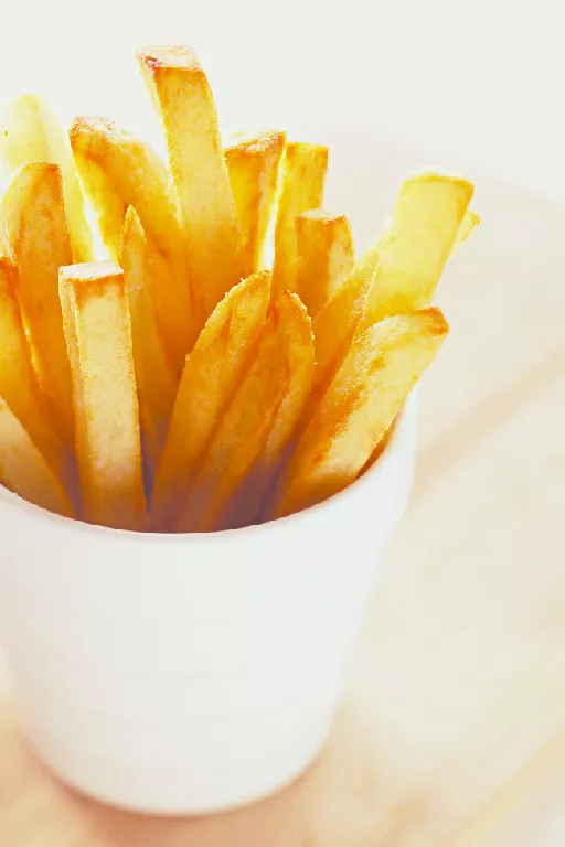
- 2 medium russet potatoes
- 8 cups peanut oil for frying
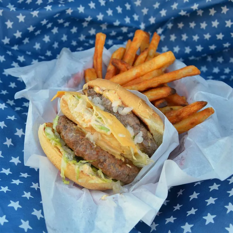
- 14 ounces ground chuck
- 4 thick slices American cheese
- 1 teaspoon hot sauce (such as Frank’s Red Hot ®)
- 1 tablespoon mayonnaise
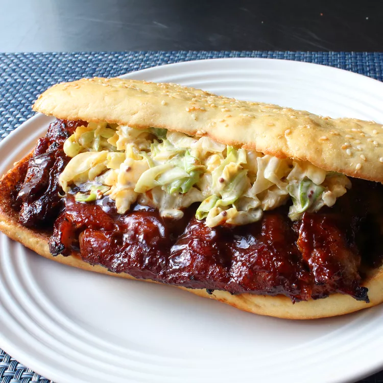
- 2 medium sesame seed burger buns
- ½ cup shredded iceberg lettuce
- 2 thick slices tomato
- 2 tablespoons diced onion
- 1 tablespoon pickle slices
- 2 teaspoons mustard
- 2 teaspoons ketchup
- 1 teaspoon kosher salt
Directions
- Cut potatoes in 1/2-inch wide strips. Place in a large bowl filled with warm water and soak for 20 minutes.
- Pour oil in a Dutch oven and heat over medium-high heat until it reaches 350 degrees F (175 degrees C). Line a rimmed baking sheet with paper towels and set a wire rack on top.
- Drain potatoes well and dry thoroughly with paper towels. Add 1/2 of the dried potatoes to the hot oil and cook, stirring often, until they soften slightly, about 3 minutes. Remove potatoes to the wire rack to drain. Repeat with remaining potatoes. Maintain oil temperature at 350 degrees F (175 degrees C) for finishing fries just before serving.
- Divide ground chuck into 4 portions and flatten to form 1/4-inch thick patties.
- Heat a large skillet over medium-high heat. Add burger patties to the hot skillet and cook undisturbed, until a brown crust has formed around the edges, 2 to 3 minutes. Flip, press down with a spatula to flatten, and cook for 2 more minutes. Flip again, press down once more, then top each patty with a slice of cheese; cook for 1 minute.
- While the burgers cook, spread mustard and ketchup on bottom halves of the buns. Drizzle hot sauce on the top halves of the buns, then spread mayonnaise over top. Layer with lettuce, tomato slices, pickles, and onions.
- Invert 1 patty onto a second patty so the cheese sides are touching. Repeat with remaining 2 patties. Place a stacked patty onto each top bun, and cover with a bottom bun, condiment-side down. Wrap burgers in foil.
- Return fries to the hot oil and cook until golden brown, 3 to 4 minutes. Drain on paper towels and sprinkle with salt. Serve immediately with burgers.
:max_bytes(150000):strip_icc():format(webp)/246835-barbacoa-style-shredded-beef-ddmfs-step-1-0780-e1029f9075c34a02b17d7b882fe9d8a8.jpg) Dotdash Meredith Food Studios
Dotdash Meredith Food Studios:max_bytes(150000):strip_icc():format(webp)/246835-barbacoa-style-shredded-beef-ddmfs-step-2-0783-817fa138500644cba39830b3a536eb7c.jpg) Dotdash Meredith Food Studios
Dotdash Meredith Food Studios:max_bytes(150000):strip_icc():format(webp)/246835-barbacoa-style-shredded-beef-ddmfs-step-3-0781-d6ca28f0d36c473db828449e88ccbbbf.jpg) Dotdash Meredith Food Studios
Dotdash Meredith Food Studios:max_bytes(150000):strip_icc():format(webp)/246835-barbacoa-style-shredded-beef-ddmfs-step-4-0949-72979a1ac59647d4a477953fba7617b4.jpg) Dotdash Meredith Food Studios
Dotdash Meredith Food Studios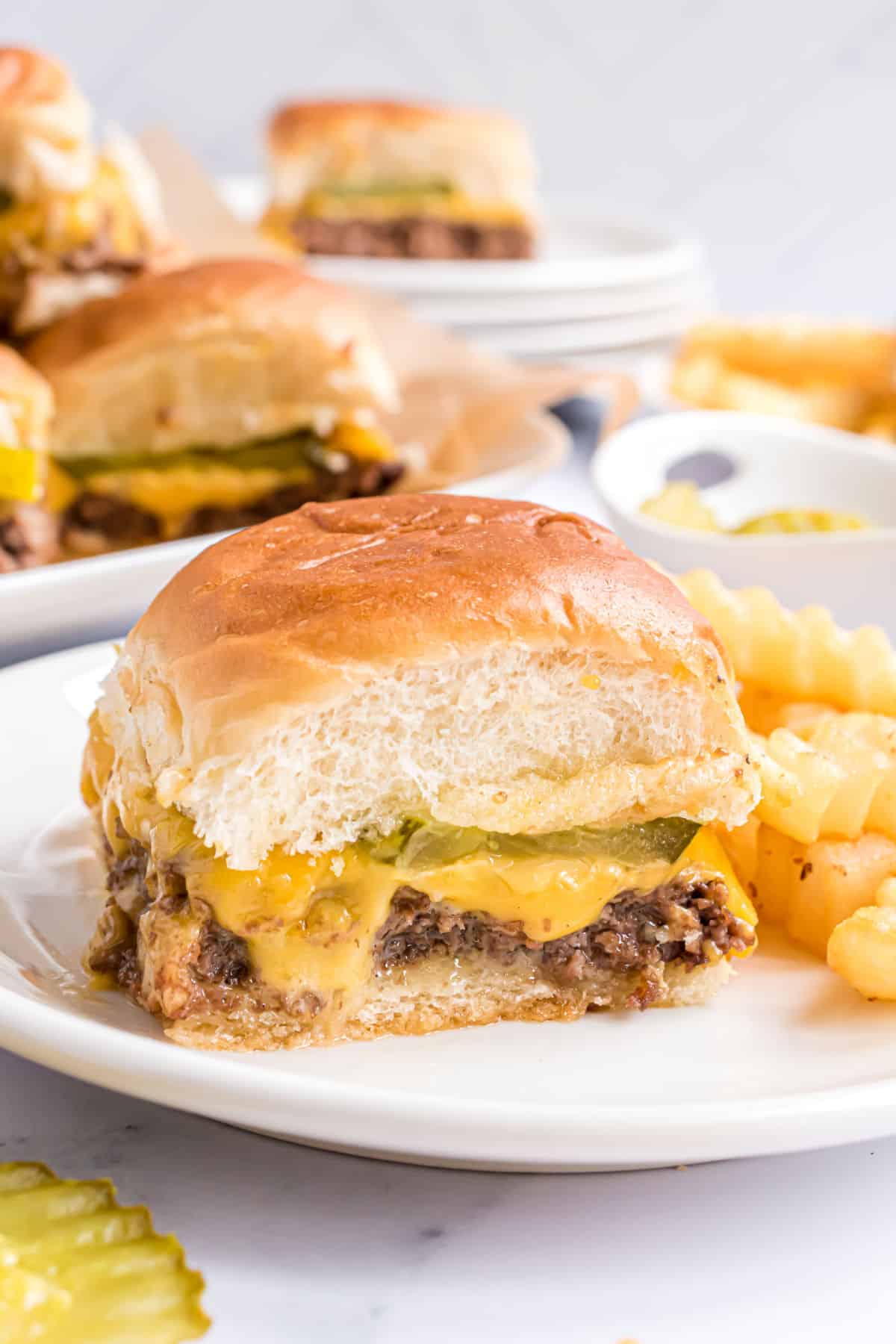
:max_bytes(150000):strip_icc():format(webp)/AR-2444188-copycat-chipolte-chicken-DDMFS-Step-1-7326d13b3637424cab3cd3e614c7394b.jpg) Dotdash Meredith Food Studios
Dotdash Meredith Food Studios:max_bytes(150000):strip_icc():format(webp)/AR-2444188-copycat-chipolte-chicken-DDMFS-Step-3-b67d6f74a3384e3ab336d21103d9cfc0.jpg) Dotdash Meredith Food Studios
Dotdash Meredith Food Studios:max_bytes(150000):strip_icc():format(webp)/AR-2444188-copycat-chipolte-chicken-DDMFS-Step-4-175e00cf0c1240cbb62371cc0076457f.jpg) Dotdash Meredith Food Studios
Dotdash Meredith Food Studios:max_bytes(150000):strip_icc():format(webp)/AR-2444188-copycat-chipolte-chicken-DDMFS-Step-5-115dcade731c4f09b908a05f5c0971de.jpg) Dotdash Meredith Food Studios
Dotdash Meredith Food Studios:max_bytes(150000):strip_icc():format(webp)/AR-2444188-copycat-chipolte-chicken-DDMFS-Step-6-75b79fb8ea0846d9bb1ea58caa8b0178.jpg) Dotdash Meredith Food Studios
Dotdash Meredith Food Studios:max_bytes(150000):strip_icc():format(webp)/AR-2444188-copycat-chipolte-chicken-DDMFS-Step-7-828f12eb3adc4958a44255c770aa4b11.jpg) Dotdash Meredith Food Studios
Dotdash Meredith Food Studios