Percentiles are a statistical concept used in machine learning to describe the distribution of a dataset. A percentile is a measure that indicates the value below which a given percentage of observations in a group of observations falls.
For example, the 25th percentile (also known as the first quartile) is the value below which 25% of the observations in the dataset fall, while the 75th percentile (also known as the third quartile) is the value below which 75% of the observations in the dataset fall.
Percentiles can be used to summarize the distribution of a dataset and identify outliers. In machine learning, percentiles are often used in data preprocessing and exploratory data analysis to gain insights into the data.
Python provides several libraries for calculating percentiles, including NumPy and Pandas.
Calculating Percentiles using NumPy
Below is an example of how to calculate percentiles using NumPy −
Example
import numpy as np

data = np.array([1,2,3,4,5])
p25 = np.percentile(data,25)
p75 = np.percentile(data,75)print('25th percentile:', p25)print('75th percentile:', p75)
In this example, we create a sample dataset using NumPy and then calculate the 25th and 75th percentiles using the np.percentile() function.
Output
The output shows the values of the percentiles for the dataset.
25th percentile: 2.0
75th percentile: 4.0
Calculating Percentiles using Pandas
Below is an example of how to calculate percentiles using Pandas −
Example
import pandas as pd

data = pd.Series([1,2,3,4,5])
p25 = data.quantile(0.25)
p75 = data.quantile(0.75)print('25th percentile:', p25)print('75th percentile:', p75)
In this example, we create a Pandas series object and then calculate the 25th and 75th percentiles using the quantile() method of the series object.
Output
The output shows the values of the percentiles for the dataset.
Percentiles are a statistical concept used in machine learning to describe the distribution of a dataset. A percentile is a measure that indicates the value below which a given percentage of observations in a group of observations falls.
For example, the 25th percentile (also known as the first quartile) is the value below which 25% of the observations in the dataset fall, while the 75th percentile (also known as the third quartile) is the value below which 75% of the observations in the dataset fall.
Percentiles can be used to summarize the distribution of a dataset and identify outliers. In machine learning, percentiles are often used in data preprocessing and exploratory data analysis to gain insights into the data.
Python provides several libraries for calculating percentiles, including NumPy and Pandas.
Calculating Percentiles using NumPy
Below is an example of how to calculate percentiles using NumPy −
Example
import numpy as np
data = np.array([1,2,3,4,5])
p25 = np.percentile(data,25)
p75 = np.percentile(data,75)print('25th percentile:', p25)print('75th percentile:', p75)
In this example, we create a sample dataset using NumPy and then calculate the 25th and 75th percentiles using the np.percentile() function.
Output
The output shows the values of the percentiles for the dataset.
25th percentile: 2.0
75th percentile: 4.0
Calculating Percentiles using Pandas
Below is an example of how to calculate percentiles using Pandas −
Example
import pandas as pd

data = pd.Series([1,2,3,4,5])
p25 = data.quantile(0.25)
p75 = data.quantile(0.75)print('25th percentile:', p25)print('75th percentile:', p75)
In this example, we create a Pandas series object and then calculate the 25th and 75th percentiles using the quantile() method of the series object.
Output
The output shows the values of the percentiles for the dataset.
Standard deviation is a measure of the amount of variation or dispersion of a set of data values around their mean. In machine learning, it is an important statistical concept that is used to describe the spread or distribution of a dataset.
Standard deviation is calculated as the square root of the variance, which is the average of the squared differences from the mean. The formula for calculating standard deviation is as follows −
σ=[Σ(x−μ)2/N]‾‾‾‾‾‾‾‾‾‾‾‾‾√σ=[Σ(x−μ)2/N]
Where −
σσis the standard deviation
ΣΣ is the sum of
xx is the data point
μμ is the mean of the dataset
NN is the total number of data points
In machine learning, standard deviation is used to understand the variability of a dataset and to detect outliers. For example, in finance, standard deviation is used to measure the volatility of stock prices. In image processing, standard deviation can be used to detect image noise.
Types of Examples
Example 1
In this example, we will be using the NumPy library to calculate the standard deviation −
import numpy as np

data = np.array([1,2,3,4,5,6])
std_dev = np.std(data)print('Standard deviation:', std_dev)
Output
It will produce the following output −
Standard deviation: 1.707825127659933
Example 2
Let’s see another example in which we will calculate the standard deviation of each column in Iris flower dataset using Python and Pandas library −
import pandas as pd

# load the iris dataset

iris_df = pd.read_csv('https://archive.ics.uci.edu/ml/machine-learningdatabases/iris/iris.data',
   names=['sepal length','sepal width','petal length','petal width','class'])# calculate the standard deviation of each column
std_devs = iris_df.std()# print the standard deviationsprint('Standard deviations:')print(std_devs)
In this example, we load the Iris dataset from the UCI Machine Learning Repository using Pandas’ read_csv() method. We then calculate the standard deviation of each column using the std() method of the Pandas dataframe. Finally, we print the standard deviations for each column.
Output
On executing the code, you will get the following output −
This example demonstrates how standard deviation can be used to understand the variability of a dataset. In this case, we can see that the standard deviation of the ‘petal length’ column is much higher than that of the other columns, which suggests that this feature may be more variable and potentially more informative for classification tasks.
Mean, Median, and Mode are statistical measures used to describe the central tendency of a dataset. In machine learning, these measures are used to understand the distribution of data and identify outliers. Here, we will explore the concepts of Mean, Median, and Mode and their implementation in Python.
Mean
The “mean” is the average value of a dataset. It is calculated by adding up all the values in the dataset and dividing by the number of observations. The mean is a useful measure of central tendency because it is sensitive to outliers, meaning that extreme values can significantly affect the value of the mean.
In Python, we can calculate the mean using the NumPy library, which provides a function called mean().
Median
The “median” is the middle value in a dataset. It is calculated by arranging the values in the dataset in order and finding the value that lies in the middle. If there are an even number of values in the dataset, the median is the average of the two middle values.
The median is a useful measure of central tendency because it is not affected by outliers, meaning that extreme values do not significantly affect the value of the median.
In Python, we can calculate the median using the NumPy library, which provides a function called median().
Mode
The “mode” is the most common value in a dataset. It is calculated by finding the value that occurs most frequently in the dataset. If there are multiple values that occur with the same frequency, the dataset is said to be bimodal, trimodal, or multimodal.
The mode is a useful measure of central tendency because it can identify the most common value in a dataset. However, it is not a good measure of central tendency for datasets with a wide range of values or datasets with no repeating values.
In Python, we can calculate the mode using the SciPy library, which provides a function called mode().
Python Implementation
Let’s see an example of calculating mean, median, and mode for a salary table in Python using NumPy and Pandas −
import numpy as np
import pandas as pd
# create a sample salary table
salary = pd.DataFrame({'employee_id':['001','002','003','004','005','006','007','008','009','010'],'salary':[50000,65000,55000,45000,70000,60000,55000,45000,80000,70000]})# calculate mean
mean_salary = np.mean(salary['salary'])print('Mean salary:', mean_salary)# calculate median
median_salary = np.median(salary['salary'])print('Median salary:', median_salary)# calculate mode
mode_salary = salary['salary'].mode()[0]print('Mode salary:', mode_salary)
Output
On executing this code, you will get the following output −
Mean salary: 59500.0
Median salary: 57500.0
Mode salary: 45000
Statistics is a crucial tool in machine learning because it helps us understand the underlying patterns in the data. It provides us with methods to describe, summarize, and analyze data. Let’s see some of the basics of statistics for machine learning.
What is Statistics?
Statistics is a branch of mathematics that deals with the collection, analysis, interpretation, and presentation of data. It provides us with different types of methods and techniques to analyze data and draw conclusions from it.
Statistics is the foundation for machine learning as it helps us to analyze and visualize data to find hidden patterns. Statistics is used in machine learning in many ways, including model validation, data cleaning, model selection, evaluating model performance, etc.
Basic Statistics Concepts for Machine Learning
Followings are some of the important statistics concepts essential for machine learning −
Mean, Median, Mode − These statistical measures used to describe the central tendency of a dataset.
Standard deviation, Variance − Standard deviation is a measure of the amount of variation or dispersion of a set of data values around their mean.
Percentiles − A percentile is a measure that indicates the value below which a given percentage of observations in a group of observations falls.
Data Distribution − It refers to the way in which data points are distributed or spread out across a dataset.
Skewness and Kurtosis − Skewness refers to the degree of asymmetry of a distribution and kurtosis refers to the degree of peakedness of a distribution.
Bias and Variance − They describe the sources of error in a model’s predictions.
Hypothesis − It is a proposed explanation or solution for a problem.
Linear Regression − It is used to predict the value of a variable based on the value of another variable.
Logistic Regression − It estimates the probability of an event occurring.
Principal Component Analysis − It is a dimensionality reduction method used to reduce the dimensionality of large datasets.
Types of Statistics
There are two types of statistics – descriptive and inferential statistics.
Descriptive Statistics − set of rules or methods used to describe or summarize the features of dataset.
Inferential Statistics − deals with making predictions and inferences about a population based on a sample of data
Let’s understand these two types of statistics in detail.
Descriptive Statistics
Descriptive statistics is a branch of statistics that deals with the summary and analysis of data. It includes measures such as mean, median, mode, variance, and standard deviation. These measures help us understand the central tendency, variability, and distribution of the data.
Applications in Machine Learning
In machine learning, descriptive statistics can be used to summarize the data, identify outliers, and detect patterns. For example, we can use the mean and standard deviation to describe the distribution of a dataset.
Example
In Python, we can calculate descriptive statistics using libraries such as NumPy and Pandas. Below is an example −
import numpy as np
import pandas as pd

data = np.array([1,2,3,4,5])
df = pd.DataFrame(data, columns=["Values"])print(df.describe())
Output
This will output a summary of the dataset, including the count, mean, standard deviation, minimum, and maximum values as follows −
         Values
count    5.000000
mean     3.000000
std      1.581139
min      1.000000
25%      2.000000
50%      3.000000
75%      4.000000
max      5.000000
Inferential Statistics
Inferential statistics is a branch of statistics that deals with making predictions and inferences about a population based on a sample of data. It involves using hypothesis testing, confidence intervals, and regression analysis to draw conclusions about the data.
Applications in Machine Learning
In machine learning, inferential statistics can be used to make predictions about new data based on existing data. For example, we can use regression analysis to predict the price of a house based on its features, such as the number of bedrooms and bathrooms.
Example
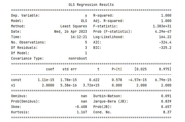
In Python, we can perform inferential statistics using libraries such as Scikit-Learn and StatsModels. Below is an example −
import statsmodels.api as sm
import numpy as np

X = np.array([1,2,3,4,5])
y = np.array([2,4,6,8,10])

X = sm.add_constant(X)
model = sm.OLS(y, X).fit()print(model.summary())
Output
This will output a summary of the regression model, including the coefficients, standard errors, t-statistics, and p-values as follows −
In the next chapter, we will discuss various descriptive and inferential statistics measures, which are commonly used in machine learning, in detail along with Python implementation example.
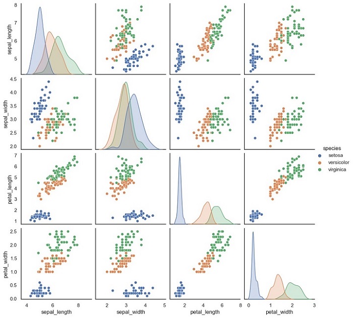
Scatter Matrix Plot is a graphical representation of the relationship between multiple variables. It is a useful tool in machine learning for visualizing the correlation between features in a dataset. This plot is also known as a Pair Plot, and it is used to identify the correlation between two or more variables in a dataset.
A Scatter Matrix Plot displays the scatter plot of each pair of features in a dataset. Each scatter plot represents the relationship between two variables. It is also possible to add a diagonal line to the plot that shows the distribution of each variable.
Python Implementation of Scatter Matrix Plot
Here, we will implement the Scatter Matrix Plot in Python. For our example given below, we will be using Sklearn’s Iris dataset.
The Iris dataset is a classic dataset in machine learning. It contains four features: Sepal Length, Sepal Width, Petal Length, and Petal Width. The dataset has 150 samples, and each sample is labeled as one of three species: Setosa, Versicolor, or Virginica.
We will use the Seaborn library to implement the Scatter Matrix Plot. Seaborn is a Python data visualization library that is built on top of the Matplotlib library.
Example
Below is the Python code to implement the Scatter Matrix Plot −
import seaborn as sns
import pandas as pd

# load iris dataset
iris = sns.load_dataset('iris')# create scatter matrix plot
sns.pairplot(iris, hue='species')# show plot
plt.show()
In this code, we first import the necessary libraries, Seaborn and Pandas. Then, we load the Iris dataset using the sns.load_dataset() function. This function loads the Iris dataset from the Seaborn library.
Next, we create the Scatter Matrix Plot using the sns.pairplot() function. The hue parameter is used to specify the column in the dataset that should be used for color encoding. In this case, we use the species column to color the points according to the species of each sample.
Finally, we use the plt.show() function to display the plot.
Output
The output of this code will be a Scatter Matrix Plot that shows the scatter plots of each pair of features in the Iris dataset.
Notice that each scatter plot is color-coded according to the species of each sample.
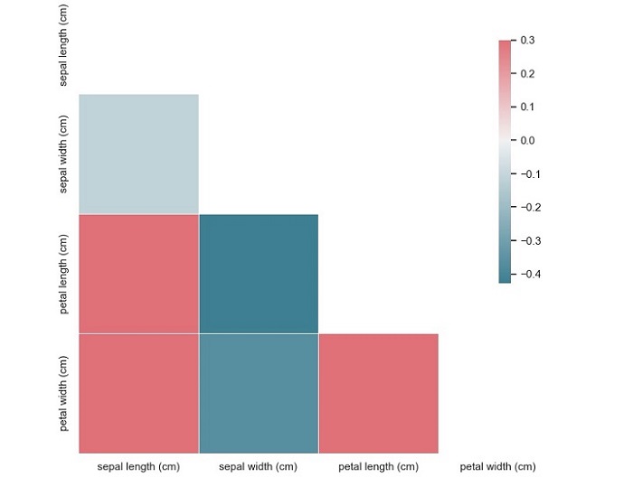
A correlation matrix plot is a graphical representation of the pairwise correlation between variables in a dataset. The plot consists of a matrix of scatterplots and correlation coefficients, where each scatterplot represents the relationship between two variables, and the correlation coefficient indicates the strength of the relationship. The diagonal of the matrix usually shows the distribution of each variable.
The correlation coefficient is a measure of the linear relationship between two variables and ranges from -1 to 1. A coefficient of 1 indicates a perfect positive correlation, where an increase in one variable is associated with an increase in the other variable. A coefficient of -1 indicates a perfect negative correlation, where an increase in one variable is associated with a decrease in the other variable. A coefficient of 0 indicates no correlation between the variables.
Python Implementation of Correlation Matrix Plots
Now that we have a basic understanding of correlation matrix plots, let’s implement them in Python. For our example, we will be using the Iris flower dataset from Sklearn, which contains measurements of the sepal length, sepal width, petal length, and petal width of 150 iris flowers, belonging to three different species – Setosa, Versicolor, and Virginica.
This code will produce a correlation matrix plot of the Iris dataset, with each square representing the correlation coefficient between two variables.
From this plot, we can see that the variables ‘sepal width (cm)’ and ‘petal length (cm)’ have a moderate negative correlation (-0.37), while the variables ‘petal length (cm)’ and ‘petal width (cm)’ have a strong positive correlation (0.96). We can also see that the variable ‘sepal length (cm)’ has a weak positive correlation (0.87) with the variable ‘petal length (cm)’.
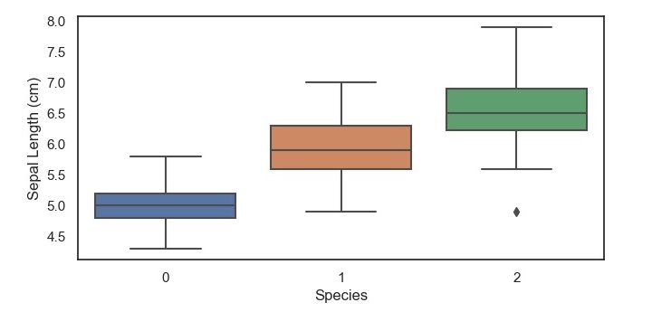
A boxplot is a graphical representation of a dataset that displays the five-number summary of the data – the minimum value, the first quartile, the median, the third quartile, and the maximum value.
The boxplot consists of a box with whiskers extending from the top and bottom of the box.
The box represents the interquartile range (IQR) of the data, which is the range between the first and third quartiles.
The whiskers extend from the top and bottom of the box to the highest and lowest values that are within 1.5 times the IQR.
Any values that fall outside this range are considered outliers and are represented as points beyond the whiskers.
Python Implementation of Box and Whisker Plots
Now that we have a basic understanding of boxplots, let’s implement them in Python. For our example, we will be using the Iris dataset from Sklearn, which contains measurements of the sepal length, sepal width, petal length, and petal width of 150 iris flowers, belonging to three different species – Setosa, Versicolor, and Virginica.
To start, we need to import the necessary libraries and load the dataset.
Example
import matplotlib.pyplot as plt
import seaborn as sns
from sklearn.datasets import load_iris
iris = load_iris()
data = iris.data
target = iris.target
Next, we can create a boxplot of the sepal length for each of the three iris species using the Seaborn library.
This code will produce a boxplot of the sepal length for each of the three iris species, with the x-axis representing the species and the y-axis representing the sepal length in centimeters.
From this boxplot, we can see that the setosa species has a shorter sepal length compared to the versicolor and virginica species, which have a similar median and range of sepal lengths. Additionally, we can see that there are no outliers in the setosa species, but there are a few outliers in the versicolor and virginica specie.
A density plot is a type of plot that shows the probability density function of a continuous variable. It is similar to a histogram, but instead of using bars to represent the frequency of each value, it uses a smooth curve to represent the probability density function. The xaxis represents the range of values of the variable, and the y-axis represents the probability density.
Density plots are useful for identifying patterns in data, such as skewness, modality, and outliers. Skewness refers to the degree of asymmetry in the distribution of the variable. Modality refers to the number of peaks in the distribution. Outliers are data points that fall outside of the range of typical values for the variable.
Python Implementation of Density Plots
Python provides several libraries for data visualization, such as Matplotlib, Seaborn, Plotly, and Bokeh. For our example given below, we will use Seaborn to implement density plots.
We will use the breast cancer dataset from the Sklearn library for this example. The breast cancer dataset contains information about the characteristics of breast cancer cells and whether they are malignant or benign. The dataset has 30 features and 569 samples.
Example
Let’s start by importing the necessary libraries and loading the dataset −
import matplotlib.pyplot as plt
import seaborn as sns
from sklearn.datasets import load_breast_cancer
data = load_breast_cancer()
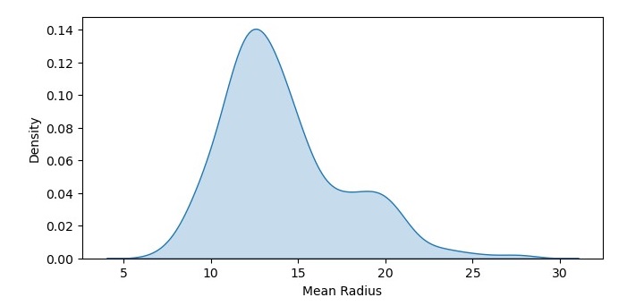
Next, we will create a density plot of the mean radius feature of the dataset −
In this code, we have used the kdeplot() function from Seaborn to create a density plot of the mean radius feature of the dataset. We have set the shade parameter to True to shade the area under the curve. We have also added labels to the x and y axes using the xlabel() and ylabel() functions.
Output
The resulting density plot shows the probability density function of mean radius values in the dataset. We can see that the data is roughly normally distributed, with a peak around 12-14.
Density Plot with Multiple Data Sets
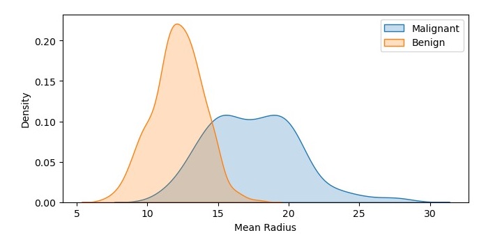
We can also create a density plot with multiple data sets to compare their probability density functions. Let’s create density plots of the mean radius feature for both the malignant and benign samples −
In this code, we have used the kdeplot() function twice to create two density plots of the mean radius feature, one for the malignant samples and one for the benign samples. We have set the shade parameter to True to shade the area under the curve, and we have added labels to the plots using the label parameter. We have also added a legend to the plot using the legend() function.
Output
On executing this code, you will get the following plot as the output −
The resulting density plot shows the probability density functions of mean radius values for both the malignant and benign samples. We can see that the probability density function for the malignant samples is shifted to the right, indicating a higher mean radius value.
A histogram is a bar graph-like representation of the distribution of a variable. It shows the frequency of occurrences of each value of the variable. The x-axis represents the range of values of the variable, and the y-axis represents the frequency or count of each value. The height of each bar represents the number of data points that fall within that value range.
Histograms are useful for identifying patterns in data, such as skewness, modality, and outliers. Skewness refers to the degree of asymmetry in the distribution of the variable. Modality refers to the number of peaks in the distribution. Outliers are data points that fall outside of the range of typical values for the variable.
Python Implementation of Histograms
Python provides several libraries for data visualization, such as Matplotlib, Seaborn, Plotly, and Bokeh. For the example given below, we will use Matplotlib to implement histograms.
We will use the breast cancer dataset from the Sklearn library for this example. The breast cancer dataset contains information about the characteristics of breast cancer cells and whether they are malignant or benign. The dataset has 30 features and 569 samples.
Example
Let’s start by importing the necessary libraries and loading the dataset −
import matplotlib.pyplot as plt
from sklearn.datasets import load_breast_cancer
data = load_breast_cancer()
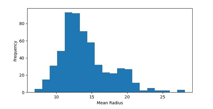
Next, we will create a histogram of the mean radius feature of the dataset −
In this code, we have used the hist() function from Matplotlib to create a histogram of the mean radius feature of the dataset. We have set the number of bins to 20 to divide the data range into 20 intervals. We have also added labels to the x and y axes using the xlabel() and ylabel() functions.
Output
The resulting histogram shows the distribution of mean radius values in the dataset. We can see that the data is roughly normally distributed, with a peak around 12-14.
Histogram with Multiple Data Sets
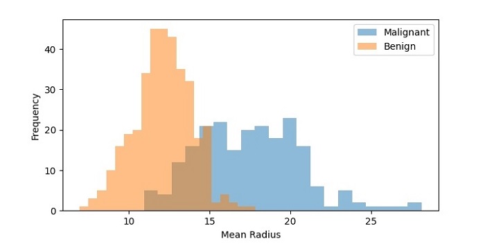
We can also create a histogram with multiple data sets to compare their distributions. Let’s create histograms of the mean radius feature for both the malignant and benign samples −
In this code, we have used the hist() function twice to create two histograms of the mean radius feature, one for the malignant samples and one for the benign samples. We have set the transparency of the bars to 0.5 using the alpha parameter so that they don’t overlap completely. We have also added a legend to the plot using the legend() function.
Output
On executing this code, you will get the following plot as the output −
The resulting histogram shows the distribution of mean radius values for both the malignant and benign samples. We can see that the distributions are different, with the malignant samples having a higher frequency of higher mean radius values.